Hey all! Thought you might enjoy a sneak peek of one my projects a.k.a. pride and joy. I’ve been working on this complete overhaul/renovation for months now for a wonderful growing family that are just an absolute joy to work with.
Meet “White Oak” lovingly named by its new owners (I can already picture a beautiful “WO” monogram on the dining room chairs). White Oak was a bank owned property that sat by itself for a few and needed a bit of work. It is a classic Southern elevation complete with four gorgeous Corinthian columns imported from the city of New Orleans. Anyone who knows me, knows I love that town because of its MAD style and we’re taking a few queues from the region throughout the design process.
To kick things off some structural improvements took place. The homeowners had been looking at custom garages for a while so when they moved in they decided to get a new garage installed and knock the old one down. But that’s just the start!

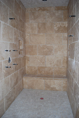
When you entered the master bath suite there was this wide open space, sort of like a sitting room, but in the bathroom, ahhh not so much. We borrowed enough space from the room to create a walk in closet for their eldest daughter’s bedroom on the opposite wall and framed in this gorgeous dual head shower with a custom shower base.

I love how it’s completely encased in ivory stone with built in bench and niches on each side, out of sight. Notice the separate shelf for soap and product. Details loves. Details.

Here is a shot opposite the shower. Previously a huge sunk-in tub was to the left with these grand steps to get in (hello, the eighties called they want their tub back). It literally came out a good three, four feet into the main room and threw off the traffic flow and symmetry. We’re replacing it with a simple under mount tub like the photo below. Sconces shown are from the previous owner. We also became interested in double sink vanities for the bathroom to add a bit of extra class and style, which should fill out the space perfectly.
I apologize but I cannot recall where this photo came from. If you know, holler. It’s a beauty!

Here is a shot of the master closet (I know. It’s bigger than both my children’s bedrooms). If you look there is a door to the right and left where the light from the window is coming in. This was originally unfinished storage space and it has been transformed into his and her closets. This room will most likely be a craft room for Mama.

A shot of one of the new closets. Still almost as big as my son’s bedroom, which you’ll see soon.
 The view walking out of the master suite into a grand upstairs hallway. Drama. Love it. And I can’t even wait to show you the light we picked for this space and the sconces. A great mix.
 Here is a shot of the main hall and staircase from downstairs. I love a grand main hall. Nothing like creating an entrance. Its also good feng shui to enter your home and see directly out the back. A little feng shui never hurt anybody. 😉

Moving on to the dining room. Bless their heart. They were going for Tiffany box blue. Let this be a little lesson friends, blue intensifies once it is up on the walls. If you’re debating between two shades, go for the lighter.
The homeowner has a gorgeous long dining table her Grandfather made (how perfect!) with tons of side chairs to match. They are a little rustic but I think we can jazz em up with a simple slipcover on the back or seat. We dug out a pair of old wingback chairs she had stored in a barn for the anchors. I can’t help but picture huge holiday gatherings for this large and loving family. I love the light fixture we chose for in here and we’re stenciling the walls above the chair rail. Below is the inspirational photo for this room courtesy of Atlanta Homes & Lifestyles. The beloved Samarkand fabric by Peter Dunham is our guide for a modern day stencil.
I love symmetry (admittedly some days it can be a curse) and this house is chuck full of it. There are two separate entry halls leading from the dining room to the kitchen/keeping room. Here is a shot of one with the addition of this bench, bead board and hooks where the family will come in and out most days. Precious.

The opposite hall has a butler’s pantry on one side and a walk in pantry on the other. I had to take a shot of the new pantry shelves because they are tight. I’m also wild about all the transoms in this home. Character builders.

I think I might be most excited about this next upgrade. When I say this family has been an absolute joy to work with it is no exaggeration meaning I throw out a suggestion and we are aligned. I casually mention “I feel like the kitchen is missing a focal point” and draw up a quick pencil sketch for them to see.
What comes next…

the magic! I literally did a cheer when I saw it for the first time. The lines of the transoms and the lines of the hood were just not jiving with me, like it was missing its hat. There was no weight, heft to anchor the artery of the home. Not…any…more. A few other improvements include reconfiguring the countertop to accommodate bar seating for the kiddos, an apron front sink and some gorgeous pendants.
We’re still discussing the back splash here and waiting to see what it looks like once the cabinets are painted. Personally I’d like to paint it. Not because its atrocious or anything but when my eye moves across the room and it gets to this point – I see static and the tones are a bit off. Maybe if I show my client this photo she might reconsider.
image via Greige
I don’t necessarily want to replace the backsplash but better yet experiment with it. You can paint almost anything these days and thought it might be cool to paint all the tile one color and then add a squared off stencil pattern, like the one above, in another color. I call that big bang for little buck. And if it doesn’t work, oh well, paint over it. The result is still better than what we started with. It’s little details and experiments like this that make design life fun.
Next up is the study.
Here it is when the owner’s purchased it. The bookcases removed and on the right you’ll see a small hallway leading into the guest bedroom. Instead that door was removed now creating a closet for the guest bedroom, which brings our tally to six total. Folks you can’t count it as a bedroom if it doesn’t have a closet and with that one quick fix, we increased the value of the home.
 Here it is covered and once again we have great symmetry on either side of the closet. BTW that closet is huge and will house most of the “techy” items to keep the room clean and clutter free.
 Our new gorgeous built in bookcases. We’ve got big plans for this room. Below are a few inspirational shots. Mr. White Oak is an avid hunter so I’m very excited about the prospect of his wins displayed tastefully here in just the right dose. Are you still undecided whether your room needs the addition of a bookcase, for storage and aesthetic reasons, have a look at why every home needs a bookcase and see if you could be sold.
Image via Cote de Texas. LOVE the carmel colored sofa.

The AH&L cover is more along the lines of the wall color we’ll be using. We have a gorgeous desk inherited from her Great Grandfather that was a general in the Canadian Army.
I’ll leave you here with a shot of the new GORGEOUS carrera marble subway tile in the guest shower and my new favorite, the basket weave on the floor.

A labor of love. The folks making the magic happen are also family. Its a fantastic collaboration and true blessing to work on this family’s forever home.
I hope you enjoyed this little taste and I cannot wait to celebrate the rest with you all! Coming soon!!!
xo
Jennifer


