I had the pleasure and the privilege of touring this year’s Inspiration House on press night, a wild and lovely time. Wild was all the color and inspiration of the interiors and lovely was celebrating the rooms my three design darling friends dreamed up.
If you’ve never toured a show house, you must! The beauty is that each room is left up to the designers discretion and artistic vision. Totally. Some rooms will be over-the-top indulgent, which doesn’t always fly with a client, and others full of luxury that most of us can only dream about. This is what I love best about show houses. Their like dreams but only better, you can touch, feel and see them all in living color and then walk away with all kinds of ideas for your castle. It’s safe to say, after I toured this show house for a little I did some digging into property design teams such as these architects Cheshire has to offer, and had a look around at some of the project portfolio’s for more inspiration, should I ever wish to redesign my home in the future!
Speaking of color, check out Dayka’s killer back stairwell. I was wild about her space. The rug, the paint on the walls, the striped chairs, the drapery fabric, the CB2 light (that I’m totally going to use!) and the mirrored picture frames of vintage family photos.
Who would have thought that these types of accessories could make a difference in the overall mood and look of a room? When it comes to rugs, and the wide selection they have at places like TopTeppiche.de, they can come in different colors, sizes, and styles, so you will be able to keep it within your design tastes. Finding the right rug also has the ability to complement the rest of the room and its features. For some homeowners, a rug is a must!
And Sherry and Lori’s coze factory (is coze a word?)!! I wanted to hang out there all night (which I kinda did) because it was so cozy and a little bit sexy and just a great mix of masculine and feminine. You can live the journey (or the “birth of their baby” as they so aptly called it) HERE and HERE. After you’ve gone and checked em out, come on back and we’ll chat about how stinking cute (and hilarious) they are.
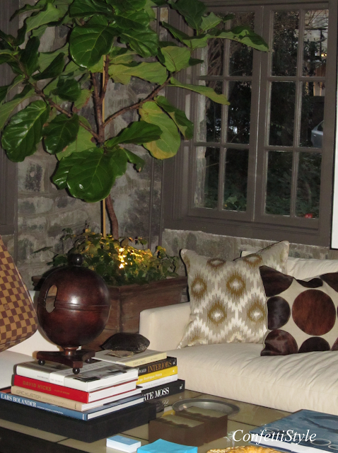
They shared the downstairs space, with its stone walls, with Bill Ingram (a hero of mine, more on that later) and William McClure from Bill Ingram Architects. Ironically they had the same dark, cozy and a little bit sexy idea too. Hah, great minds think alike.
The gorgeous fiddle fig trees occupied each corner of the room, with subtle spotlights shining up into their leaves, upping the ante on the ambiance factor.
The first room I feasted on was by Yvonne McFadden. Wow. Hi Yvonne, your new biggest fan, RIGHT here. When finally sitting down to write this post, I went and checked out her portfolio. Bananas!
Who hasn’t pinned this amazing piece of design work…
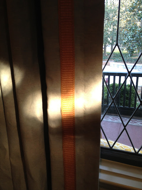
I loved the Rogers and Goffigon tape she chose for her drapes. Just that little pop of persimmon made all the difference.
Summer Loftin’s “Gentlemen’s Club” was next. It was wild and whimsical and rich in storied antiques, including this antique murphy bed she so graciously displayed for us.
It was a pleasure to meet Summer. We concur with names like Summer and Sunshine, bad moods are hard to come by.
Gorgeous hand-painted mural in Brooke Merrill’s foyer space.
I wish I’d taken more shots of Brooke’s space. It was really special but naturally where everyone was hanging out and difficult to get a full on shot of all the lovely details.
So I’m headed to Palm Springs in April with my college roommates and this next room put me in the mood! Sign me up for some Trina Turk stat.
I’m using that ribbon design on a pillow soon. Details love.
In the event you cannot find some birch logs for your fire, just paint some white…
You’ll find ideas and inspiration from every single space of the house, including this little vignette of Jonathon Gonzales’s apartment bathroom. How many times have you been at a yard sale or antique store and spotted a tarnished silver tray like this? Did you ever think to pile it high with utilitarian ivory soaps? Yeah, me neither. Borrowing that too, thank you very much.
The color continued in Jennifer Reiner and Robert White’s thriller space decked in peacock blues. My hazel eyes looked really good in that room. Kidding, but I could have been a docent in my matching dress.
Notice the white whippets. I’ve wanted a pair of concrete ones for my back door, gosh, for probably ten years now (ever since I visited the KWID designed Viceroy Santa Monica) but every time I come across them, their so damn heavy. Mom would of chose gargoyles. I go back and forth. Did you know gargoyles ward off evil spirits (even though they look kind of evil themselves)? And Lord knows there’s a few evil spirits in every neighborhood that could use some warding off. 😉 There’s a stellar stylish home back in Lake O by Koko’s house that has a pair standing guard on the back porch and at Christmastime they adorn them with Santa hats. One of those fun facts that just sticks in my head for that “someday maybe I’ll try that”.
This next picture, I realize, is tricky with the glass table but I thought the styling was special and a nice mix of the coral, plant, fur and books along with a tiny peek of the beautiful iron base.
These were the original light fixtures and the designers glammed em up by lowering them over the table (do this!), adding the round white bulbs and dressing it up in some serious crystal strands. You all remember the tinsel you would just throw up on Christmas trees like this in the 80s? Our family friends, the Campbells, would cover their tree in it. It was so cool looking and this reminded me of it. Maybe we need to bring that back? And btw, they painted their fireplace logs gold. The spray painting of logs, a new one for me and I like it.
The bathroom! The floor was designed by Karen Ferguson, as in she drew it up and the tile company cut it to scale. Not worthy. Nor is that gorgeous taupe colored toilet in the background which I am sure would look great next to glass shower doors but aren’t in this instance. Why are we married to white toilets? My husband has always said we need a dark toilet and maybe he’s right?
(put it down, I just admitted the hubs might be right).
This next story is exciting. Meet Wesley Huffard. She is a former interior designer returning to the scene! And I’d say with a BANG. Good for her. Her space was beautiful. I walked in and imagined Thanksgiving here and thought oh how nice would that be. Such a gracious and gorgeous table.
I cannot recall the maker of this fabric, but I’m going to guess Clarence House. It is stunning. I’m in the process of designing six slipcovered tables like this for myself and my clients so I had to get a pic.
So I mentioned earlier that I met the great Bill Ingram architect and his incredibly kind business partner William McLure AND you know how I’m always going on about the architecture and design scene in Birmingham, Alabama. It is off the chain (see my post on the Dugan Nequette HERE) and Mr. Ingram is a big part of that scene. I expressed what a huge fan I was and he knew I wasn’t b.s.ing after rattling off about 15 of my favorite details from the Southern Accents Show house he designed thirteen years ago…”wow you have a great memory” or the fact that I have pinned every shot of his Lake Martin home. Stalker.
SO since we’re on the subject of show houses and Bill Ingram, here are a few favorite shots I snapped with my iphone from the magazine vault.
This next picture is like poetry. For serious. The inset beam over the ovens, that gorgeous island table with the thicker than thick stone top, the built in breakfast table bench with its swoop nailhead decor, the sweet little clover cut outs in the cabinets, the floors! My Aunt and Uncle have those same floors. Have had them for years. Way to go Uncle Jim and Aunt Linda.
I’ve always loved a cook area enclosed in a sweet little niche like this. When we were drawing up plans to build another home, this was a must design detail for me.
The perfect mix of furniture lines. Throw the sconces in with the pots!
A refined canopy bed.
And lastly, upon walking up to the show house, I found this simple and stylish gate to be awesome and logged it in my memory bank for future use.
Cheers!
Jen


Awwww…..great post!!! I love William and Bill. They have been fun to get to know….in fact that has been the best part about the whole experience…..!
SUCH a great wrap-up post, Jennifer! William is such a nice guy–have enjoyed talking to him a bit when I run downstairs to hang with my peeps for a break 🙂 Thanks for the sweet words about my room, so glad you could make it out!
Xo,
D
Great post and terrific people! We are thrilled to assist Rhonda Peterson with her space and hope to meet you soon!