Oh dear, its getting harder and harder to blog these days. So what a treat for me to be sitting down tonight writing this post, that has been on my plate for oh almost two years.
Tonight I am giving you a hot damn (!!!) before and after tour of my friend Jilly’s house. The purchasing and renovation of this house was a celebration of sorts. Jill’s new found independence and the conquering of that nasty little beast called Cancer that had crept into her colon. Praise Him! So when we finally got our hands on this white-painted brick beauty, it was show time and blow it up we did.
Let’s start with the foyer. This house had a lot of great elements about it, like the floor to ceiling window here, the gorgeous brick floors and extensive trim moldings throughout. But like all hidden gems, they were being out shined/ overshadowed by some outdated color choices.
And after. All the walls and trim were painted our favorite white “mascarpone” by Benjamin Moore. The front door was adorned with an ivory burlap curtain for privacy when needed and Jilly made the foyer light out of a wheat colored basket that we sprayed another greige favorite “ethereal mood” by Sherwin Williams. We also painted all the interior doors this same greige color.
Moving into the dining room before…again those great elements I mentioned, wainscoting, the trim work on the ceiling and that big dramatic window (my favorite thing about this house).
And after. You’ll notice we refinished the dark brown floors and had them white washed with water and gesso from the art supply store. THEY WERE SO BEAUTIFUL! But no matter how much sealant we put on them, they did not hold up to the elements (such a shame) so they had to be refinished again, this time with Minwax’s “classic gray”. Jilly’s vintage oil lamp chandy was installed that follows her from house to house. We had plans to paint the walls above the railing chalk board and write in beautiful script her favorite recipes (she’s an AMAZING chef).
Here’s a shot of the floors when they were white washed…they were a bit lighter.
A pair of Aiden Gray lamps adorn her Ballard Design sideboard. Mrs. Meyer’s candles are always burning and smell so good.
Moving on to the main kitchen and living area…where things start to get interesting 😉
during…this happy guy installs inexpensive subway tile all the way to the ceiling.
and “look at you, you sexy thang!” after…
All of the cabinets were painted mascarpone, we had the granite honed and added the extra long IKEA pulls on all the cabinets to give them a modern fresh look. We removed the traditional trim around the tops of the cabinets and replaced it with a straight edge piece of molding instead. The pendants are from Wisteria and such a great price at $150 a piece. I recently put them in my kitchen but sprayed the inside of them gold and I must admit, they are rocking my world…supersonic.
Here is the main living room before…we loved the brick surround on the fireplace but that was about all.
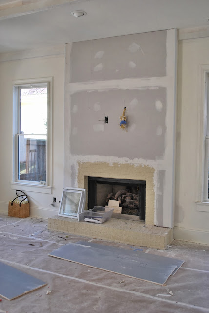
We ripped off the builder grade surround, added drywall to the ceiling and covered it all in joint compound.
LOVE how it turned out. We dreamed about reclaimed doors to cover the television but Jilly didn’t stay here long. Another one of my tricks is to spray the inside of those “faux” brick builder grade fire boxes black, so they just sort of go away.
That fabulous mirror was a Ballard’s back room find. We pretty much stole that console table at the Country Living Fair last year.
A sweet organic vignette.
Another great feature of this home was the coffered ceilings, however, they had this funky round moulding on the bottom of them. We were like tear that shit off, leave it rough on the edges and paint over it. Yeah. Yeah.
The majority of the homes in our neighborhood, take on this same similar floor plan with open living, kitchen and breakfast nook. We decided one too many eating areas with the dining room, kitchen island and nook all right in a row and took the former breakfast area here…
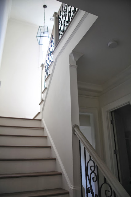
And after. The oak bannisters were painted “ethereal mood” and the stairs refinished. A Ballard’s back room pendant hangs in the light filled landing.
The first floor bathroom with the dreadful toilet and sink side-by-side competing for wall space, balance, symmetry (I cannot stand that lay out! Quit it people).
We unified the space with some reclaimed boards, a pair of French sconces wired to each side (I scored four of these bad boys at Lakewood Antiques show) and hung a Ballard’s mirror in the center, painted one of my favorite go-to colors “sealskin” by Sherwin Williams. We also got a plumber in to install a new toilet (if you’re looking for a plumber check out Aquarius Home Services!) The old one didn’t fit in with the new bathroom decor but I’m so pleased with how it looks now. It’s finally all coming together!
This is such an easy and cost effective element to add to a small space. I absolutely adore how it turned out. Texture, texture.
The front room was transformed into a gaming play space for the kiddos.
Here it is staged with the lounge furniture shortly before going on the market. It lasted all of one week on the market.
A Restoration Hardware shelf styled perfectly.
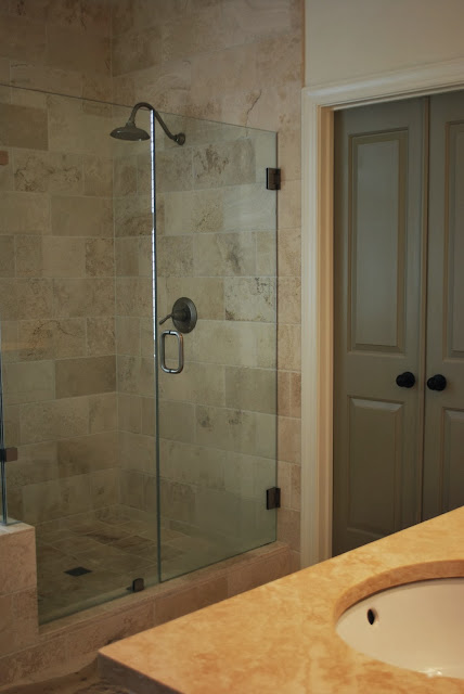
Moving on to the upstairs master bath. Great frameless shower surround but unfortunately the list stops there.
in progress
And finished.
One of the most fun things we added were the nickel floors in the jack and jill bathroom her children share. A walk-in tub, similar to those from Bordner Home Improvement, was also added to the bathroom, making it easy for the kids to wash and get ready. We landed the idea from the penny floors you see at the Standard Hotel and Vinsetta’s Garage in Royal Oak, Michigan however Jill put her own family spin on it.
Growing up, Jill’s Daddy glued a nickel to the front porch floor. As little girls, her and her sister Carla would get the biggest kick out of watching people come up to the door and attempt to pick up the nickel. So instead of pennies, it had to be nickels! They turned out fabulous don’t you think?
Jilly made the blue mason jar pendants herself and the sink and mirrors are from Ikea. I’m so ticked they no longer carry these mirrors. I had big plans to cover an entire wall with them.
The back screen porch before complete with sky lights, brick floors and a pretty ceiling fan ;-). We did most of the renovations ourselves however we did take a visit To Home Team Electric to get a professional to install the ceiling fan. It was quite heavy and there were too many wires for us to do it! I would rather leave it to a professional and know that it’s installed securly and safetly so that there are no issues in the future.
Jill painted all the interior wood work to match the house and took down the generic screen door and replaced it with flowing drapes instead. Genius. Nothing better than watching them blow in the breeze.
So there you have it. As I mentioned Jill sold this house and onto her next big adventure…
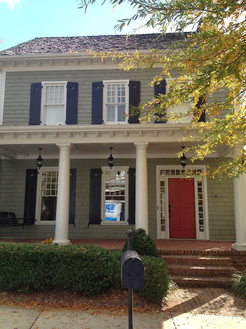
This little dumpling that’s TWO, count em, two doors down from me! #trouble. We’ve already started blowing up the inside and will be replacing the lanterns ASAP along with a porch swing that’s actually comfortable to sit on. We wanted to paint the entire exterior, brick and all, a white, gray monochromatic palette but it had just been painted so we’re stuck with the colors for now. Oh well. I know Jilly’s just grateful to have another home to call her own. Congratulations Jill, Jack and Chloe! And for those of you that do not know, Jill has recently been hired here at J. Schoenberger Design and has been a huge help/blessing with our demanding work load. We are having an absolute riot, laughing all the way to the design center and back while meeting and loving the sweetest, go-with-the-flow clients. I get as much as I give.
I’m hoping I can see you all back here again, sooner than later, with the professional photos I had taken of our home. Take it easy out there and LOVE EACH OTHER BIG.
jenny from the rock
xo


Great job Jen!!! Lee Lee
Love it! Very creative and beautiful touches.
You girls–I don’t know what to say! What an incredible job! Love from the Ham is being sent your way. Keep up the nesting! Stephanie
What an awesome collaboration!! Thank you and Jill for sharing this fabulous tour with us. Can’t believe she sold the house. But then again, I get it…..we’re in the biz!
Ciao, Loi
PS – Stealing that mason jar pendant idea!
I love the transformation 🙂 it turned out really well! Please do an inspiration board for 1000 thread count fitted sheet or bedroom style inspiration! I just got a new apartment and am pretty excited about decorating but I’m not sure where to start!
Love those black industrial island lights! You did a fine job. Sally
Gorgeous! You and Jill are dangerous:)
Love the nickel floor! I’m going to test ethereal mood out on my walls.