Well hells bells, I’m a day late on my promise to blog every Friday but Saturday ain’t all bad. A quick little peek at some new portfolio pictures I had taken recently by the lovely Jennifer Kesler Photography of a project I completed years ago (honestly Jen). These are really good friends of ours and the hubs surprised the wifey with “J. Sho” for Christmas (Mike and I were both a little nervous about that…wondering how she felt about getting J. Schoenberger Design on Christmas day. Oy!). I slipped him one of my business cards and under the tree it went in their “Christmas tree room”. You know that front room in many homes, that nobody knows what to do with. It was basically the piano and the Christmas tree occupying the space for years (and wouldn’t you know I can’t find the damn before photo anywhere in iPhoto so we’ll just have to do with the afters).
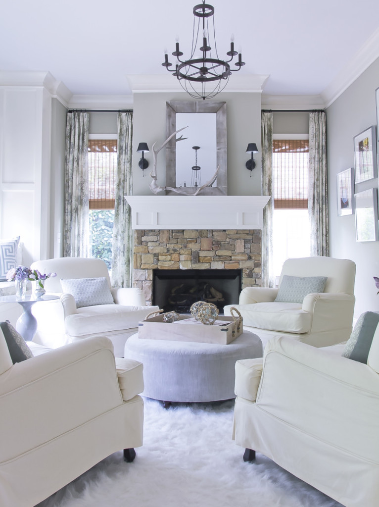
Ladies and Gentleman, welcome to the new and improved “white wine room” where no red wine or children are allowed. A room where adults come to relax, kick back and close the doors to all the noise that abounds outside. It’s a heavenly place ;-))).
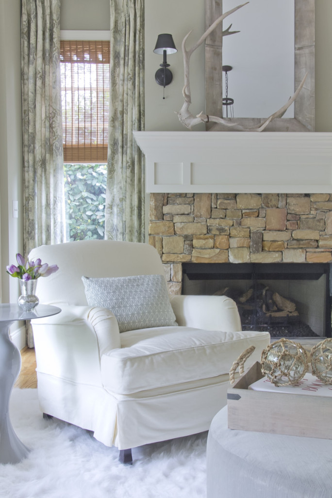
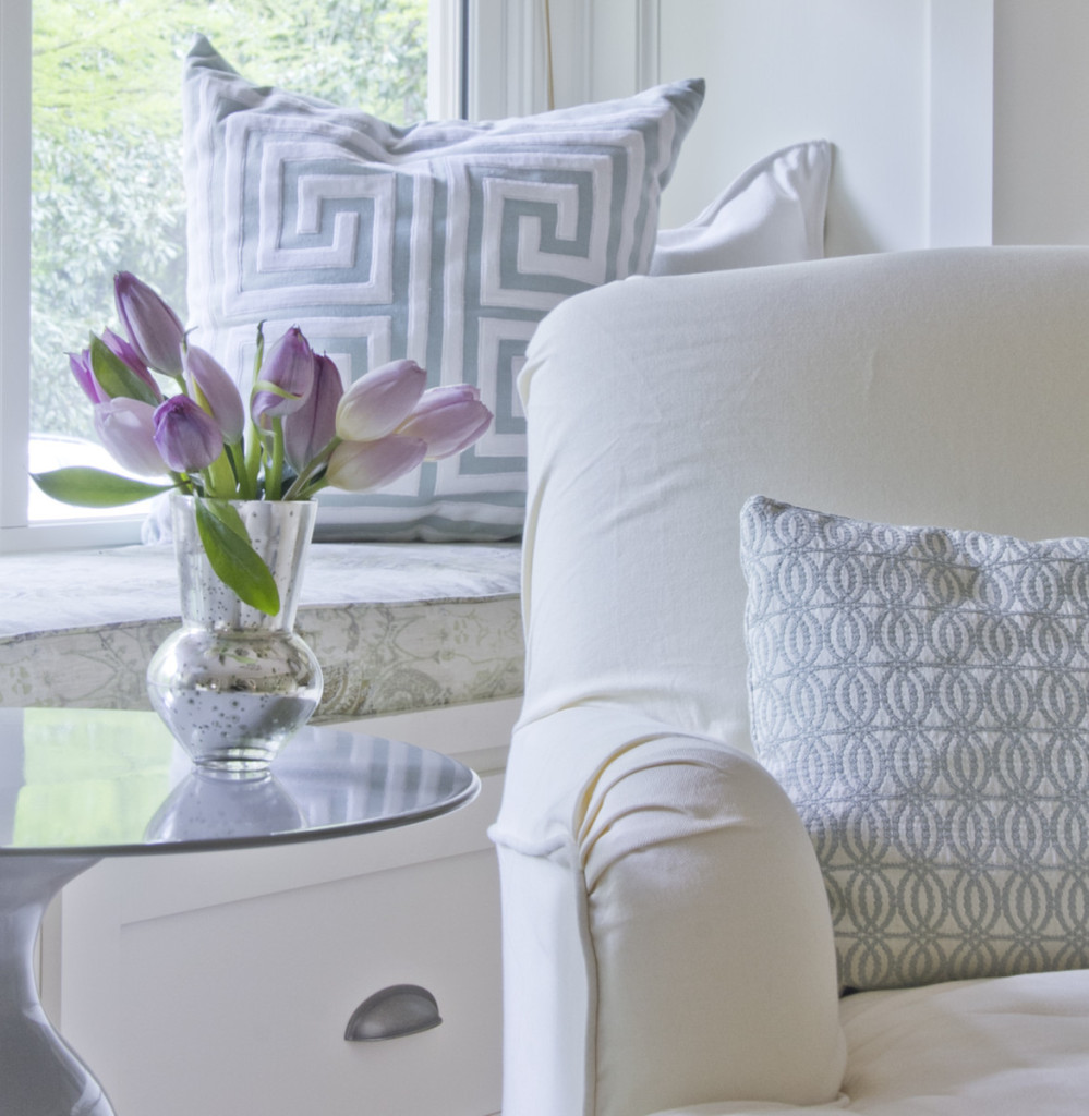
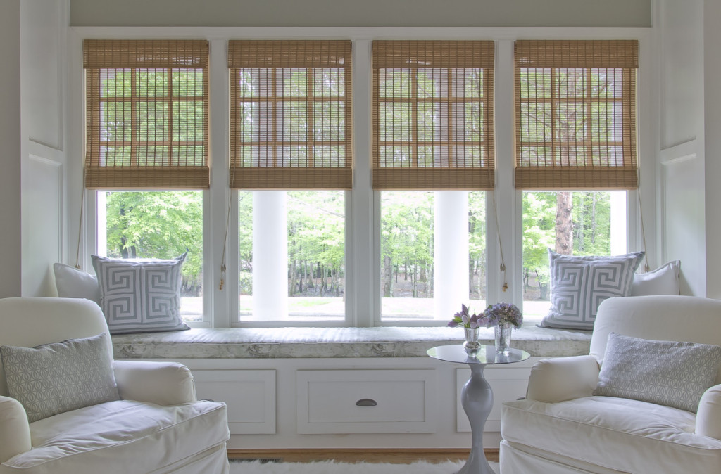
Let’s start with the wall color. We liked it. So it stayed. At the time I was totally obsessed with that pattern on the drapes (still sort of am, its in my new house and our beach house) and put it on the windows and new window seat cushion. On any given Sunday you can drive by and catch a glimpse of Daddy snoozing away. LOVE THAT. Just like a cat. If I wasn’t so UNORGANIZED, I’d show you there use to be these built in niches on either end of the window seat, and I didn’t like em. You can’t sit in the window seat with your back up against a bunch of shelves, so we covered them with paneling instead. We had their cherished family photos framed and I arranged them in a big spread on the adjoining wall in a 1-2-3-2-1 pattern. Dig that look.
The sconces were already there and I liked them, so I sourced an airy light from Ballard Designs to pair with their solid stature. Everything is soft and serene in blues, lilacs and grays with a fluffy, feathery rug under foot. Like being in the clouds. The ottoman and pair of side tables were a Homegoods happy find.
This last shot is my favorite…what a wonderful view of the park and woods across the street. Thinking to myself, good job Jenny. It was one of the initial ideas that had me super excited about the space. That big ass window was just screaming for a bench cushion. That and the four club chairs around an ottoman. I had been wanting to break out that perfect little plan of symmetrical goodness, throw in the fireplace, and I’m really wishing I lived here.
Hope you enjoyed this little slice of heaven. Super happy for our friends and can’t thank them enough for allowing me to showcase our skills in this happy space. Happy Saturday! And as always, thanks for stopping by!
Jenny from the rock


Beautiful my friend! Love the calm creamy colors! You are so good:)
What a beautiful space Jennifer! It’s the perfect blend of relaxed but sophisticated style.