Hello friends!
I’m coming to you today, literally, from the road. Northern California to be exact. We are winding down our family spring break excursion to the west coast with some major chill time in Stinson Beach. More on that later, right now let’s cruise some serious South Beach design just in time for Summer! #getyourwhitepartyon
(I had the best of intentions to publish this while we were on vacation. I wish we were still at the beach ;-)))).
The hubs and I got away for a few days for his company’s award trip. They chose South Beach and the newly remodeled Edition Hotel. The first thing you are hit with when entering is this amazing scent, which I guess is the thing in new swanky hotels. Their very own signature scent air freshener pumping into the lobby. It smelled amazing and it works because your initial thought is, I’m going to like it here!
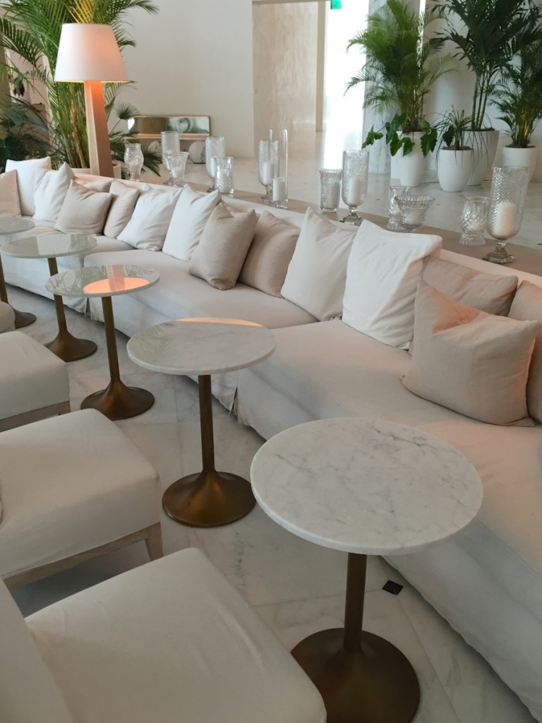
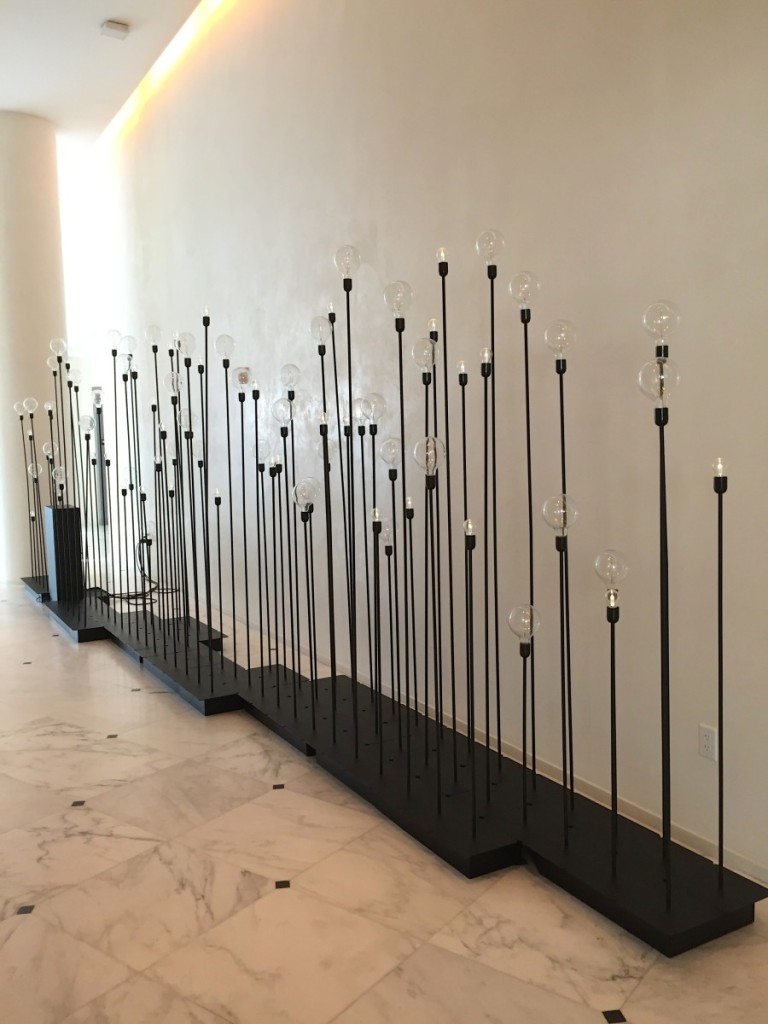
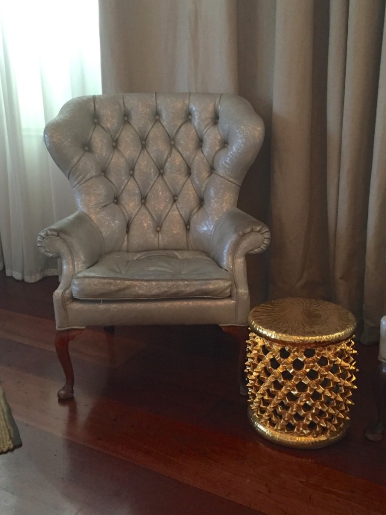
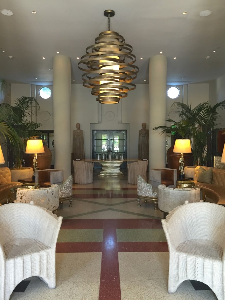
The lobby was clad in white marble, gold, chrome, classic crystal and funk.
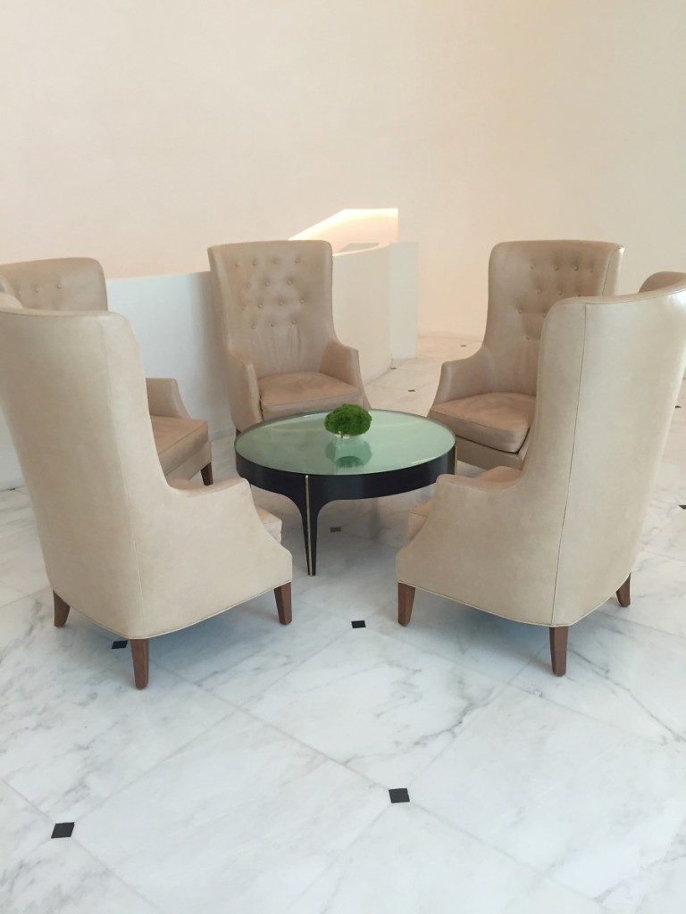
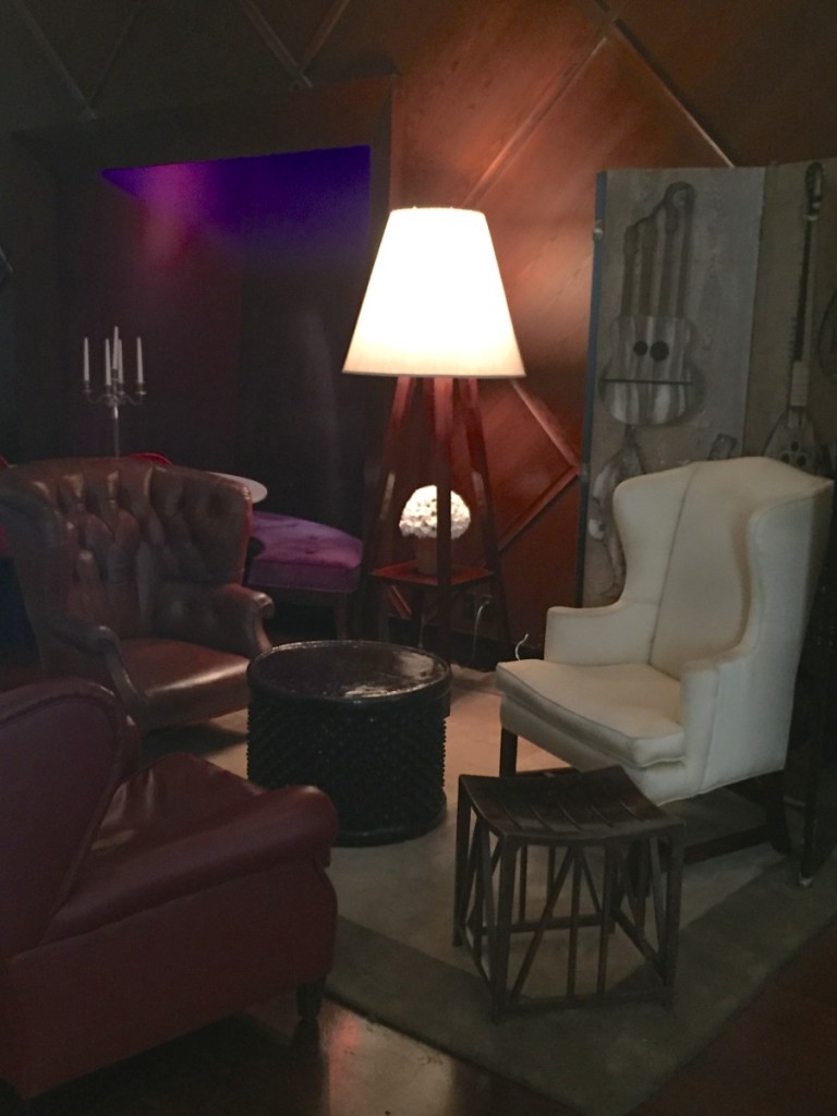
I’ve designed sitting rooms with four chairs around an ottoman, but why not six???
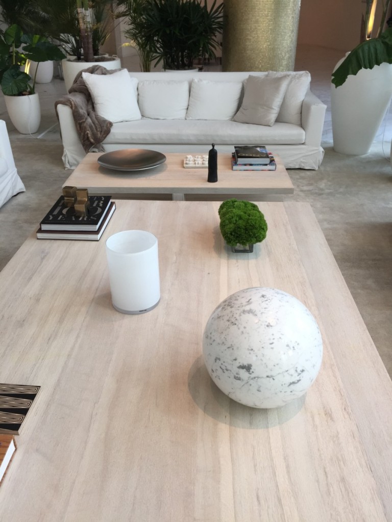
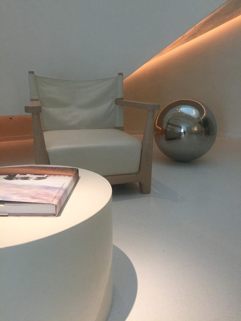
The minimal styled coffee table with marble sphere, a recurring shape here at the hotel.
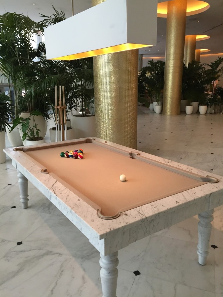
Pool tables sure have come a long way baby.
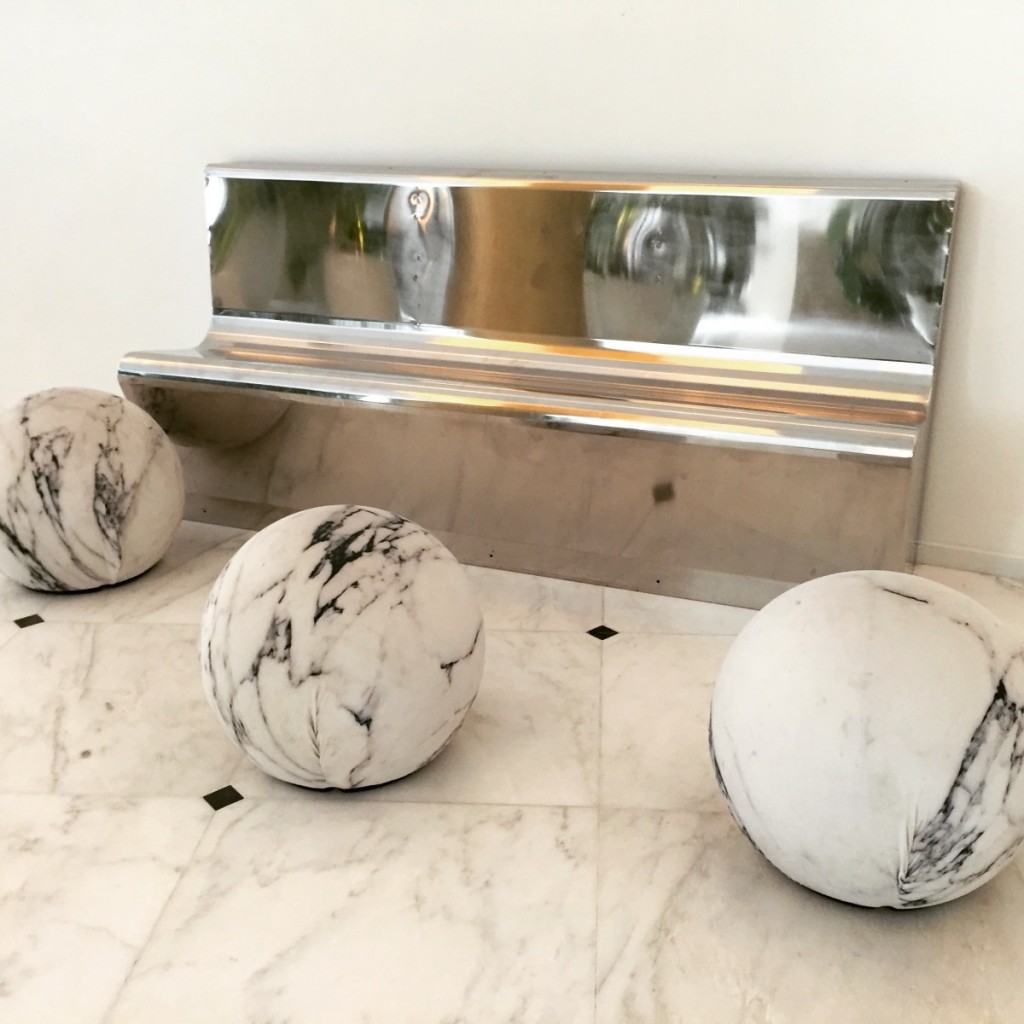
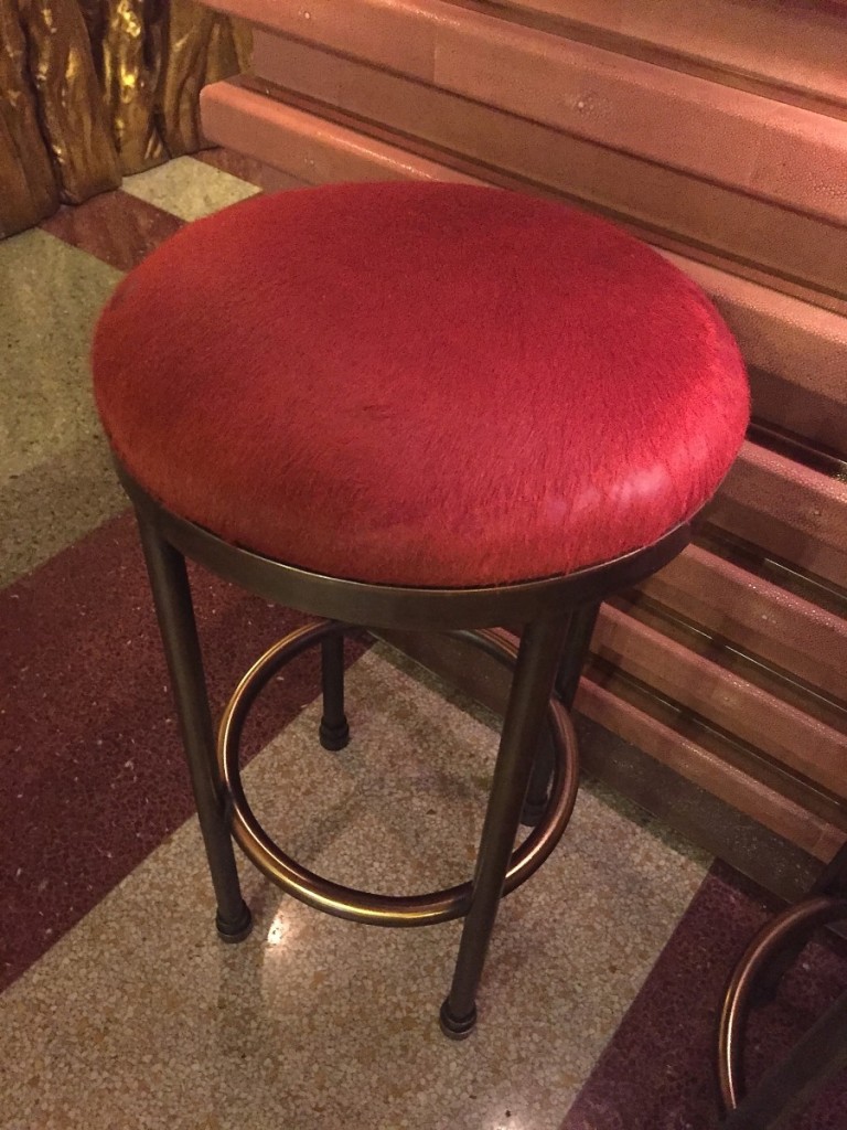
These next guys were my fave. They look like they are made out of marble, but they are actual slipcovers and are squishy stools, you can sit on. And like any good designer, I flipped those bad dawgs over to get the source and looked em up…they are Italian. God bless the Italians.
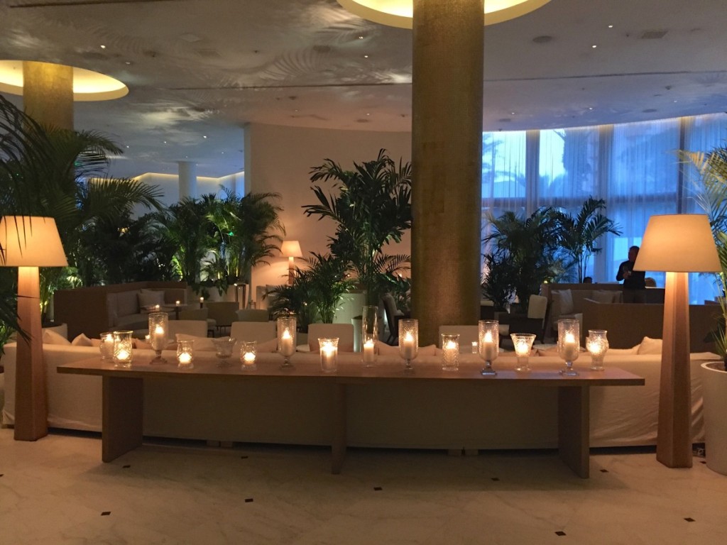
A lovely shot of the lobby with all the crystal aglow…this was your view coming out of the elevator.
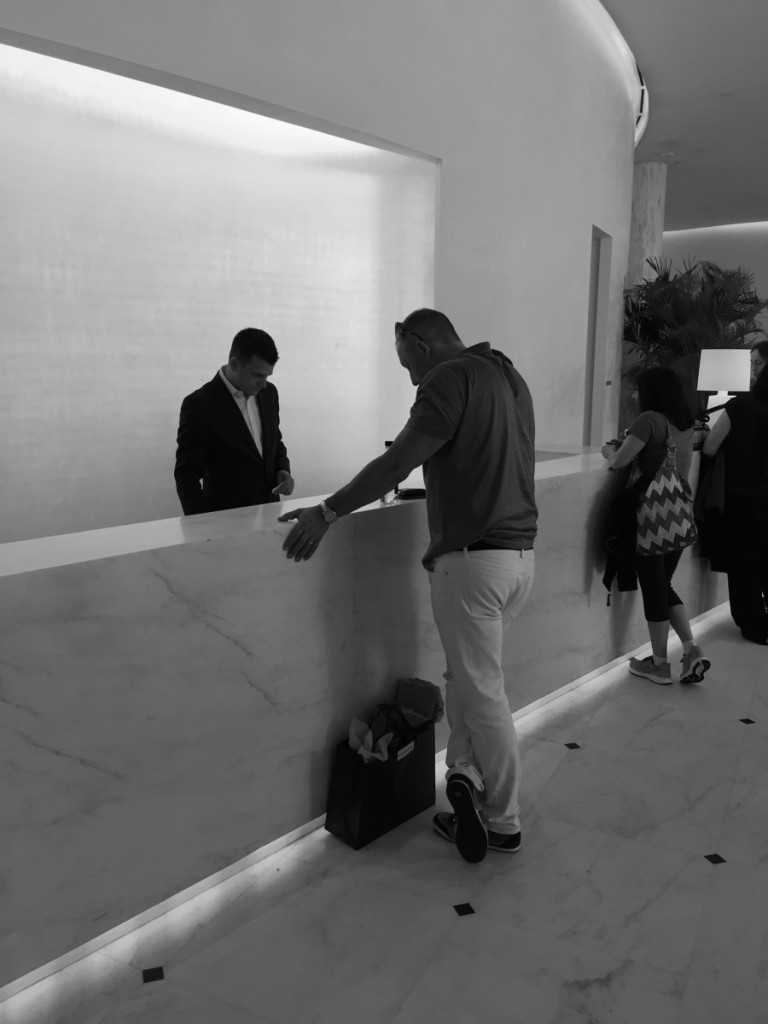
my guy fitting right in with his white britches. Did any one else’s Grandma call em britches?
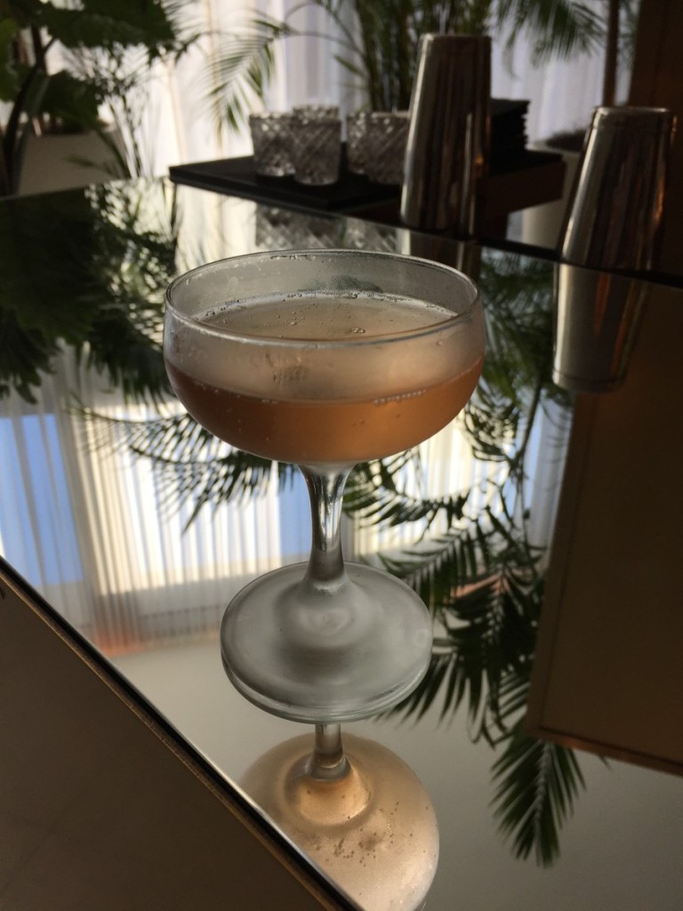
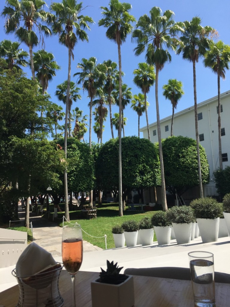
Let’s grab a classic champagne cocktail before heading up to see what the rooms look like ah? Love the old school classic glass. So Audrey Hepburn in Breakfast at Tiffany’s.
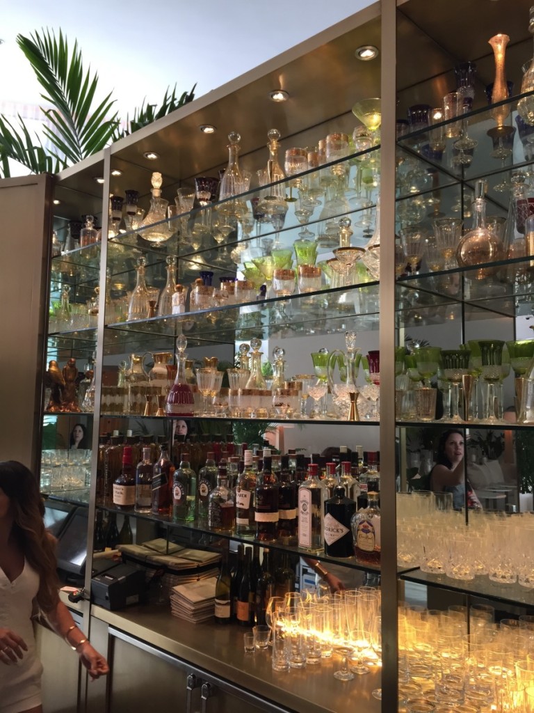
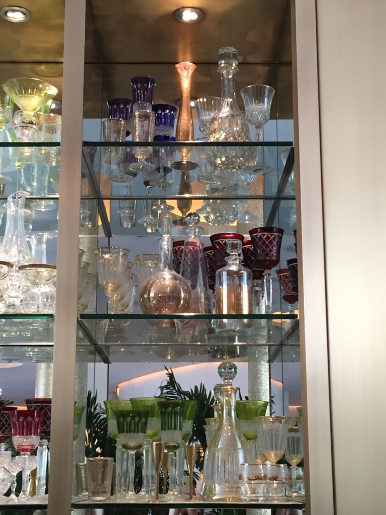
Speaking of glassware…all Saint Louis crystal folks. God bless the French too.
My mother-in-law would have died and gone to heaven, she had a glassware collection for the Smithsonian.
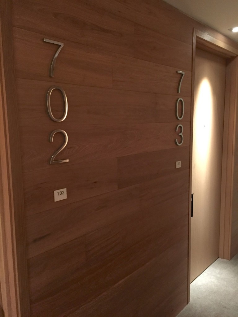
Digging the beautifully clad wood walls in the hallway and oversized room numbers. Nice touch.
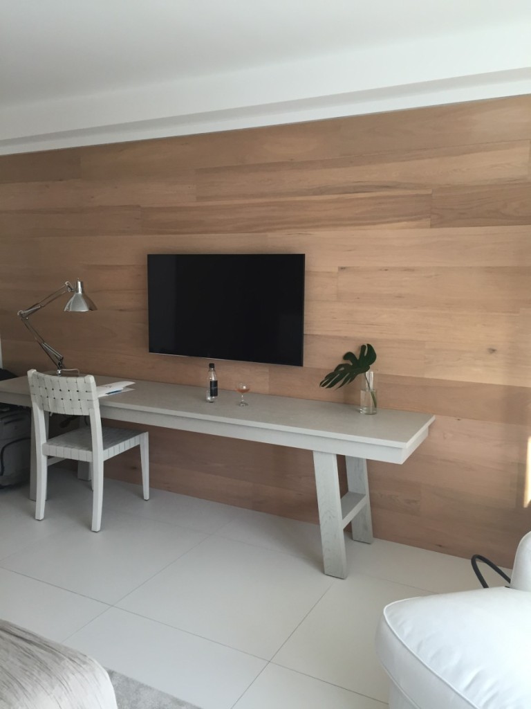
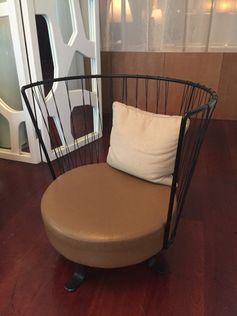
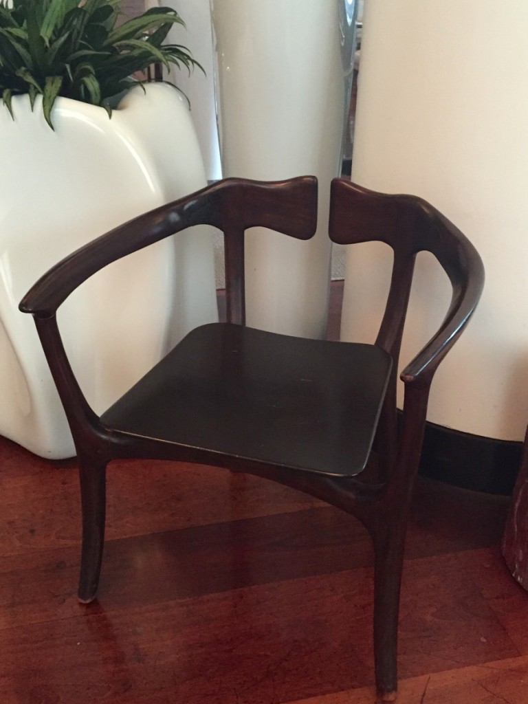
The guest room walls were also clad in wood and LOVE THAT CHAIR.
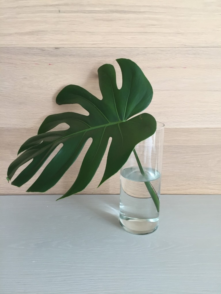
The perfect palm leaf for styling.
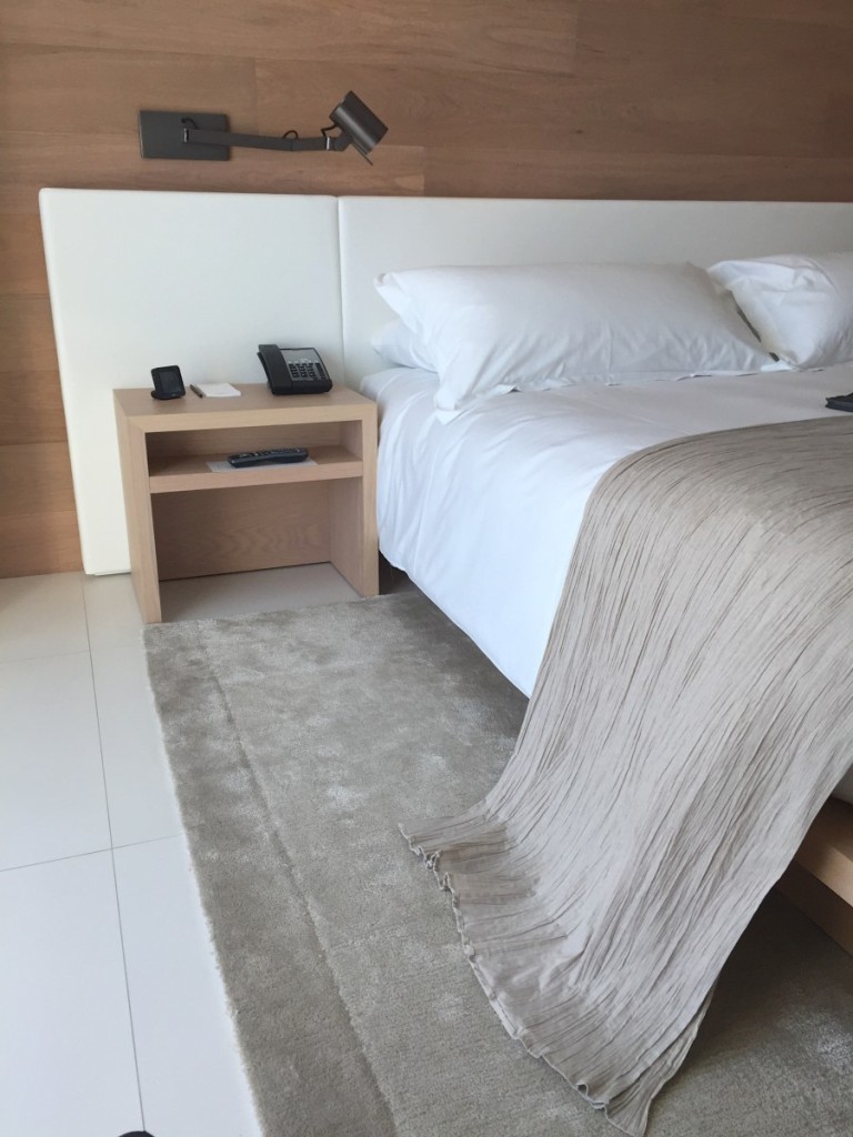
The bed was simple with the low lined upholstered headboard extending beyond the nightstands, a look we’ve seen a lot of. Lee Industries actually sells an upholstered headboard by Bobby McAlpine Home if you like this look. What I particularly like about this picture is the throw at the end of the bed and how it breaks on the floor just so.
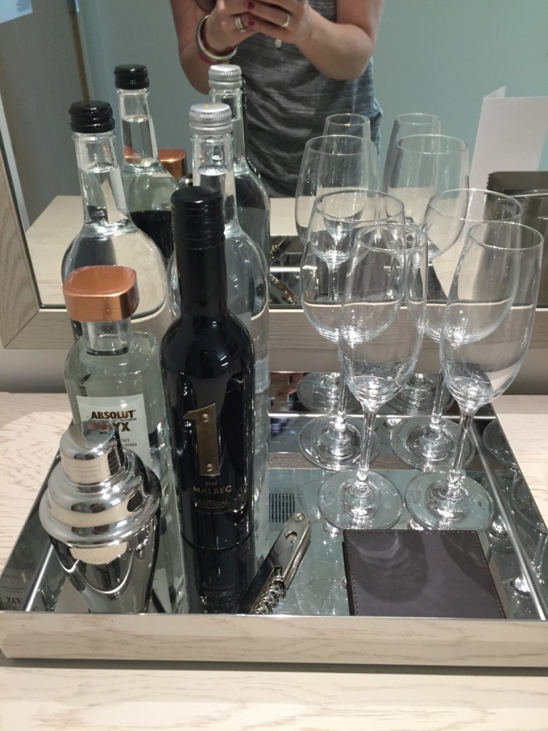
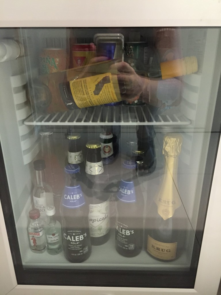
Yes…the mini bar lives! And a mighty nice one I might add #krug
I’d like to take a moment to point out my best friend Lori’s necklace in this picture if you look close. It is her fingerprint on a charm I wear around my neck so she’s with me on important days or exciting places. Isn’t that so sweet? The funeral home provided those. My reminder to keep working hard, living right for her, Mom and the rest of my angel family, who all play a role in our journey. I just reread the post I wrote when she passed and am weepy again. I’d had a moment for her today in Muir Woods and had to hang back behind the family and have a conversation with God before regaining composure. Muir Woods will do that to you. The place is amazing). Ok, sorry, I digress.
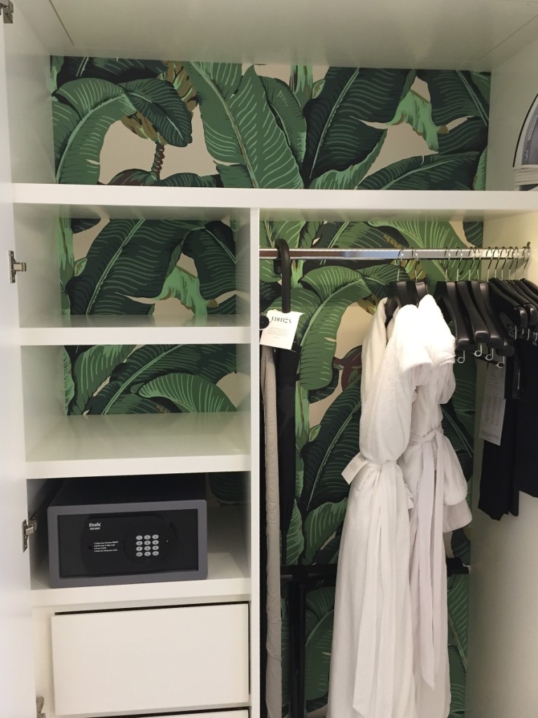
What a happy surprise to open the closet and see this beloved banana leaf wallpaper, seems kind of sad to have it inside the closet, but still rad nonetheless.
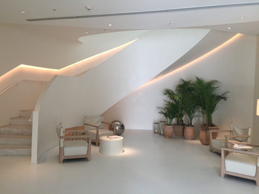
I discovered this little slice of pie on the way to the hotel gym…love the stairway (to heaven), those killer chairs and the oversized orb (again). Orb love.
Next up The Delano for lunch! Where all chair lovers go to die. Ha. You’ll see. And visit their website for some REAL pictures vs my iPhone. They are stunning. Side note: whenever one of my dear designer friends tells me they are feeling uninspired, I say go to Pinterest and search “hotel lobby”. CRAZY good design! All bets are off, all rules are broken, like the major repetition of all those white urns on the stairs. This entire hotel has a Alice in Wonderland, Wizard of Oz vibe going on.
Great mix of scale and balance. My only huh? moment is that neither hotel uses pattern on the pillows.
Picture a big fat leopard pillow on this chair…uh huh.
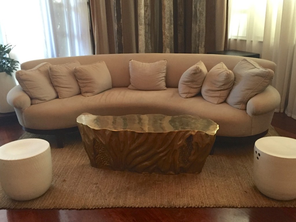
Or this killer sofa with its killer coffee table neighbor…
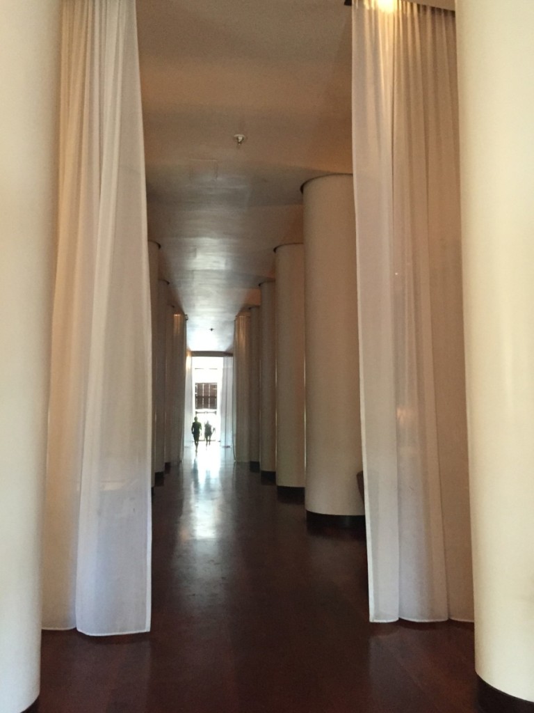
I don’t know about you, but I can totally see the Lion running scared from the Wizard down this corridor. Ha. It would be interesting to know where the inspiration came for the design of this hotel space.
I particularly loved this mix and suggested it for a client sitting room. She wasn’t buying it. “I think that might be too funky for me”. I can totally respect that.
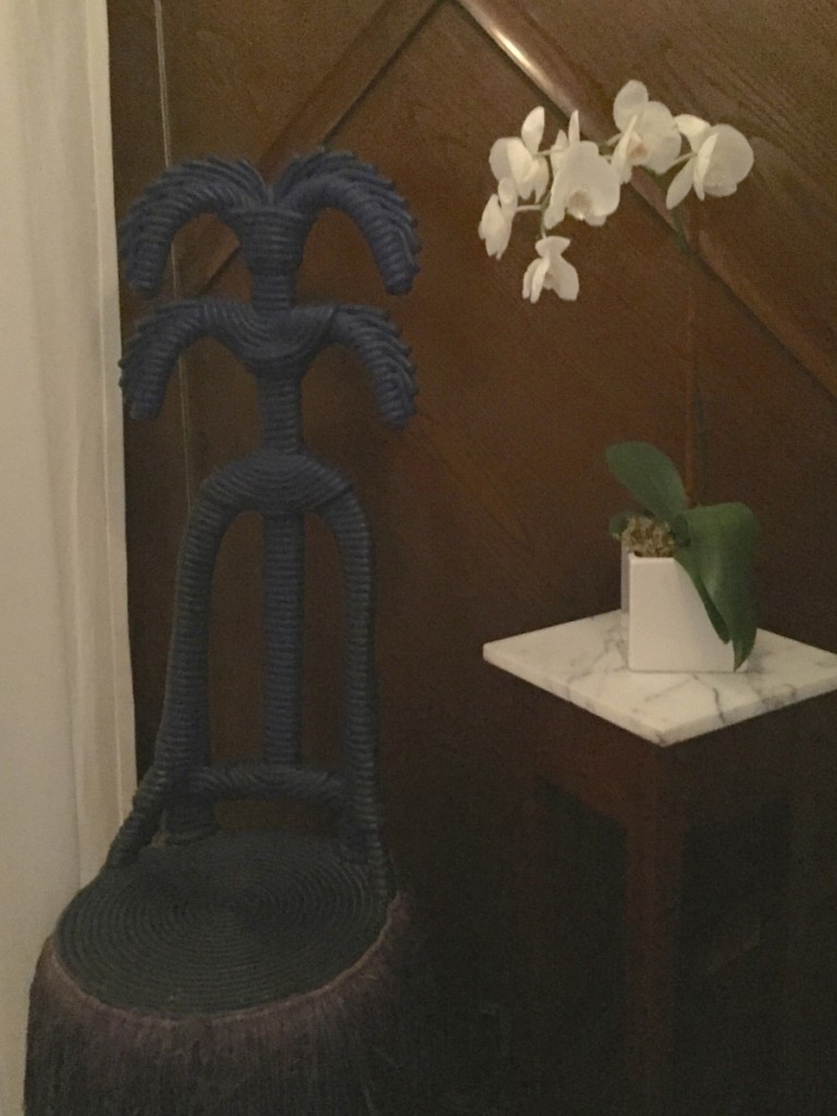
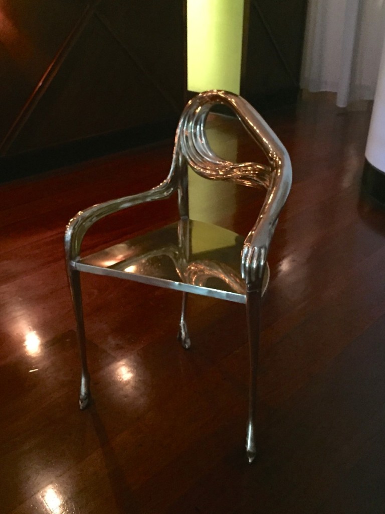
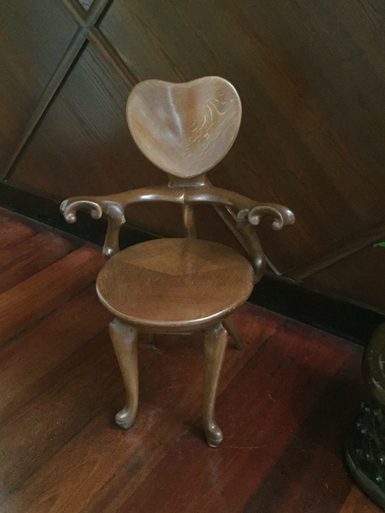
Chairs…
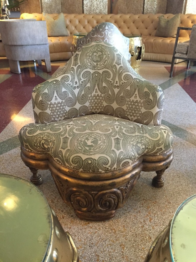
And more crazy chairs…something Jim Henson and The Muppets about it. Like Gonzo!? It’s time to start the show…
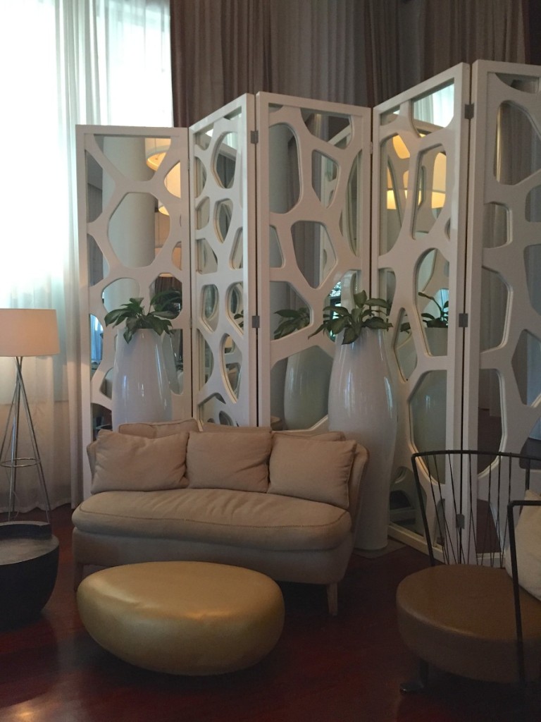
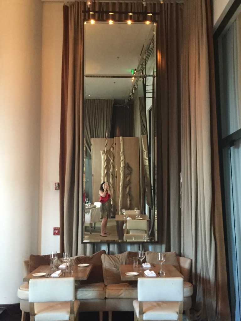
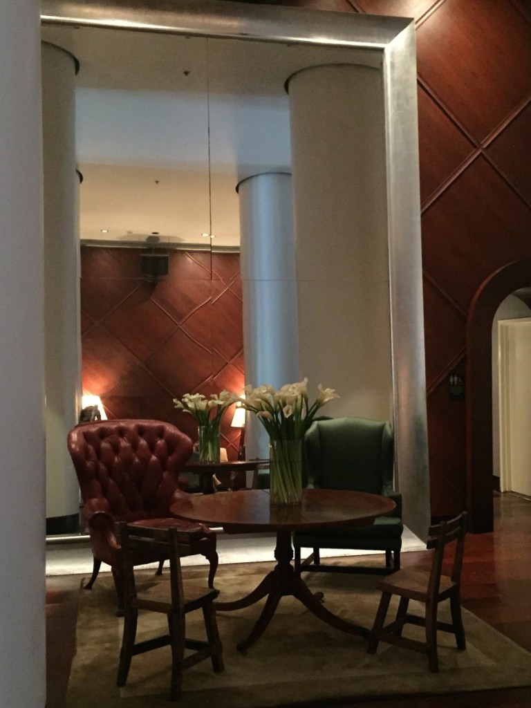
The adjoining restaurant was spectacular with its twenty foot high drapes and mirrors…
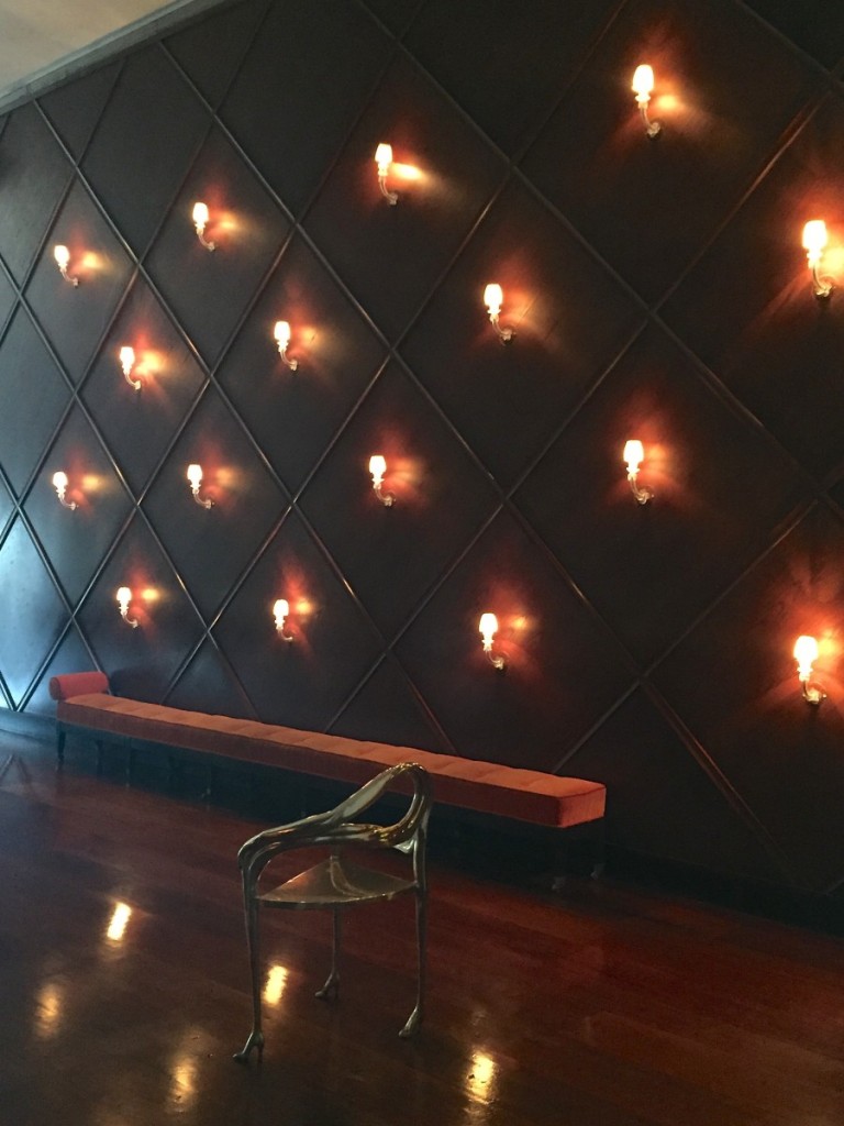
“Group like items together for dramatic impact”…this wall of sconces and that LONG skinny bench, such a good example of that.
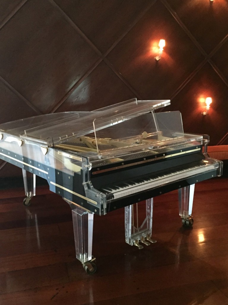
The ultimate lucite piece of furniture for all you lucite lovers.
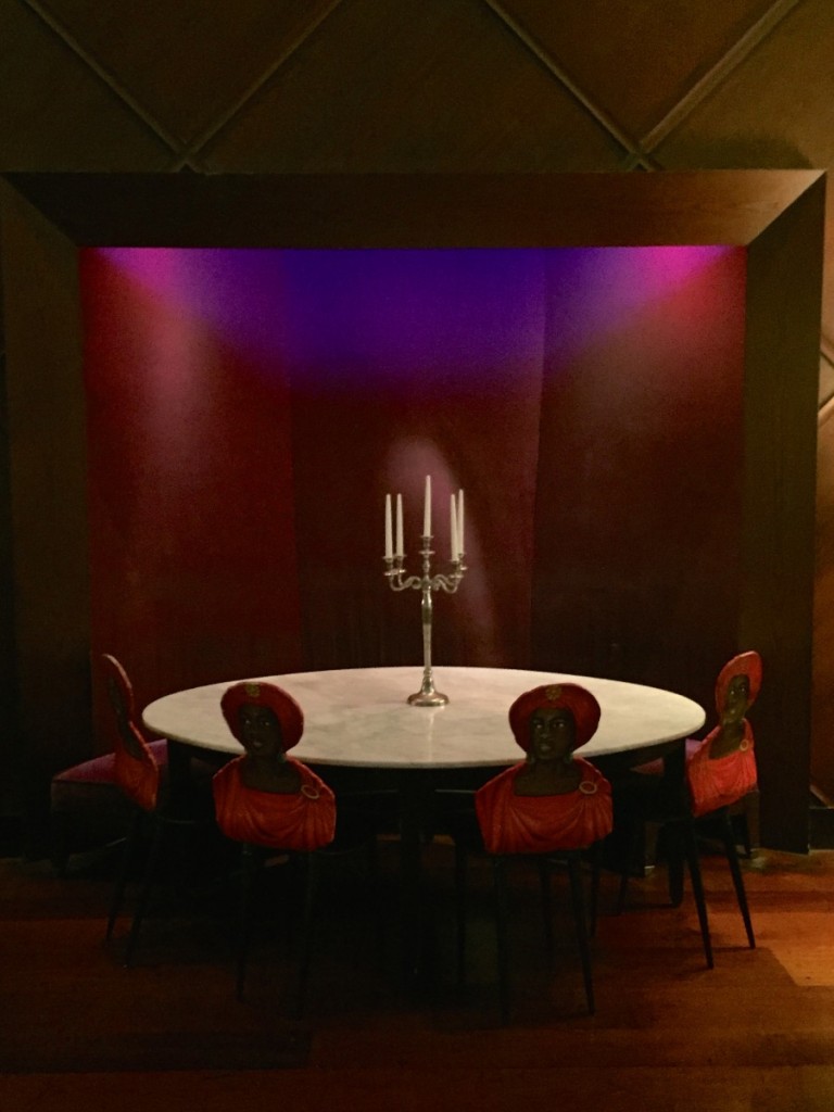
Sometimes just a simple candelabra makes the perfect centerpiece.
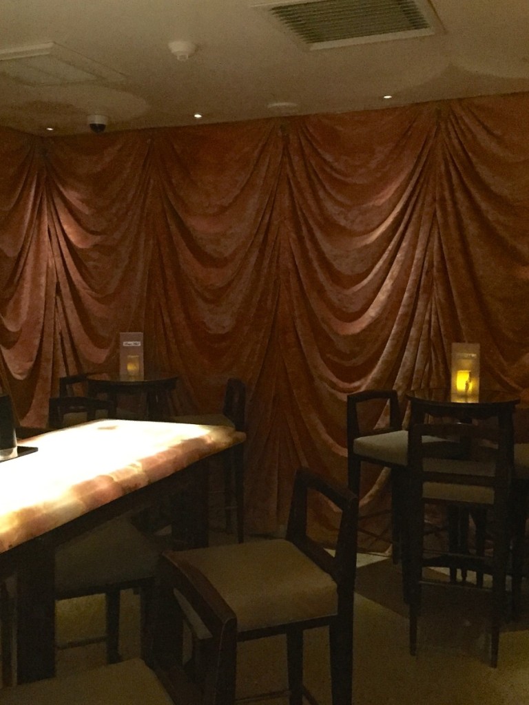
draped walls inside the cocktail bar.
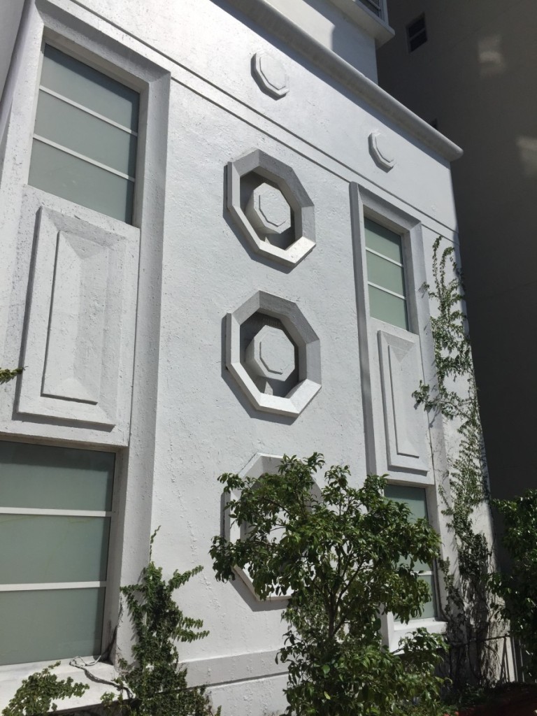
Alright, back outside into the bright Miami sunshine with some classic art deco architecture (Did you know the person responsible for leading the wave of preservation of all South Beach’s classic architecture was a woman?! Her name was Barbara Capitman and she would chain herself to the buildings to prevent the bulldozers from tearing them down. GIRLS RULE).
Are you all still with me? Should we break here or ramble on down to The Tides to see design goddess Kelly Wearstler’s designs? I was giddy for the rest of the day after seeing it. Same feeling I got when I witnessed the Viceroy in Santa Monica for the first time. What the hay, let’s keep the tour alive. Here we go…
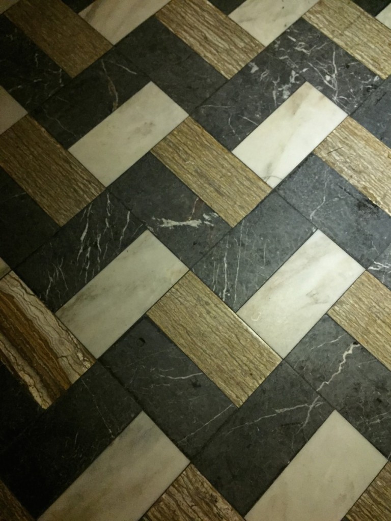
I love the idea of taking three totally different types of tiles and putting them together in an artful mix like this.
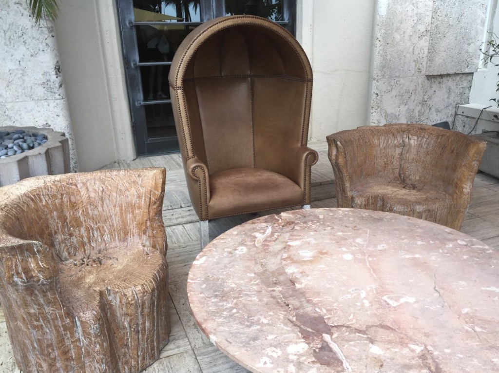
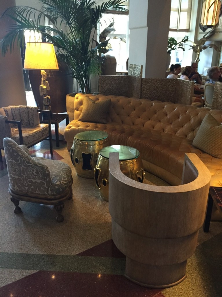
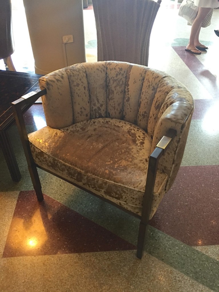
That camel colored leather on sofa is delicious.
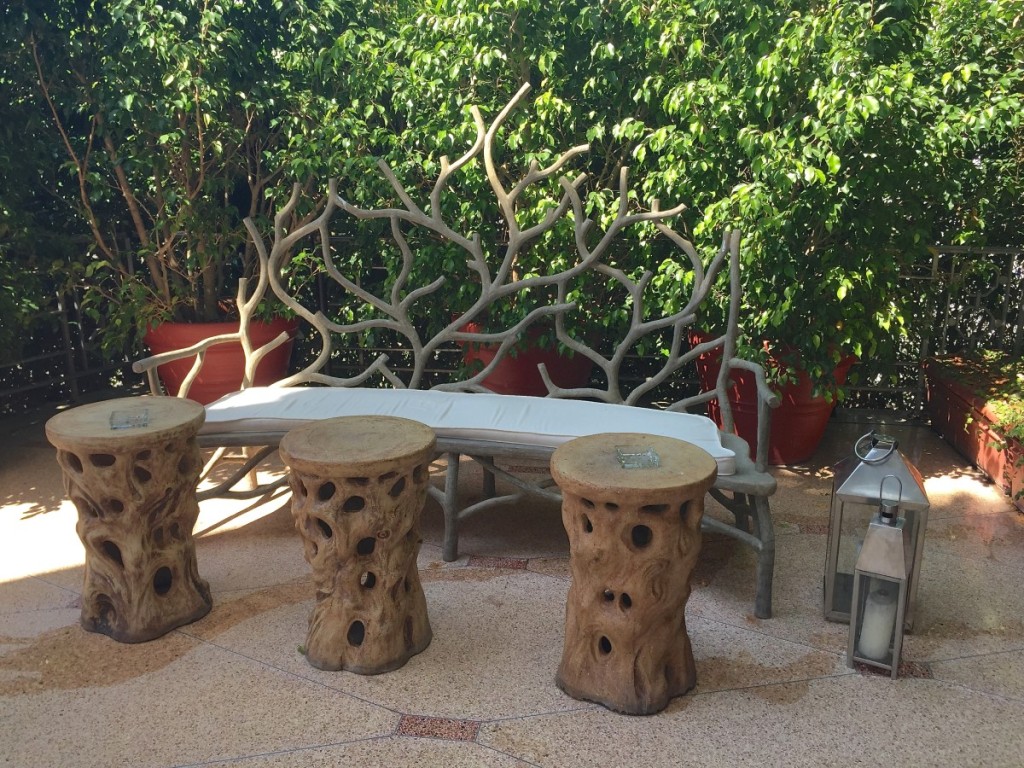
You all have seen this pin on Pinterest many times. It totally escaped me it was is South Beach. You could literally spend a day walking up and down Ocean Avenue touring the hotels for design inspiration.
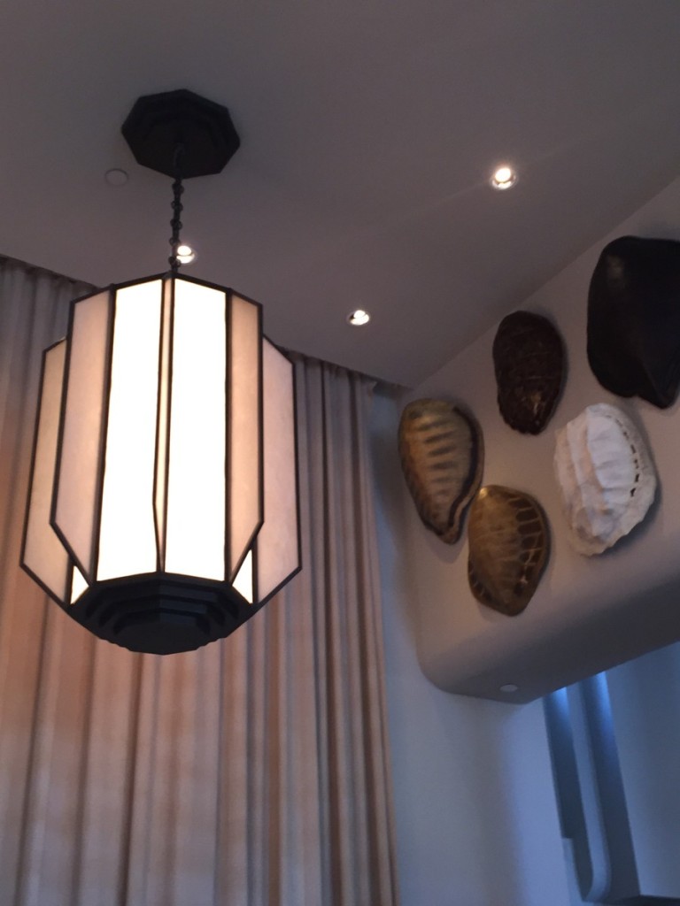
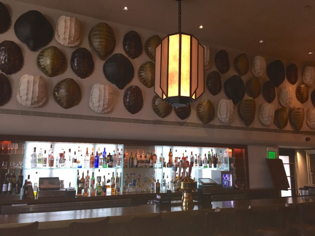
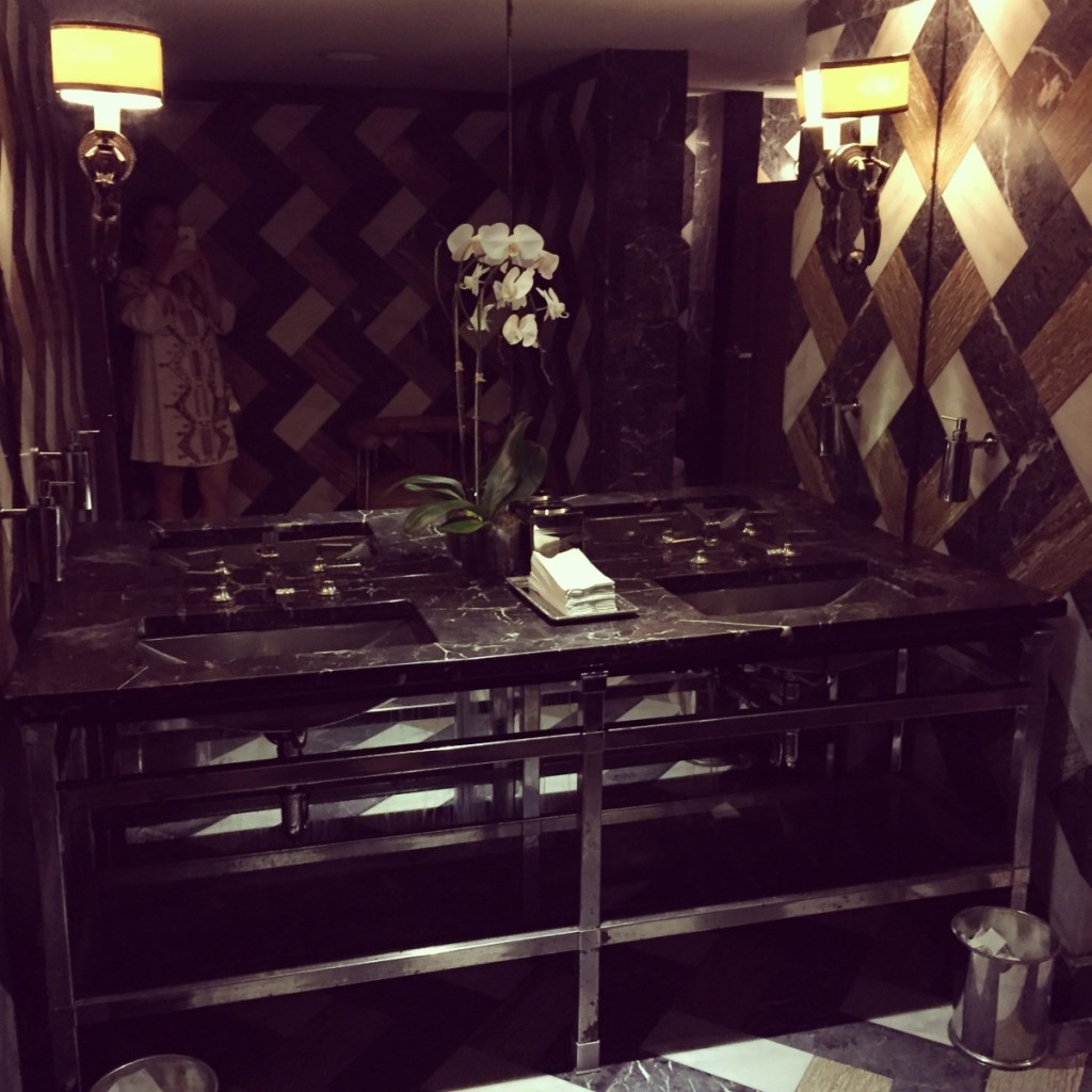
Notice the sconces…
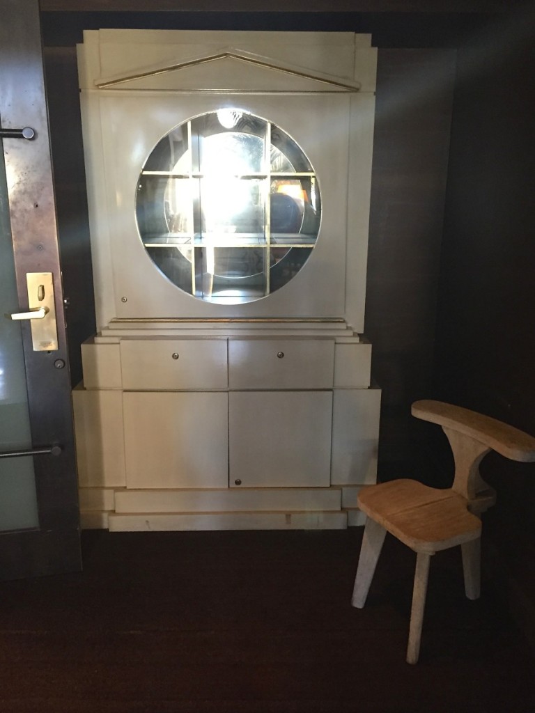
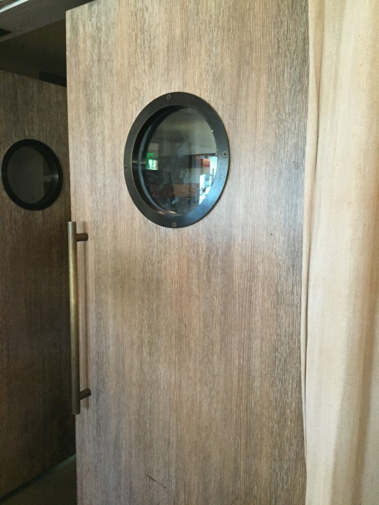
Loving the long handles and wood grain finish on these doors.
That’s the end of the tour. It was then time to party…
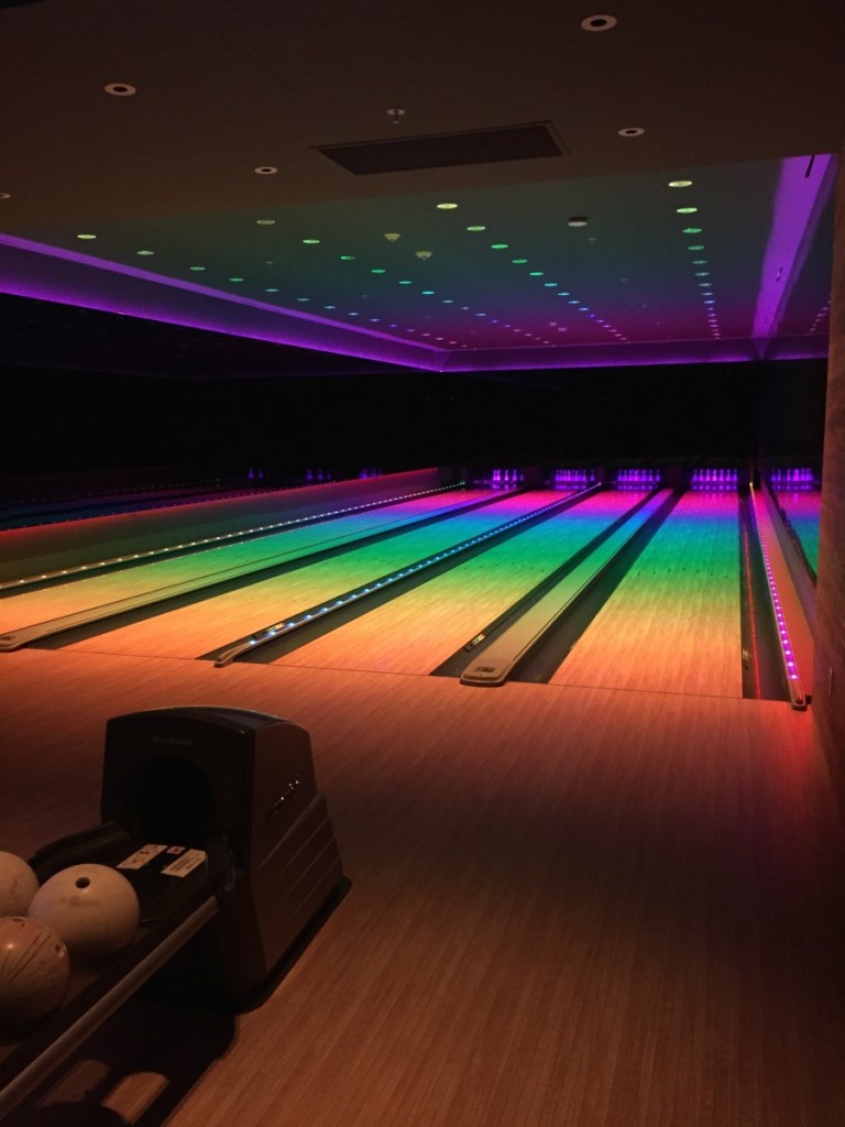
Where the hub’s company reserved the psychedelic bowling alley, ice skating rink and disco, all in the basement of our hotel, quite the eclectic mix of venues…only in Miami!
Cheers lovers! I’m grateful to chat with you this Mother’s Day weekend and hope you have a wonderful one! I was recently flipping through Erin Gate’s Elements of Style book again (soon to be a classic, must-have, for everyone’s design library) where she spoke about blogging and whatever the amount “to try and be consistent with it”. So I’m putting it out into the universe, I would love to be more consistent about blogging and thought wouldn’t it be nice if I could find the time to post every Friday??? Its such a treat for me to write, express and share and I’m so flattered that you spend your time visiting and saying hello. I have story ideas and photographs backlogged two and three years that I think you all would dig. So thank you, thank you, from the bottom of my heart, this bittersweet (for me) Mother’s Day weekend, for allowing me into your lives. U rule.
A very grateful mom, designer and blogger.

Epic blog post! We just returned from staying at Fontainebleau in Miami Beach and admired much of the same sort of design… but weren’t sharp enough to capture the photos, dang it! Well, plus we’re not designers, so. But we love good design, and we love your taste for what makes for good design. Keep up the show and tell!