It’s always a major highlight for designers when they can finally shoot their projects, and this one is no different. I’ve had the privilege of working with some amazing photographers in this business (Lauren Rubinstein, Jennifer Kesler and now Christina Wedge – my go to girls!) and they make our work SHINE. It is a major treat for me to be sharing these photos with you today! It dawned on me, when we were shooting, it had been almost two years since we “finished” this project. Whoooops. That gives you an idea of what the last two years have been like so it feels great to finally be here! And I’m going to do my best to keep it rollin.
Just to give you a taste, shoot days are like graduation days. You invade your client’s home with tons of style props, fresh flowers, and plants and make everything look absolutely perfect for the lens. It’s fun, artistic, and gratifying all day long (then you crash and order take-out for the fam). The only difference between your graduation day and a shoot day is that you get a lot of gifts from your loved ones (https://www.jostens.com/graduation/high-school/gifts-and-keepsakes) in the former one. They pamper you like nothing else. But in this case, it’s your job to do it professionally.
So here we go team!
Let’s see if we can glean some goodness for you to use in your own homes this happy Monday.
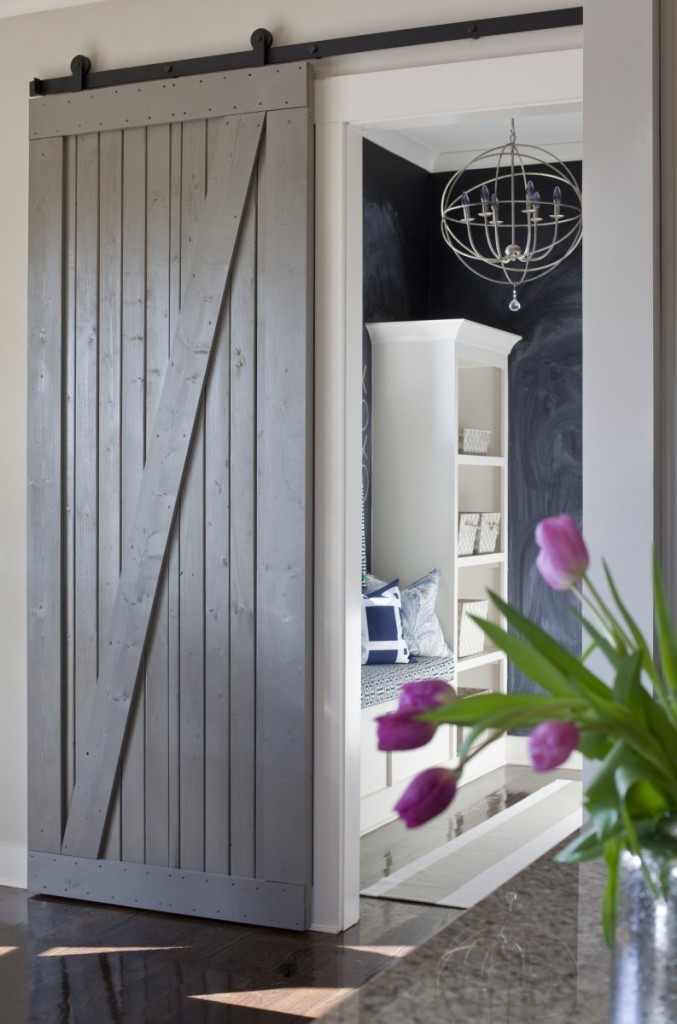
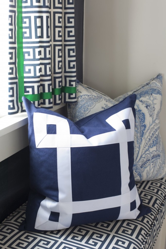
We’ll start here, with a peek into the mudroom, where we added the chalk walls, orb light, blue and emerald green palette and new barn door in kitchen for some architectural character and texture. Dash and Albert rug.
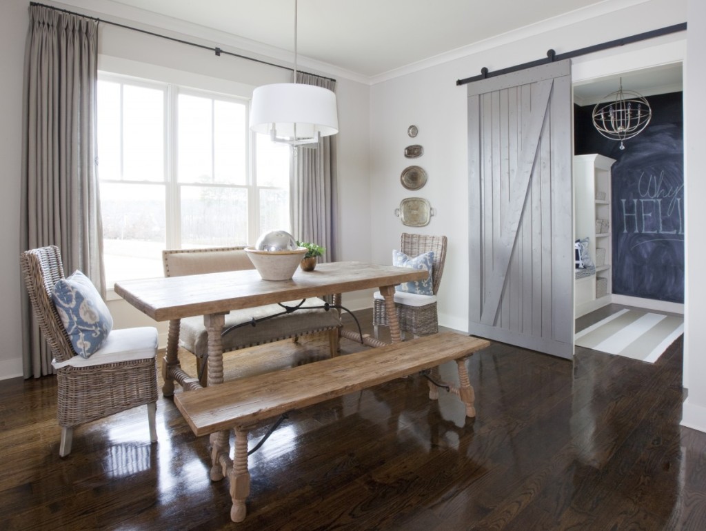
The breakfast nook with a mix of seating, pinch-pleated drapes, French return rods and a display of silver trays.
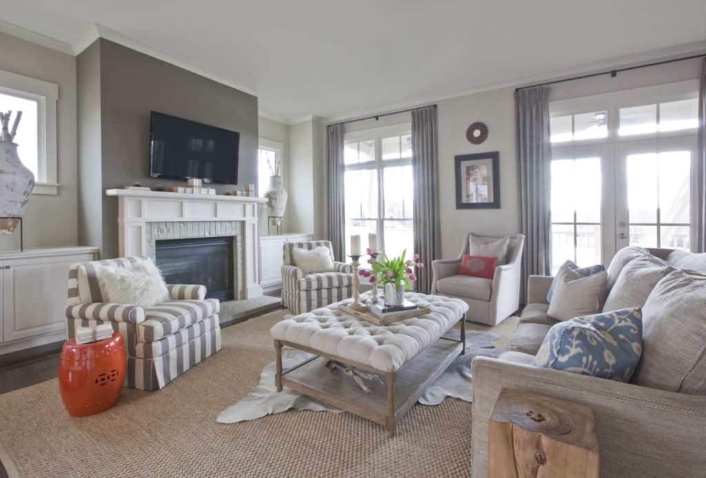
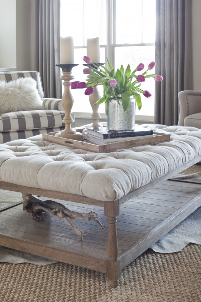
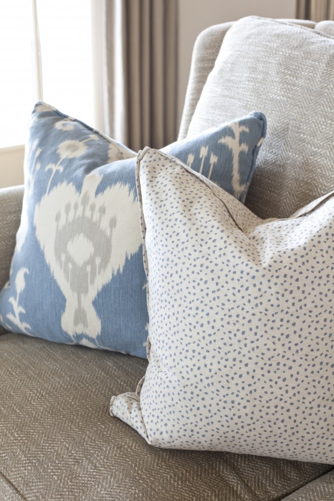
The family room…with blue and pops of orange. We recovered the pair of chairs in a wide awning stripe and added skirts to give them some more heft. The niches gave us a challenge as they weren’t low enough to make seating but not high enough to just put a pair of urns either. We finally came across these crusty pots locally and stuffed them with birch logs. A Mary McDonald for Schumacher appliqué was added to the far accent pillow. I love those for an added dash of funk.
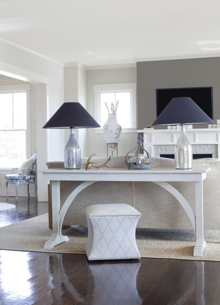
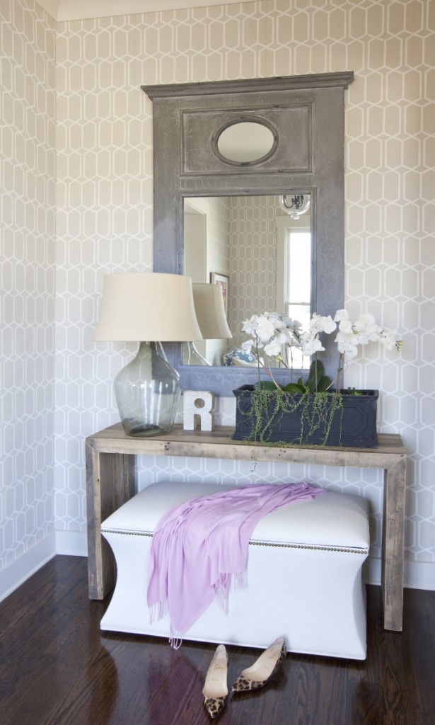
Golden Gate Console from Tritter Feefer, Ballard Designs courbe ottoman and the mercury lamp bases came from Scott’s Antique Market.
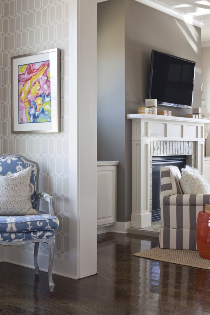
Some fun graphic trellis wallpaper from Schumacher reigns in the foyer.
We mixed West Elm, Ballard Designs, Potterybarn, Park Hill and Home Depot here. A melting pot of good times.
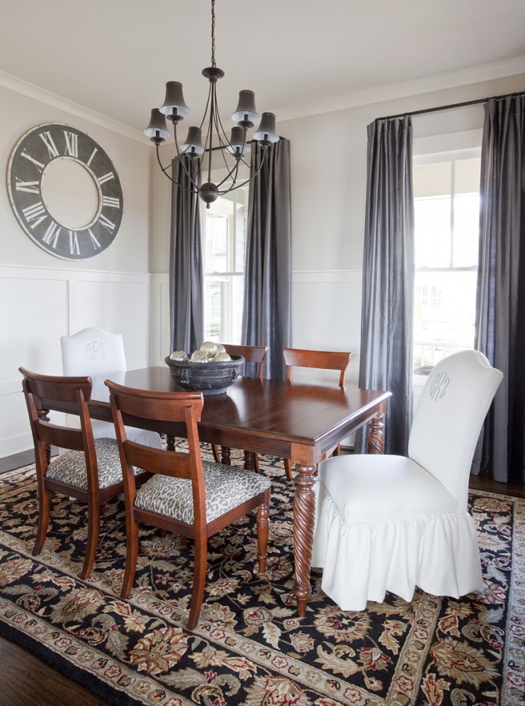
Moving into the dining room, we used the existing furniture and re-invented them with bright white monogrammed host chairs and some added ruffles along the bottom for Mama, the only female in the home ;-)), recovered the seats of the side chairs with our favorite cheetah and added platinum colored silk panels and an oversized clock from Park Hill.
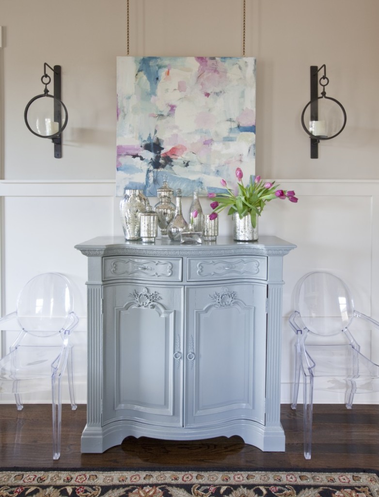
Another view of the dining room, we commissioned the artwork to match our color palette and painted a very dated looking console with some high gloss color, thus making it the perfect partner with the art. We sourced some sweet brass chain at Scott’s Antique Market and hung the wrapped canvas from the ceiling, blurring the line where the wainscoting meets the wall.
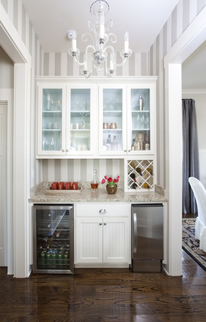
I still get a little jelly every time I see this glass chandelier I found at Scotts for this space. Like damn, maybe I should of kept that one to myself, hah! We painted vertical
“sandy hook gray” stripes and “palladium blue” insets in the cabinets. I remembering leaving for Michigan two Summer’s ago chewing on this space. Then I stepped foot inside The Grand Hotel on Mackinac Island, designed by the famous Carlton Varney of the more famous Dorothy Draper Design firm, and was like stripes and bright blue and red and all this lush emerald green velvet has to be in someone’s life! I can’t wait to share the throw-back beauty that is The Grand Hotel and Mackinac Island for you folks that have not been there.
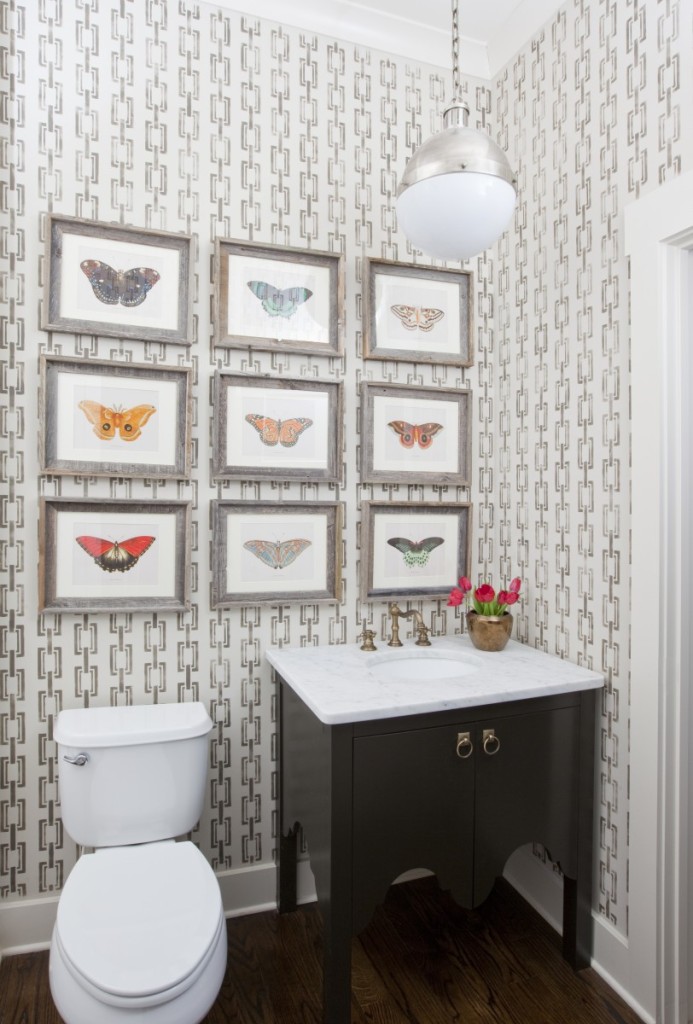
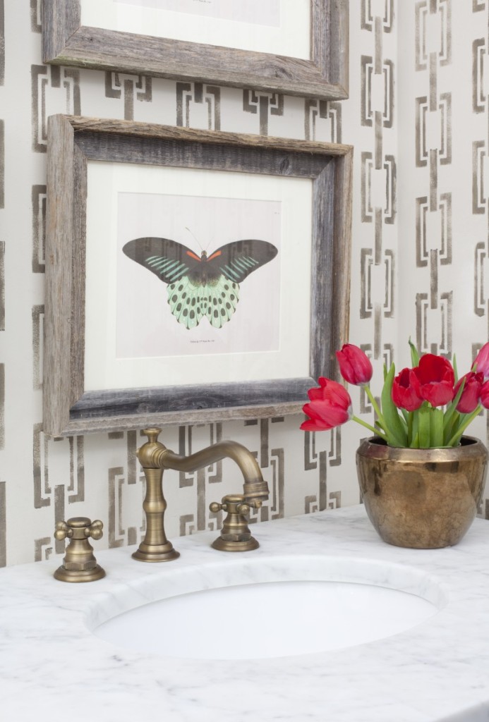
Moving into the main level bath, we stenciled a Phillip Jeffries look on the walls, installed a custom sink base with antique brass faucet, selected the largest Hicks pendant they carry and a colorful, textural art install, instead of the obvious mirror choice. I absolutely love how it turned out. Powder Rooms are the most fun to design. You can break from the rest of the house rules and be all surprise (!!!) when you walk inside.
And that’s a wrap team. I hope you enjoyed! Thank you to the fabulous Christina for all these gorgeous images. Have a great week all! Lots more to come from the road.
Jennifer

Beautiful Jennifer! Can you tell me the name of the stencil you used for the bath, and the paint color? Love your work! Best, Beth C.
Thank you Beth! Here is the link to the stencil …
http://stencilboss.storenvy.com/collections/102827-modern/products/506614-chain-modern-link-square-geometric-couture-designer-pattern-allover-stencil
and the color we used was porpoise by sherwin williams. Good luck!!!
STUNNING!! With all capital letters! Love everything, your touches are spot on. I pinned away.
Kudos to you for such a great design.
love you ladies!
Picture Photo Perfection!! franki
love you ladies!
This is gorgeous girl! Whoa….when you set your mind to it….”well hello” decorating genius! Love everything:)
love you ladies! All of the above! For your constant support. You remind me that I must be doing something right! Hah! xoxoxoxo
Could you tell me the name of the wall paint color in the living room in this post
SW accessible beige ;-))) xo