Howdy friends! It’s Tuesday night woo hoo. Quite possibly the lamest night of the week (if it wasn’t for funk night at The Star Bar). Like reality-is-here day…yes you work for a living and yes the weekend is officially over. But not to worry because tomorrow is HUMP DAY and the day after that – Friday eve! We can do this.
Alright down to business. A before and after we busted ass on last Spring and Summer. A total refresh pretty much. Living room, master bedroom, master bath, dining room and powder room. For any designer reading this, they know what that sounds like: A LOT of work. Yep, but all good things. Got to stretch the wings and challenge myself to make the two story family room, very common here in Atlanta, not feel so out of touch, like “wasted space” way up there (which would be something Dad would say). Ive been wanting to design a room like this and often wondered how I would approach it. First inclination is to meld the two sets of windows, first floor, second floor, together with head to toe drapes. Then build down from there, in visual steps, so to speak.
Let’s see how we did. Should we start with the befores or the afters? I can never decide.
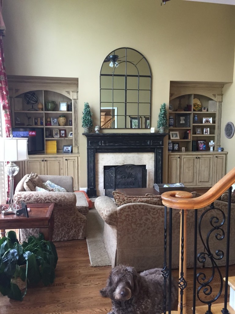
Here is the before (and a very sweet dog ;-)))). Red drapes that hang above the first floor of windows from wooden pegs (fricken can’t stand those- sorry!), sofas my client was ready to burn (too bad we’re not in East Lansing) and fresh floors and paint everywhere.
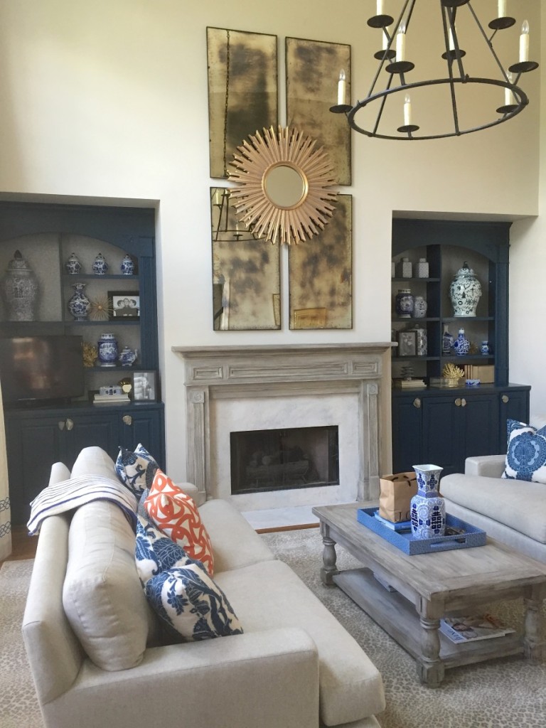
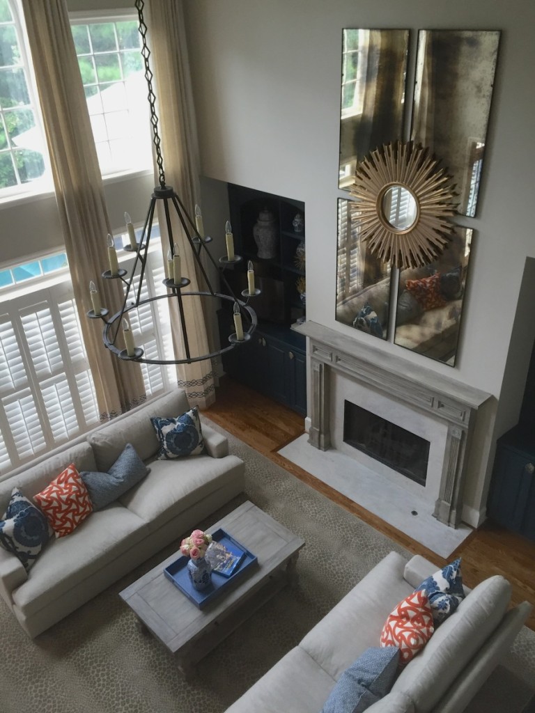
The after! Pretty much new everything. We hung this great Ironies light to make it feel like hey mr. ceiling, you’re not so high after all. Then middled the space between the top of drapes and top of built ins with a collage of foxed mirrors and a starburst (for good drama. No bad drama, no no). My client said she loved starbursts from the initial consult…. you and I will be friends! This is what I was trying to describe, probably poorly above, about visually taking these massive two story great rooms, and using different SCALE and height to bridge the two, so you don’t have this huge expanse of dead wall space.
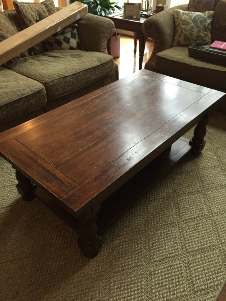
get a good look at the coffee table above…
The same. It was the perfect size, we know good artists and knew we had a lot to tackle. Up cycle when you can, know what I mean bean?
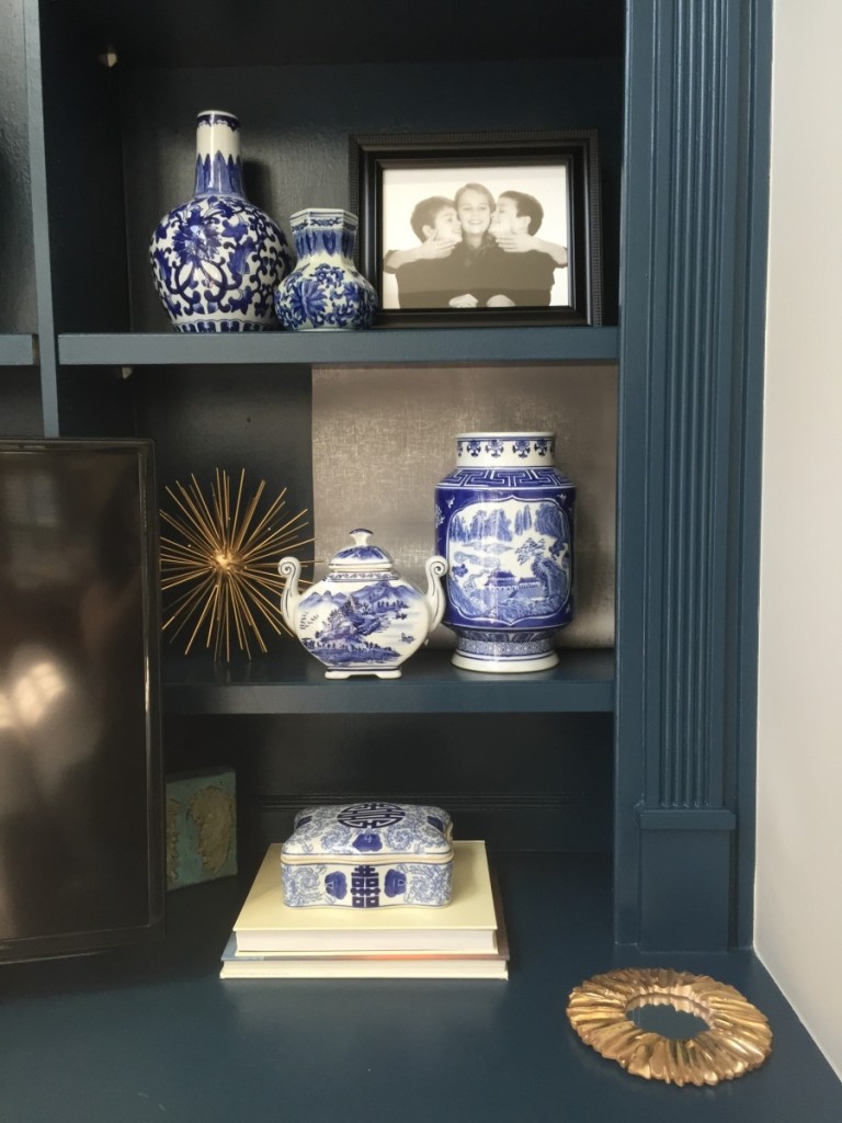
We applied the same principal to the fireplace than went dark navy on the bookshelves and added agate knobs from Anthro that I became obsessed with last Spring. Once the cabinets were ALL navy, it didn’t feel like there was enough definition, so we applied this silver metallic removable wallpaper to the backs. From Target! I’m totally hooked on it (Thank you Melanie! xo). It is just a great way to add one more layer of glint, texture. Its all about the layers team! Layers and scale would be my two driving fires, buzz words, if someone asked me about my design prowess (I like that word prowess. Sounds kinda sultry, kinda hubba hubba, grrrwl). I bet if you got up right now and walked around your house, you’d find a little niche, or glass cabinet to layer your house with some Tarjay paper. BTW remember layers? Like the haircut…talking on the phone to your girlfriend…”I think I want layers?”
(a close up of the removable wallpaper. You can do it)
And here is a shot from up above, big picture. You can see the oversized agate knobs, the cheetah print rug, the double layer of trim tape along the bottom of drapes. Design is in the details! And btw how fricken perfect my installer got the mirrors to hang like that?! They weigh a ton. Nice work bro.
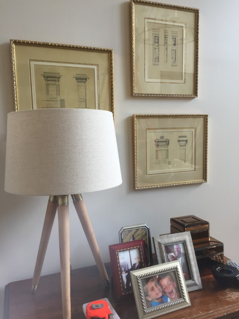
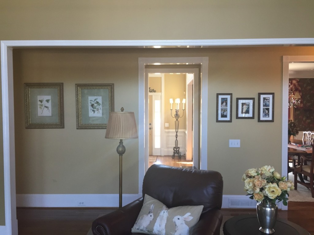
A little vignette we put together over a family piece with a new Regina Andrew lamp. Two of these prints were previously in the powder room, one in a random hallway, and you all know the rule. If you have a set of three, five, seven, whatever the number, don’t break em up and spread them around. Come on team. If there is anything you’ve learned from the road, this is it: Group like items together for dramatic impact. I know, you’re sick of hearing me say it. Me too. Hah.
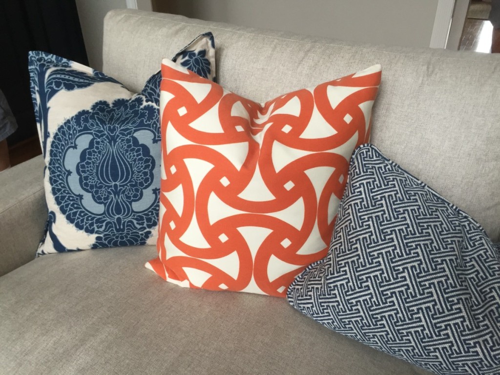
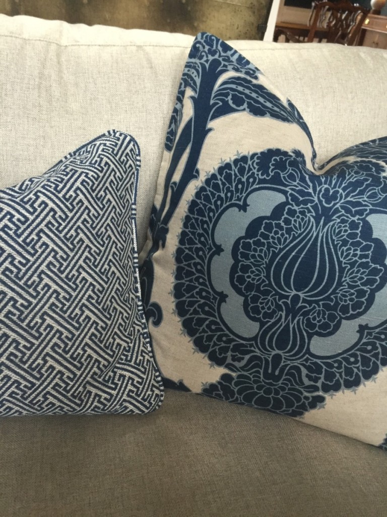
Some pillow talk…in love with that big bold blue print from Schumacher Comes in a charcoal chocolate brown and light blue too. Nasty.
Center hallway before…
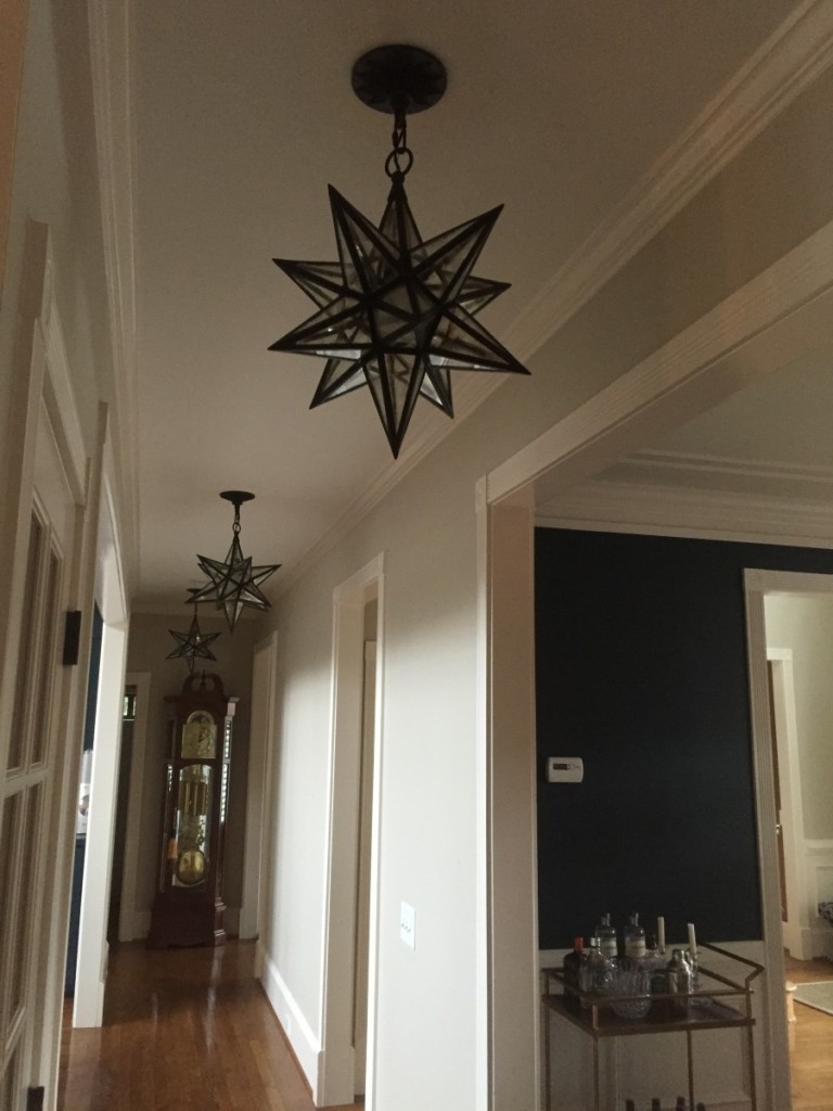
Tried to emphasize the architecture of the main center hall with a trio of star lights. Client is currently in the market for some great modern art for those walls too. OVERSIZED. Grandfather clock will be painted high gloss white or a pop of color. TBD. And we moved it to the end of the hall for a dramatic focal point.
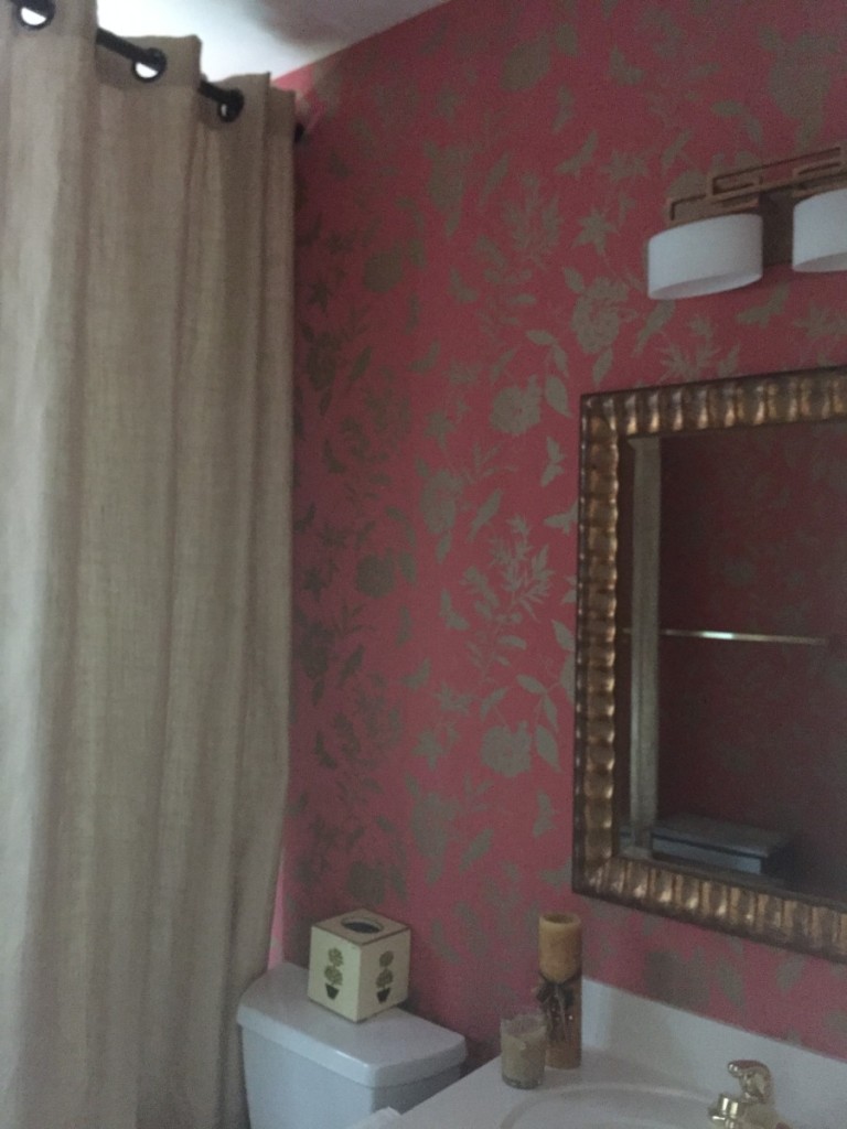
The powder room received some love from Thibault and a burlap floor to ceiling shower drape.
We went with a gold and coral paper, up cycled a mirror, added a new light for an instant, easy update. We didn’t want to go too crazy with this room so as you can see we kept it kind of simple and didn’t make too many drastic changes. The only major thing we did was change the lighting as that required us to call in and electrician, like those from inphaseelectric.com/service-areas/services-in-brookfield/, but that was it!
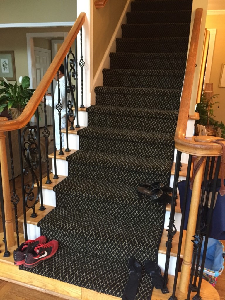
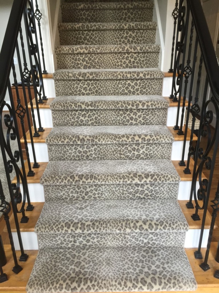
Backstairs saw some love…
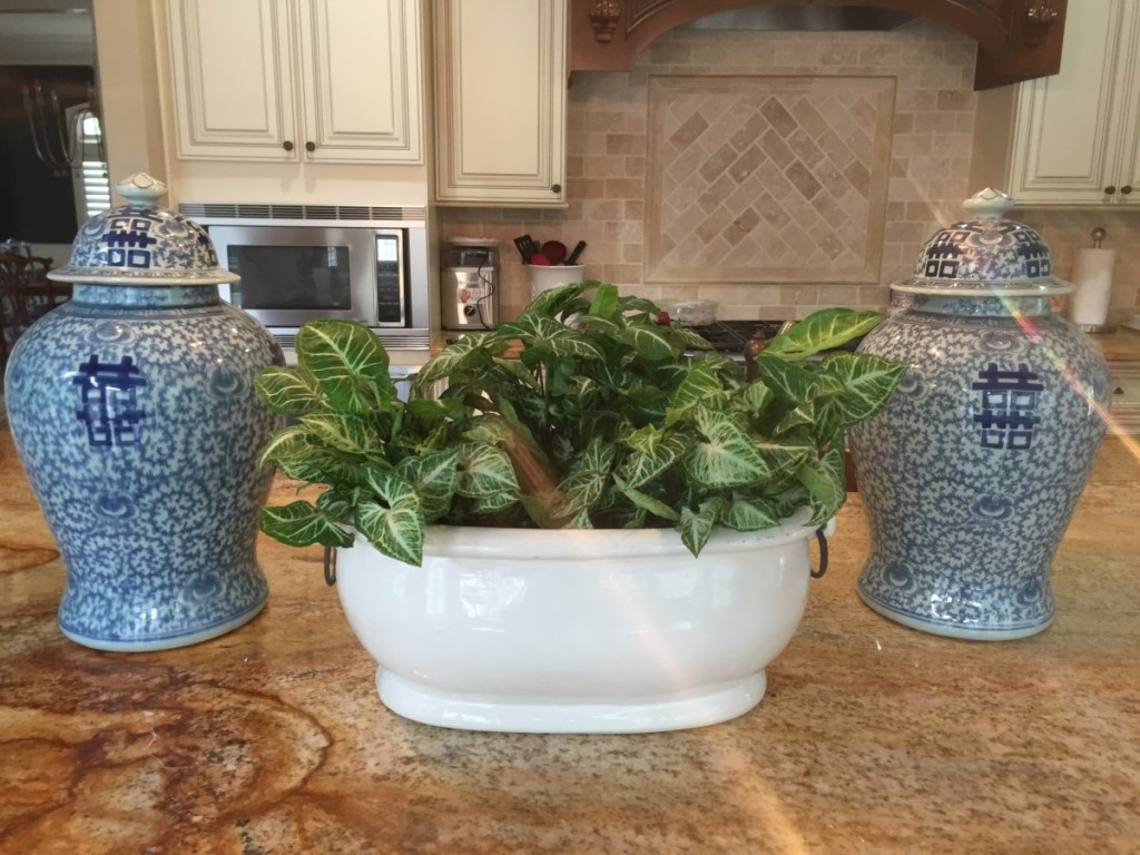
With all the blue and white chinoiserie pottery on the shelves, we wanted to bring a bit of it into the kitchen for flow. And it looks so good with her recently renovated kitchen.
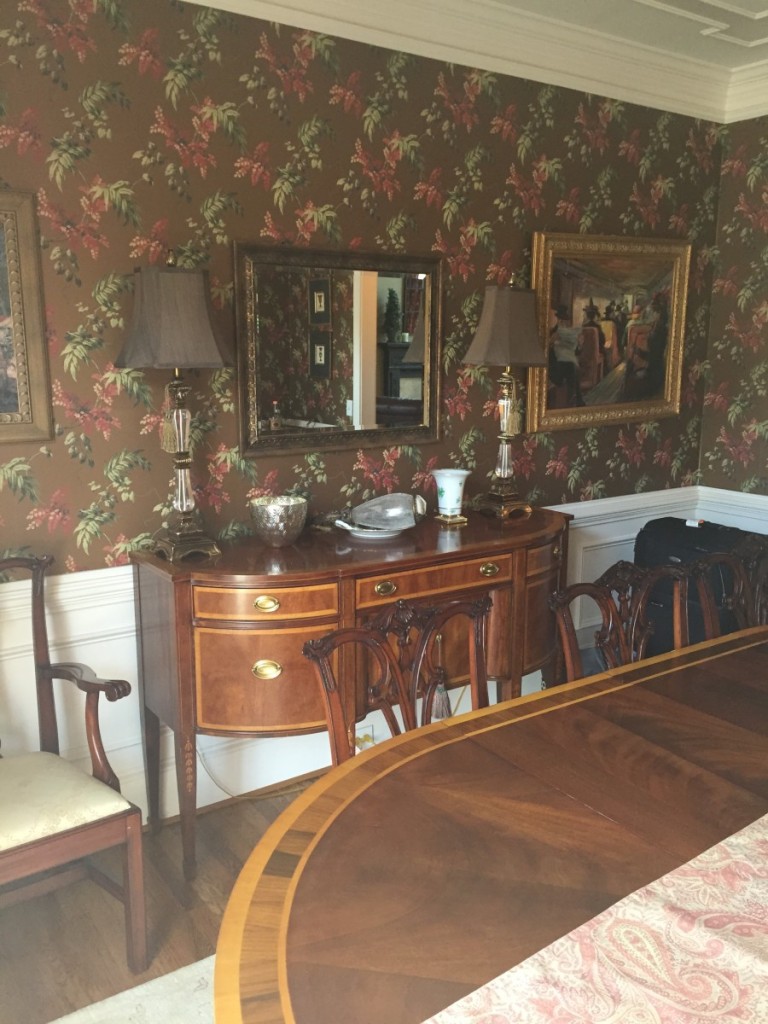
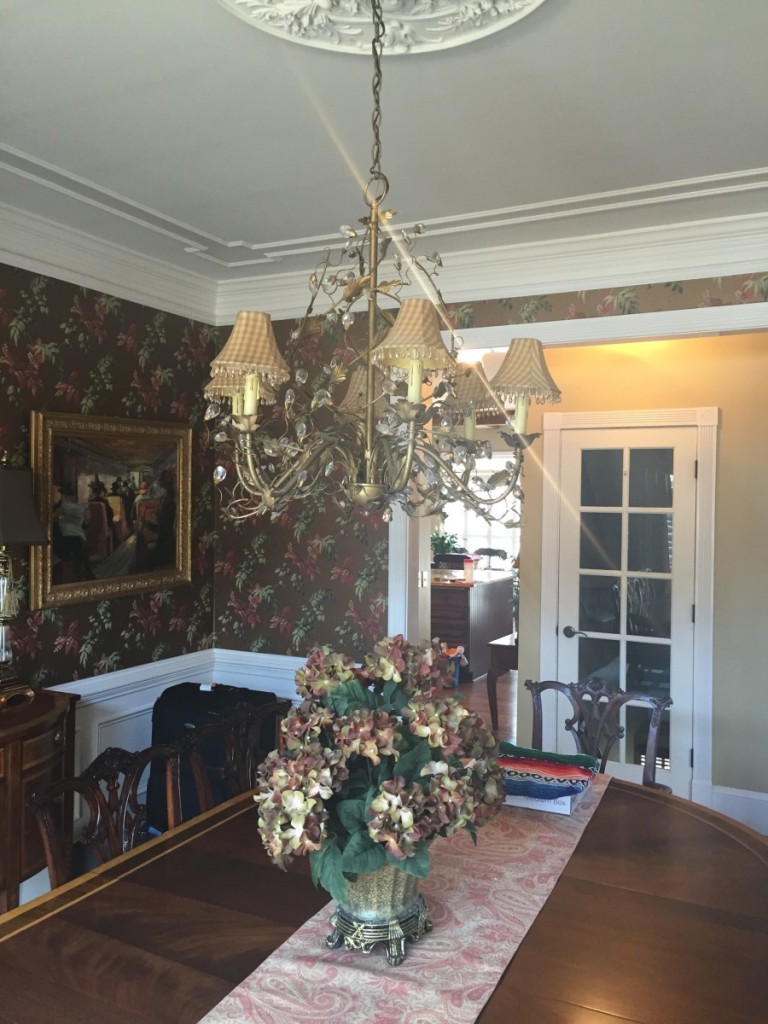
Moving on into the dining room…
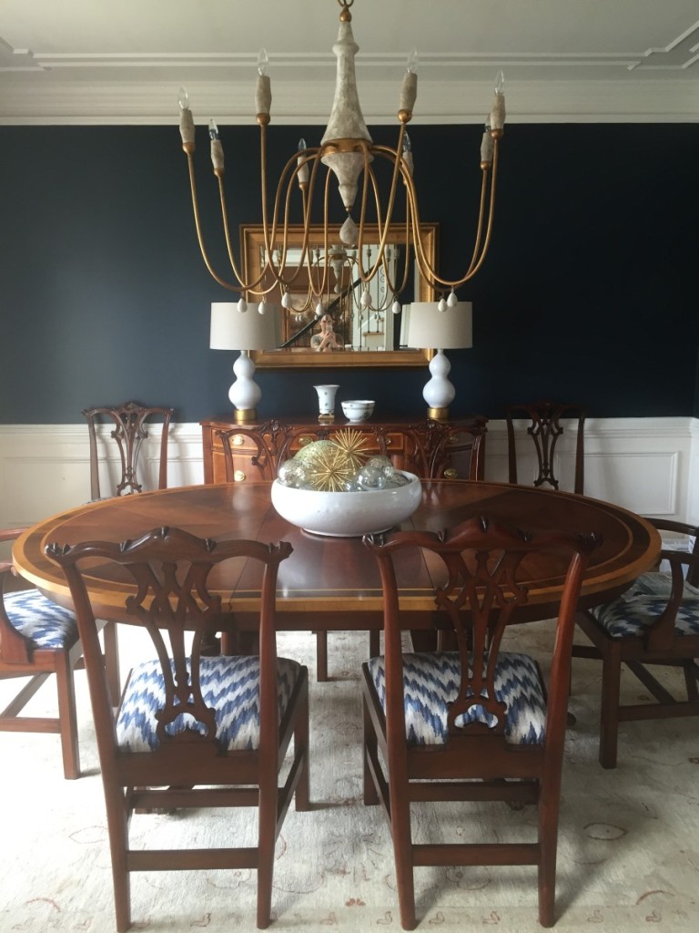
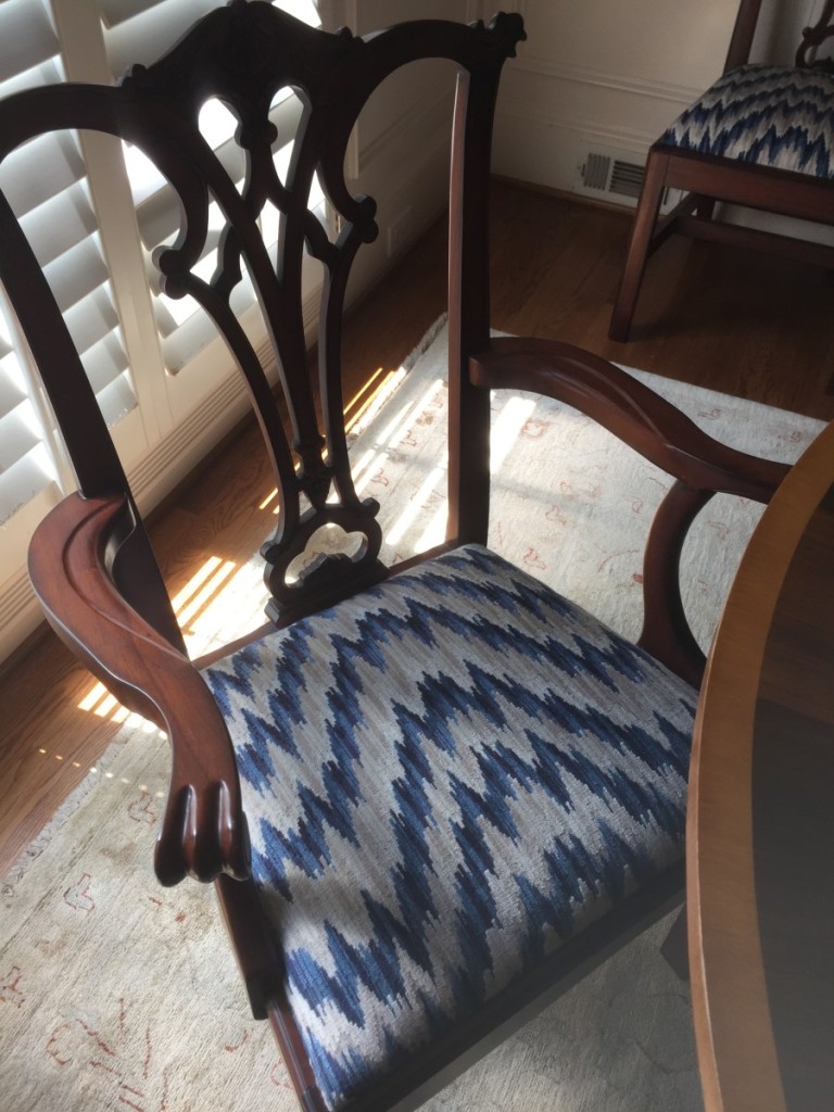
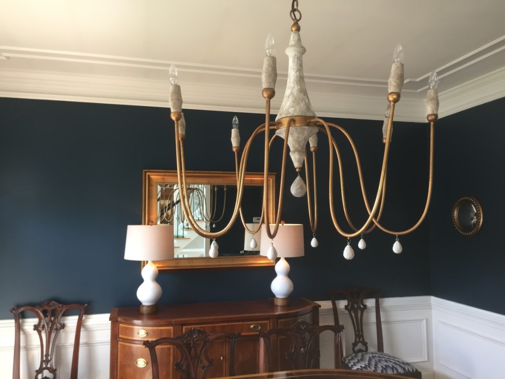
We kept the family furniture and just sexed it u a bit. The rug stayed too but we had to get a Rug Cleaning Melbourne company to give it a clean for us. It’s looking good as new now though! With the wallpaper gone and the awesome contrast between the walls and ceiling, you notice how pretty the trim molding is on the ceiling, that it even existed.
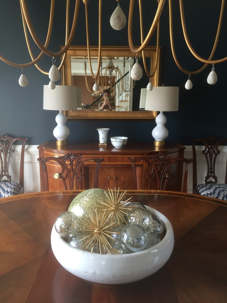
I still feel like we need some custom lamp shades in here and some big oversized, antique, crusty mirror, to give it that final finish. Anyone out there cover lampshades in wallpaper or fabric? I need you.
And I threw this pic in because I love these little convex/concave port hole mirrors we flanked the door with…you might also notice the bases on those lamps were once wood…rub and buff! Works like a charm every time.
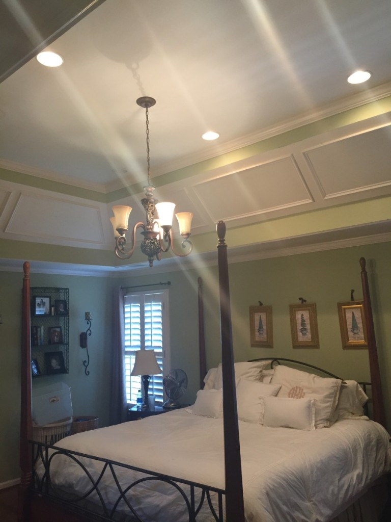
And lastly, the master suite.
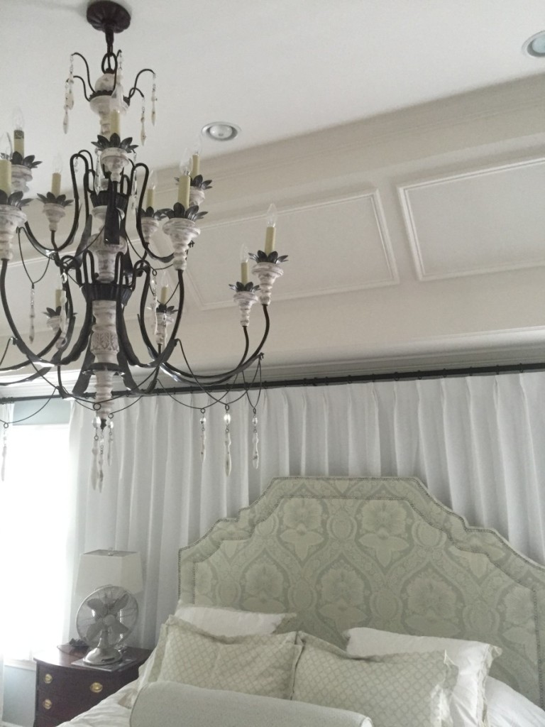
We draped the entire back wall in white linen and designed the custom headboard. In this shot the three euros are missing. But I’ll be back with professional photos for the big picture.
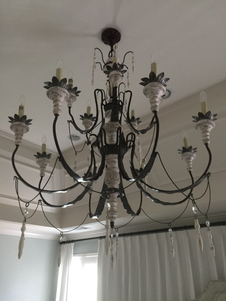
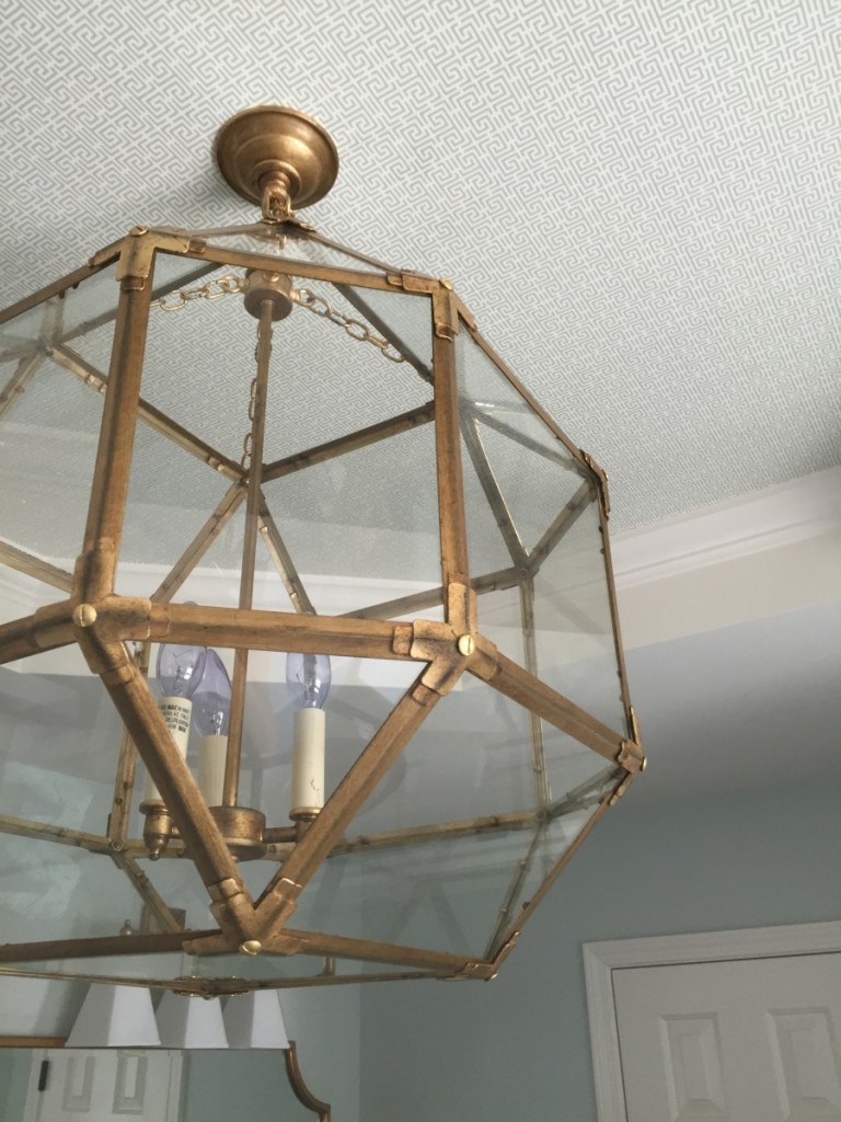
Gaga over the light…definitely the boss of the space. And the drapes. They’re a team ;-))
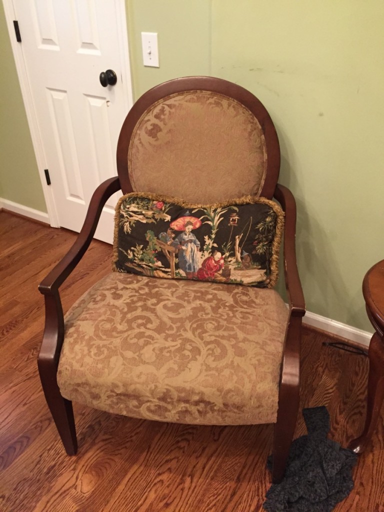
She had this chair…
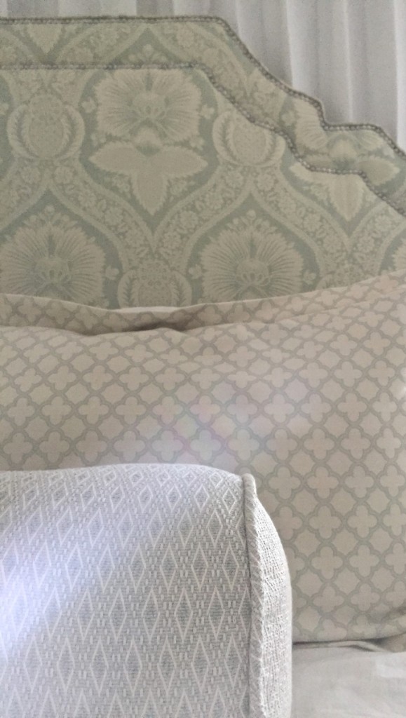
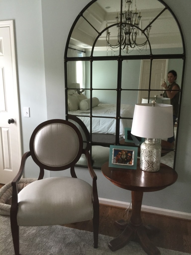
So we recovered it, paired it with another random table and the old mirrors over the living room fireplace to come up with this vignette. The two will be painted in an “adac” finish this week. A great layering of white and cream with a pinch of antique glaze. Just a pinch. We loved that headboard fabric but its a strong cream with our white, so we need these two to tie it all together and bring it home. I think one of those fuzzy white lambswool pillows would look sweet on the new princess chair when its finished. Note to self: client gift. And I tasked her with finding all new frames in our newly designed spaces, in matching finishes, but different shapes, sizes, texture.
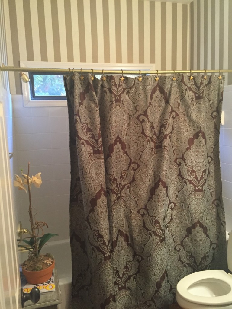
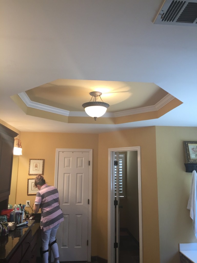
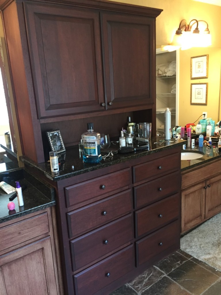
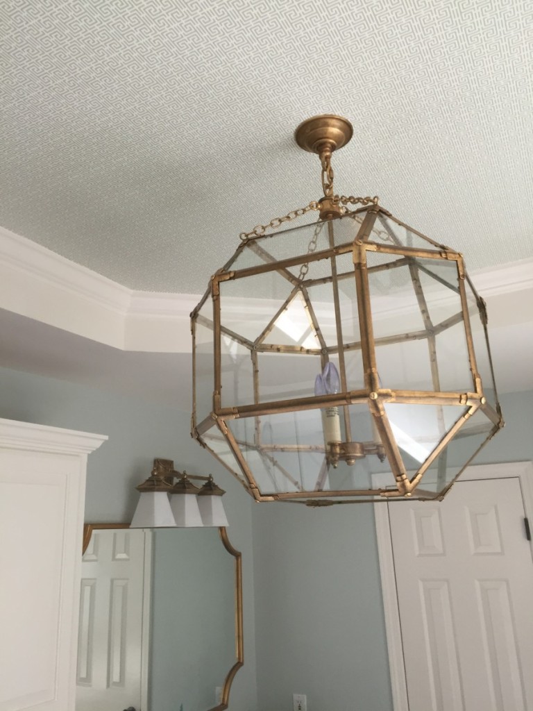
The bathroom before….I’m beginning to love tray ceilings (whaaat) just for the wallpaper possibilities.
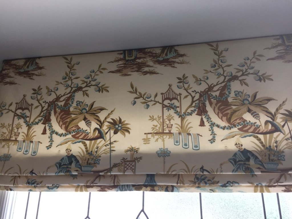
One thing I cannot stand about new builds, is this damn square, leaded glass window over the tub. As far as I’m concerned, there is nothing WORSE than having a window you cannot see out of. So we did our best to hip it out with some gorgeous Suzanne Rheinstein toile.
Here is a better angle of the new mirrors and lights over each sink too… I am so happy with how this bathroom remodel turned out! Even all the plumbing work that we had planned went smoothly. I was actually speaking to a friend of mine about this exact bathroom a couple of days ago. She lives in Massachusetts and wants a similar design in her home. So far she has managed to source a plumber online using this website: sharpplumbing.com/service-areas/berlin-ma/. I cannot wait to hear all about how she gets on.
Anyway, the cabinets were all painted white with oversize glass knobs. We also did the foyer, which I’ll snap for you next time. Waiting on some sconces to be installed. Then we will style for a shoot. Design is never done. But you can do your best to lay the foundation for layers and layers to come. Happy designing to you all!
Jenny from the paint it pretty rock
P.S. I want to thank everyone with ALL my heart for the love and support for my new philanthropy I’m starting, Charm School! I have a quick funny story about it. I was in total beast mode last week in Columbus for a two day install of a show house that I’ll be sharing with you next week when an unknown area code 734 number called my phone. Of course I couldn’t answer but got all excited thinking “maybe its our first charm school candidate calling to inquire?!” Later I listened to my voicemail and it was the fricken LA Fitness in Woodhaven that I’d worked out in last Summer at home!! LOL Waaaaaa Waaaaa.


Gorgeous work my friend….it was definitely a beast before you got a hold of it!!!
Once again….I love it. Absolutely beautiful!
What a transformation! Your client has so many pretty things to explore in her home.
I love the animal print rug and carpet. Are they from the same manufacturer? Could you offer some insight in how to have carpet made into an area rug?
Thanks!
Absolutely! Any carpet store you shop at can have a custom cut rug to your preference, depending on how wide the loom is. Typically is 12 or 13 feet wide. And they will also offer you an option of bindings for the edge. It’s a great way to go! xoxo
I’m just seeing this response…thanks for the reply. What sort of binding did you use on the leopard rug and stairs? I want to feel ready when I visit my smallish town carpet store.
The rug store binds it for you with a machine stitch. They will show you the options I promise. Take pictures of ours with you. Good luck! xo
Nicely done!! Everything looks great!! I’ve been eyeing the chandelier you used in the dining room. I didn’t think it was even available yet.
It is! And its a fun one! ;-))) 42 inches round.
Always start with befores! Jennifer, I love everything you do. This is definitely an inspiration for a refresh of my 10 year old house!
Thank you so much! What a treat this Saturday morning to be sitting down to read all these lovely comments. And the goal is and always has been to inspire ;-))) Happy decorating!
Beautiful. Can you tell me the process for the coffee table and mantle?
Hi Lisa, my faux finisher did it…I wish I knew. I tell her all the time she is magic! If you live in the Atlanta area I’d be happy to give you her number. Thanks so much for reading!
What an amazing and beautiful transformation. I can’t imagine how thrilled the new homeowners must be with their newly designed spaces.
Wow, just wow. So much goodness to see. You seriously outdid yourself. Fantastic job.
Betsy Gordon
Thank you so much Betsy!
Just wondering about the chevron pattern fabric on the dinning room chairs. Do you have a line on where that’s available?
yes! lewis and sheron fabrics… lsfabrics.com enjoy!
You rocked it again!!! LOl…love the LA Fitness story…blah haha!
Gorgeous gorgeous gorgeous! Love your work – it is amazing what paint can do – that coffee table! I’d love to see the afters of the bathroom!