Hello my friends! How are you? Has it really been July since we last talked?? Good grief. In that case, I’m feeling damn lucky to be here. And thank you for being here too. Let’s jump right into a whole home BEFORE AND AFTER renovation I “completed” this past year. I say this in jest, because ha ha ha we all know its never really finished. 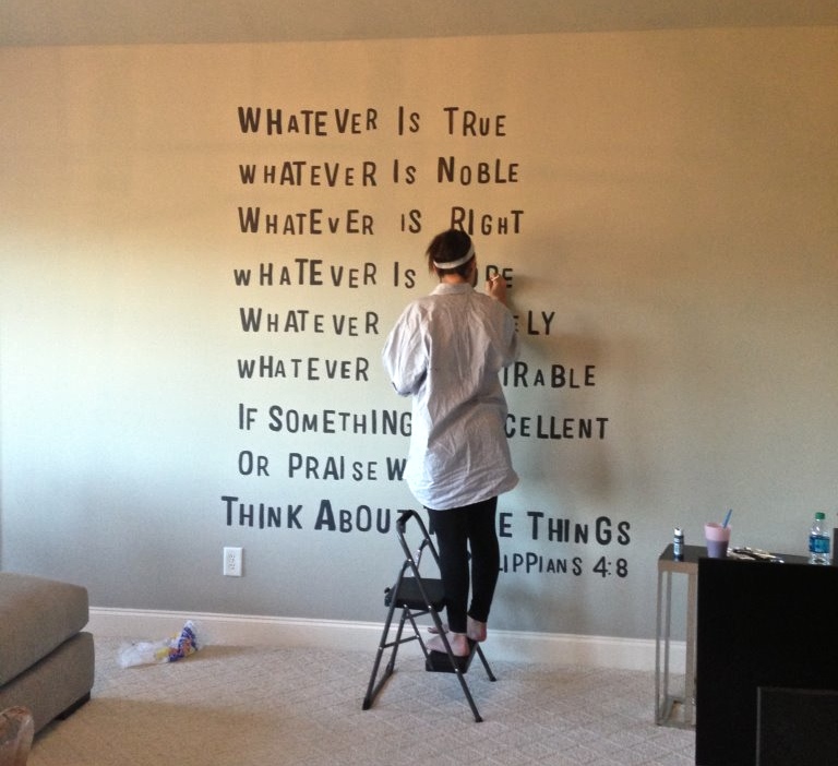
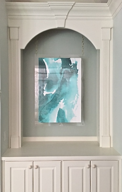
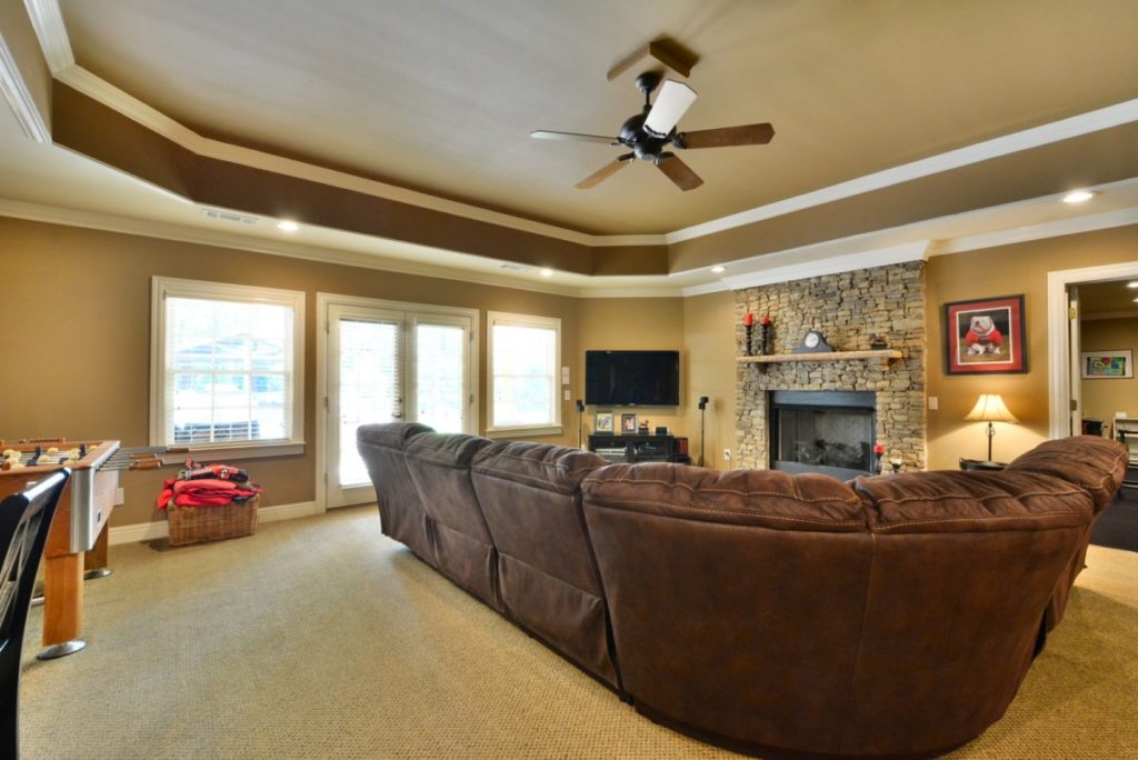
This sweet family and I stayed very busy these last few years on our design journey. We started out at their first house, changing lights, styling built ins and converting an under used bonus room into a cozy, family movie room. Including the precious art install above.
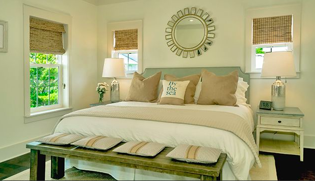
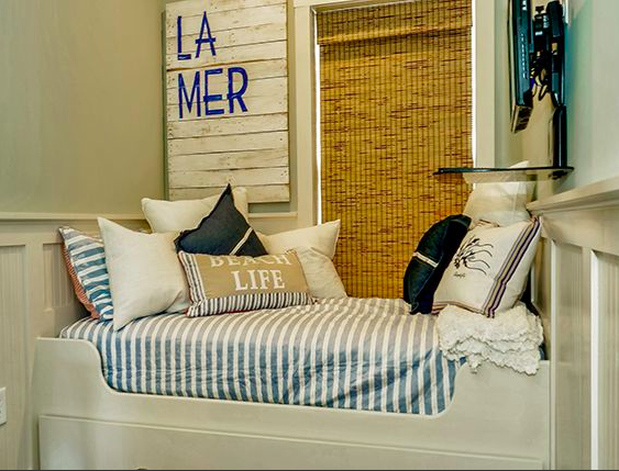
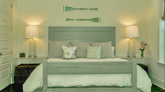
A beach house shortly followed and we banged it out in two working days, all on line. It was a lot of fun to do it that way for once. Order on line and shipped right to the door, DONE.
I love the internal doors. They really help make a statement. They also let in a lot of light so the rooms feel much bigger. I was thinking about getting our exterior doors renovated too, fiberglass doors have a lovely appeal to them and I know a few people who have decided to have them installed, I have had companies like Plastpro Inc recommended to me, so I think it is time for me to check them out.
My client did a great job of pulling it all together and adding finishing touches. There are bedrooms for days and we would laugh keeping track of it all. The key is to keep mixing the finishes until you get a perfect combo you like. Our favorite word from that moment forward, CRUST, we need more crust!
You can stay here too.
Then it was a new house which brings us to the thrill ride, the before and afters. This will be fun. Our take-a-way: never ceases to amaze me the transformation of paint. It’s not just about walls and trim either. So many opportunities to add style and layers with paint. Another huge change, the home went entirely hardwood with a rich ebony stain. The white and black together felt so fresh and modern. It truly felt like a new home.
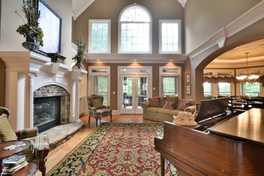
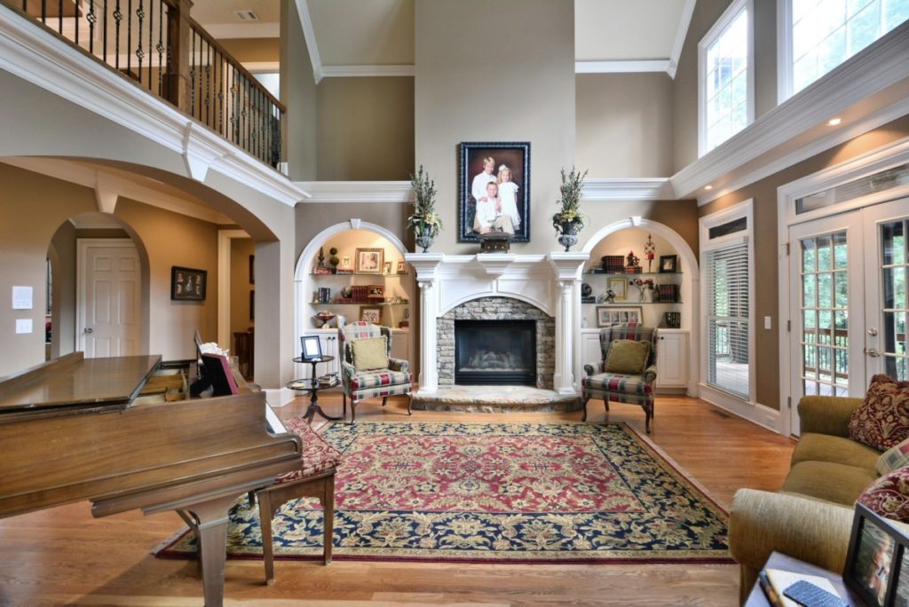
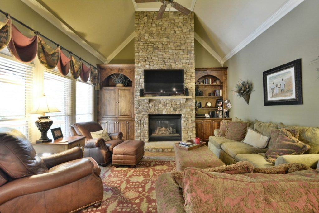
Formal living room before…
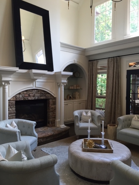
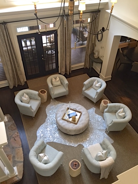
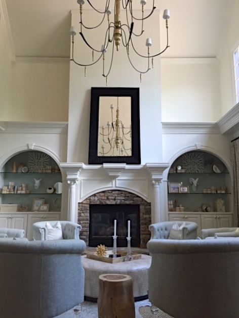
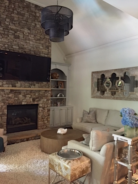
And here it is now as more of a place to lounge and enjoy some wine and a fire.
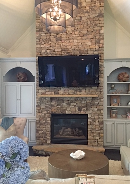
This home (and somedays it feels like every home) in Atlanta, have an abundance of built ins. I’ve come accustomed to immediately thinking take out all the shelves and use as niches for art or large objects. Especially when they have a great shape like these below. Hear me cry friends, styling bookshelves is A LOT of work. It takes a lot of STUFF. And you’d love for all of it to mean something and if it doesn’t it better have a dramatic impact .
However, they also offer a lot of style opportunity if you think beyond the shelves. Don’t get me wrong, I love to style shelves. Its one of my things, shuffle, shuffle til its just right. But I also like to challenge myself to something new and different. Maybe pick one type of object that means something to that family and go wild with it. Its the nature of the beast, when you keep coming across the same ole, same ole, to do something exceptionally different with it.
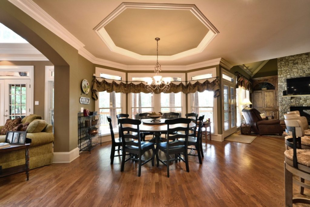
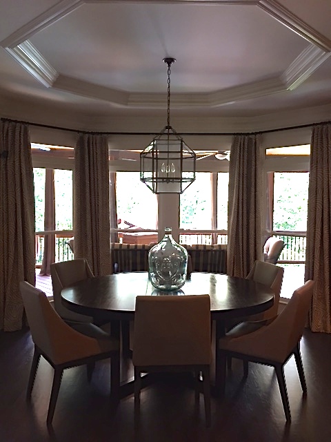
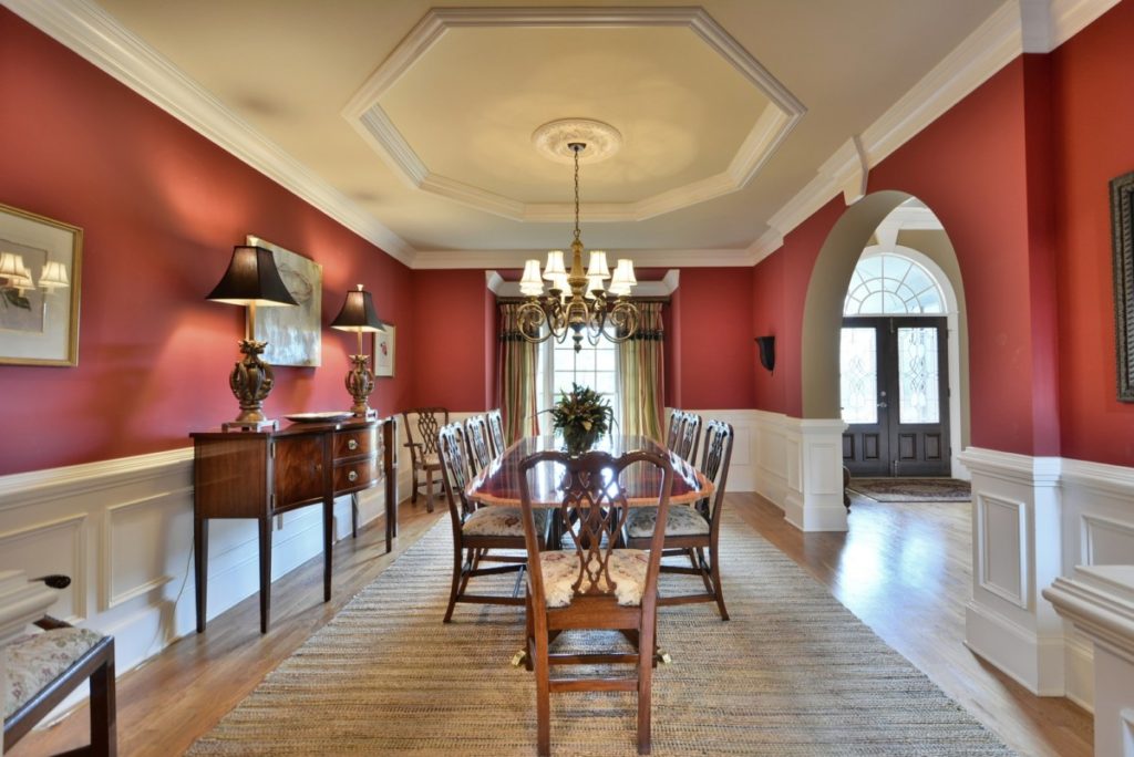
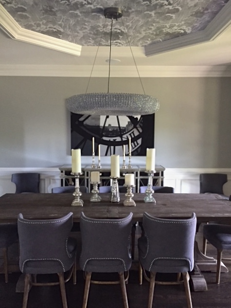
Family dinners here…
If you know me, you know I’m itching to cover that octagon in paper or paint. ;-))
The keeping room, where life and lounging happen…
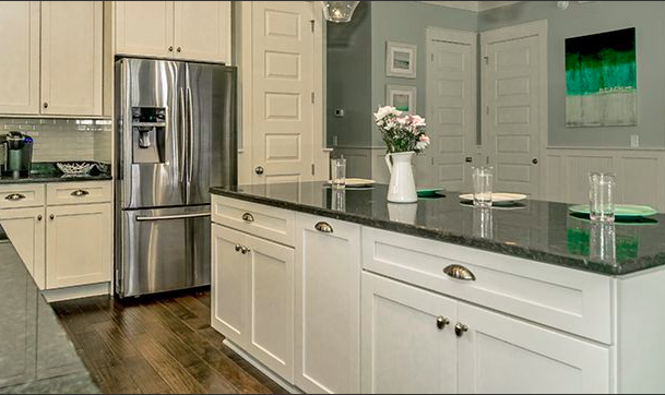
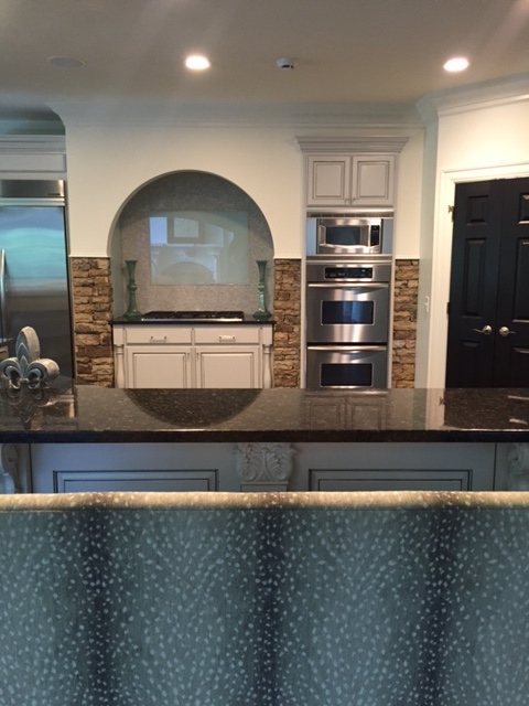
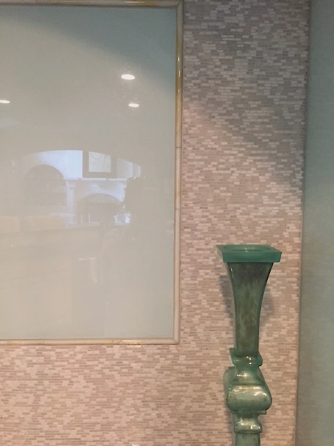
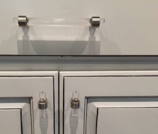
Fresh painted cabinets, a backsplash of back-painted glass and new hardware in the open kitchen concept.
We tried to paint the stone. We lost that battle.
The dining room and a peek of the foyer.
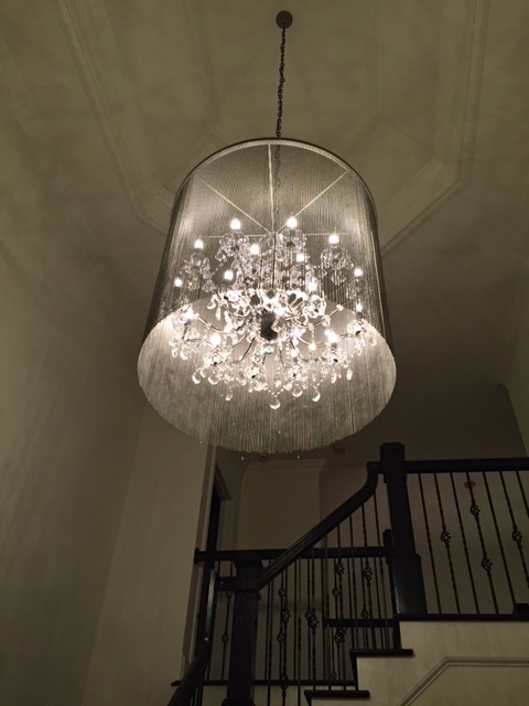
A new light sparkles in the grand two story foyer. What would you select for that sweet oblong space on the ceiling? Another opportunity. Stripes, graffiti, splattered paint, wallpaper, gold leaf, a soft hush of color, nothing at all – the possibilities are endless, the wallpaper options alone. Side note: I’m so happy wallpaper’s back. I feel like Mom! She wallpapered our entire home (same here :-)) with her key hanging on a string by a nail concoction, to get her lines straight, into the wee hours of the night. Wake up and pow, and entire room was transformed. Go Mom.
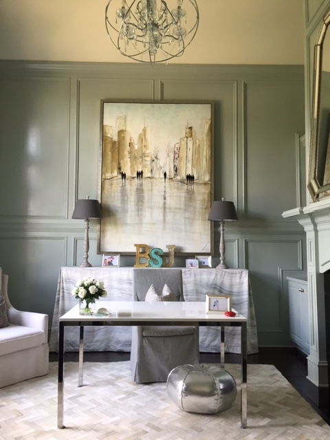
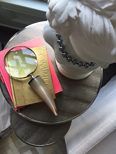
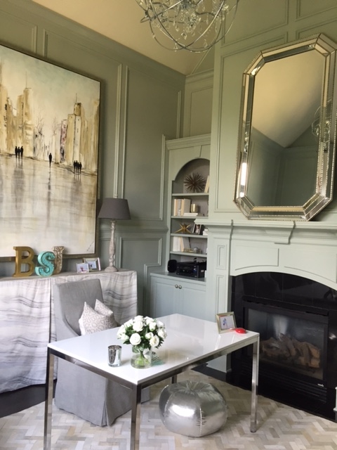
I wish I had a before of the Mrs. home office but basically it was all brown wood. I couldn’t wait to see all that texture and trim work shine with new paint. Selecting the lighting plan for this house was bade to the bone fun.
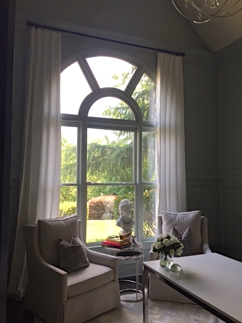
Big picture window adorned with white silk.
The entire office was bathed in “Comfort Gray” by Sherwin Williams and its true! It gives you this comforting feeling when you walk in.
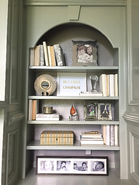
Our third set of built ins ;-)) we layered with metallic paper and took all the left over Cole and Sons wallpaper from the dining room ceiling and covered books with it for some consistency. I wanted each set of built ins to have its thing. Cole and Son here, crusty twined books in the living room and wood and bling in keeping room. An element to keep them all from looking too hodge podge.
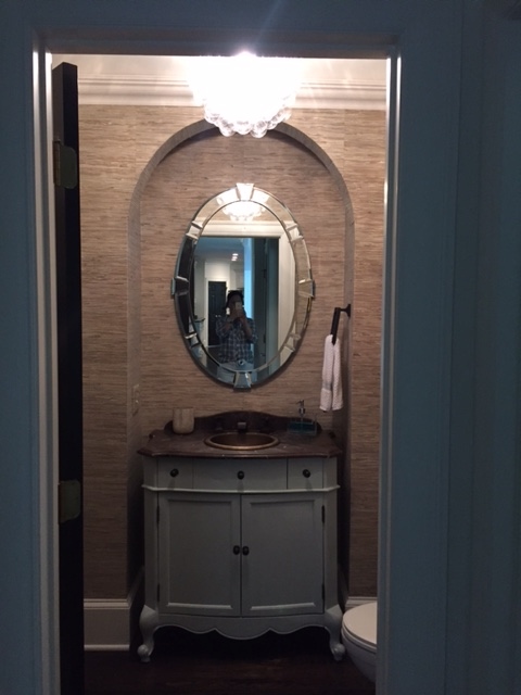
First floor powder room with new bubble light, crunchy yummy grasscloth and a 1940s art deco mirror from Scott Antique Market. We painted the existing console and added new modern RH fixtures and hardware.
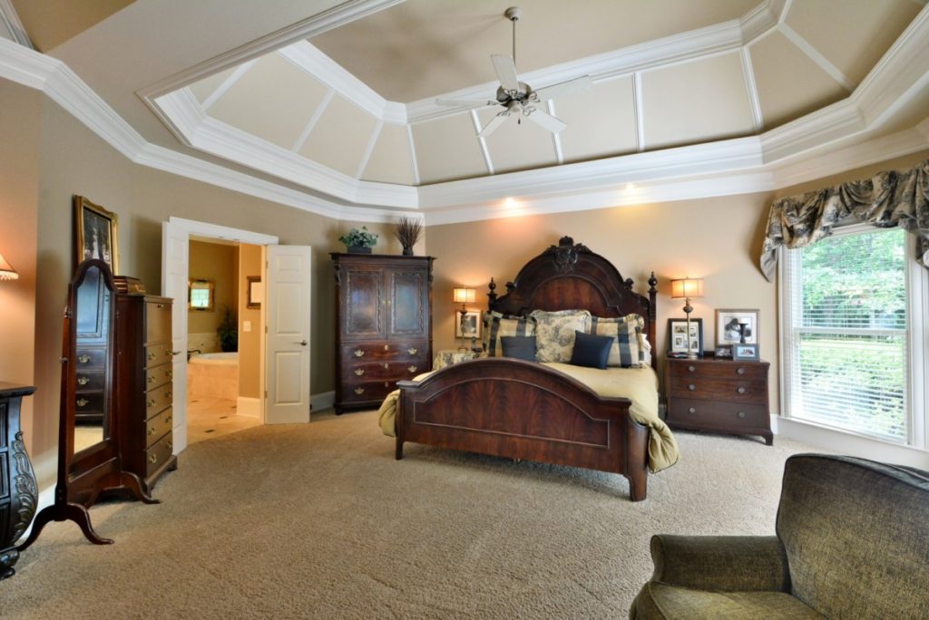
The original master bedroom
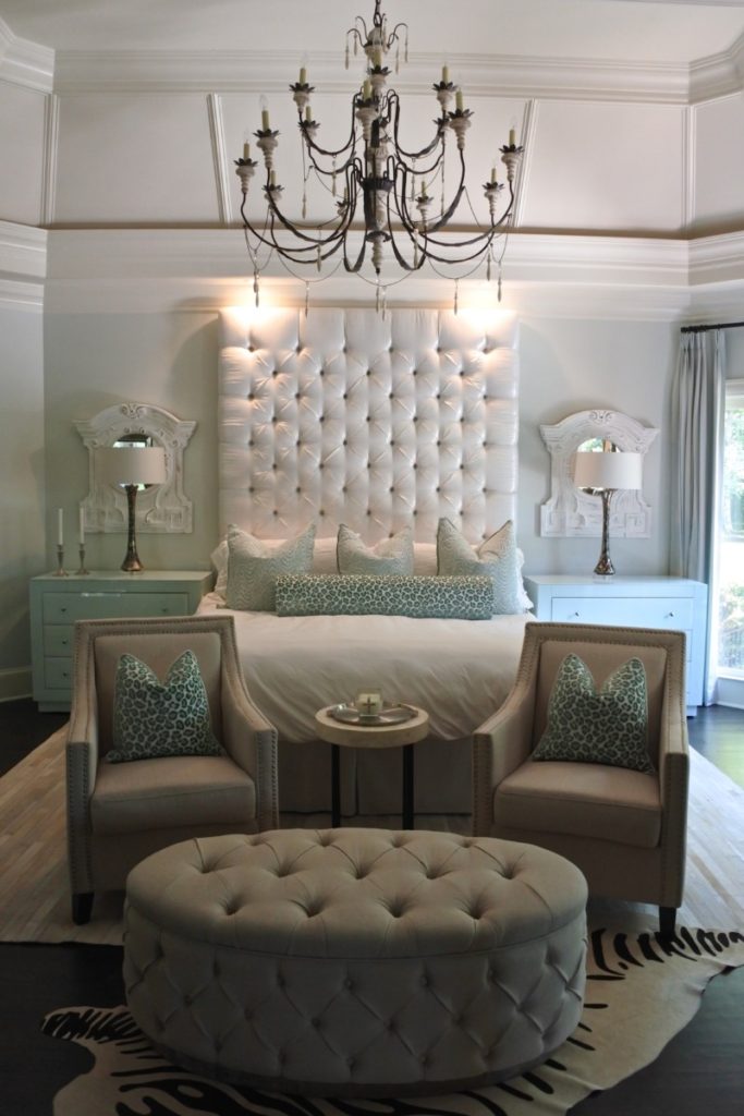
And after. I love this light! I was so happy to have the opportunity to use it again in this setting. Suzanne Kasler for Circa. She rules.
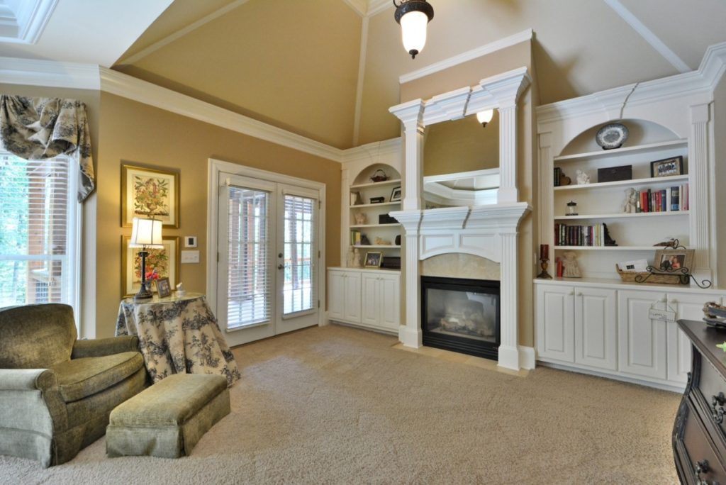
The fourth and final set. I was like kill me now but thankfully everyone was on board for omitting the shelves! Tres bien!
Upstairs, we styled the girls rooms, and two guest bedrooms and then party on, down to the basement…
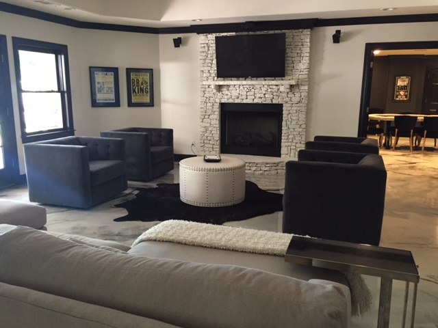
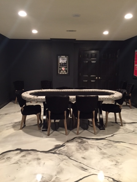
We made three critical decisions: the floors, the white walls with black trim and painting the fireplace. This was one stone battle the Mrs. and I won. Yes!
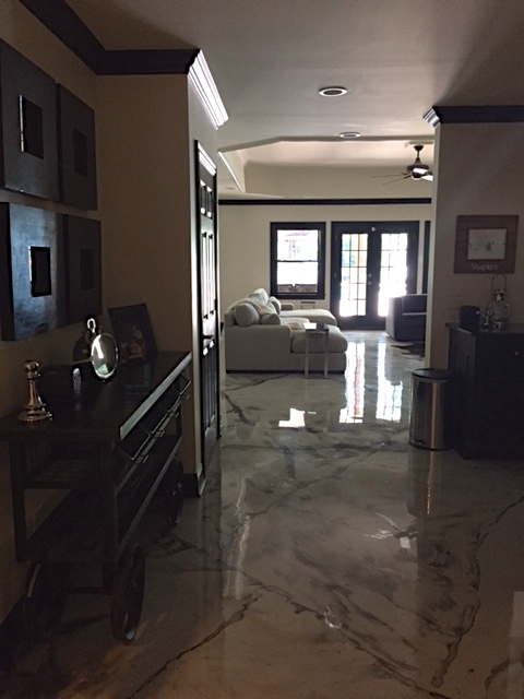
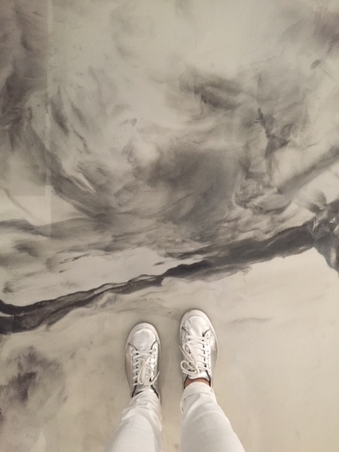
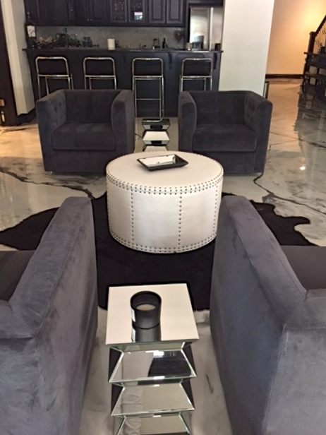
But to me, the floors steal the show. I love them and think they’re fantastic! We spent so much time looking at different flooring types and Special Offers, and I’m glad we did otherwise we never would have ended up with something so pretty. I might even go as far as saying it’s my favourite element of the whole renovation.
You want to swim in them! Or dance all day. Remember dancing to Rock Lobster? Down, down, down.
Swimming in the ocean, ooh, ahh.
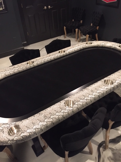
We went with black walls for the poker room and I envision a bright bold masculine oushak rug here, wouldn’t that be a fun juxtaposition with the marble floors and snakeskin? Some classic Easy Rider oversized black and white photography, Tombstone, Goodfellows. A classic Hollywood vibe in red frames maybe?
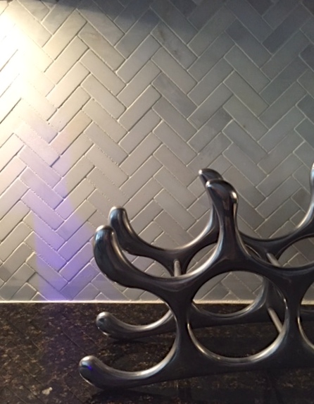
The bar area was painted black and new backsplash added. For some finishing touches we added barn lights decor for basement remodels. We were so happy with how they turned out!
This house screams ENTERTAIN ME. I hope you’ve enjoyed! We’ll fill a few holes, add some crust and get it up on the portfolio page, which, we made some tweaks and added some updated photos if you’re still awake :-)). Werk, werk, werk. A huge heartfelt thank you to my wonderful clients for all these amazing opportunities to stretch the creativity prism. Happy days to you! Much more ahead on the road. Amen.
jenny from the rock

Wow, this is beautiful! Thanks for sharing, Jennifer. 🙂
Absolutely! Thanks for stopping by the road xo
So pretty! I think I’m going to cry though my house looks like before photos.
Great job! Absolutely beautiful!
What a transformation! And, I’m with you (and wallpaper) GO MOM!!! franki
Breathtaking home and everyone must love the refreshing new look.
I’d love to know the source for the glass or Lucite cabinet hardware…. pretty please.
Thanks-a-million.
Yes! I will track that down for you. Stay tuned. And thanks for the kind words!
https://www.etsy.com/shop/LuxHoldups?ref=pr_faveshops here is the source for the hardware. Enjoy!
Just amazing. I love the fabulous lighting.
Lovely! But.. what ARE the floors? Don’t leave us hanging!
:-)))) they are just faux finished painted floors with a glossy top coat. Amazing!
So beautiful and what a great idea with great execution. Thank you!
Absolutely stunning! You knocked it out of the park again- so creative, each space tells its own story– I just love it.