Ohhhhh boy. Last week we toured the ASO Spring Show House for media day and I was blown away. It’s like every major design force in Atlanta flexin their artistry muscle, puttin on a show. Incredible. I took a lot of pictures with my phone, my good camera and there are some FABULOUS images from the press kit too so grab a glass of champagne and let’s rock!
The home is called “Palazzo Rosa” an Italian Baroque style home built in 1926. It spans 16,000 square feet and is currently for sale.
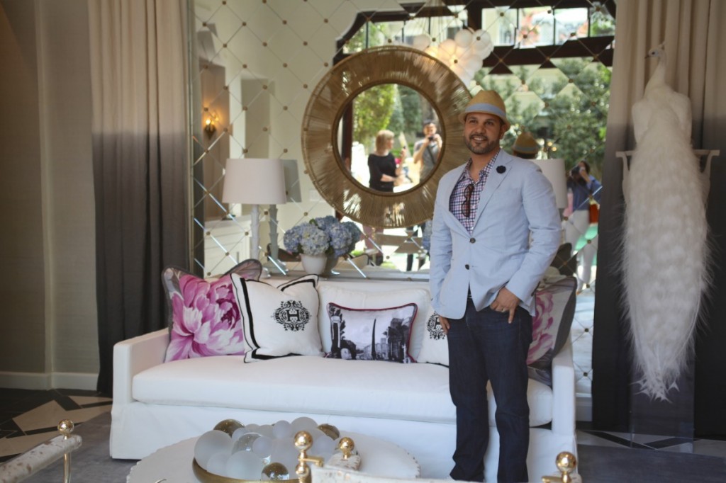
We’ll start in the pool house with this cute-as-pie designer Michael Habachy.
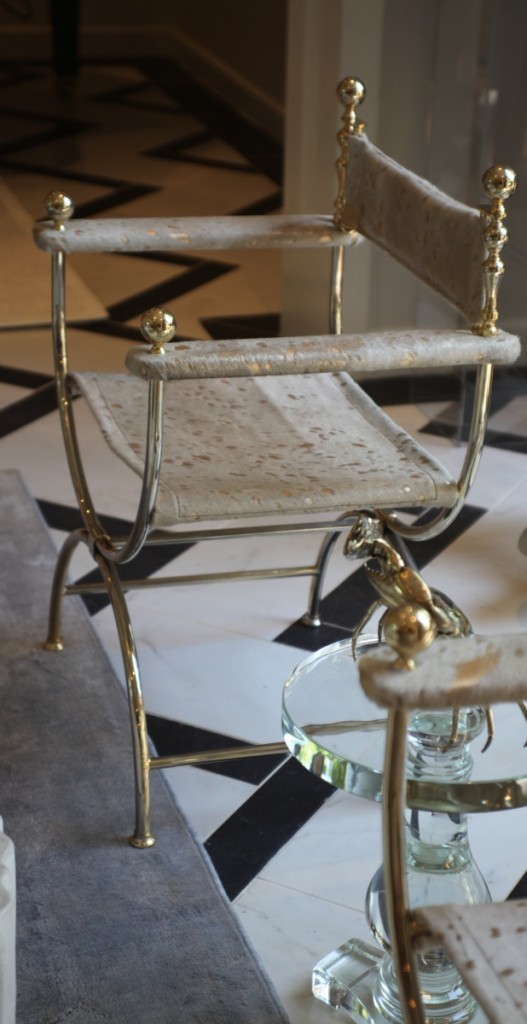
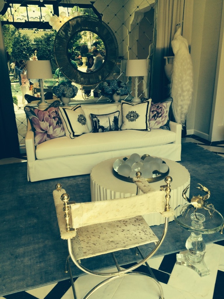
These chairs are insane. Vintage and reupholstered in hide. You know how bad I wanna say “talk dirty” right now right? Those things are so sexy!
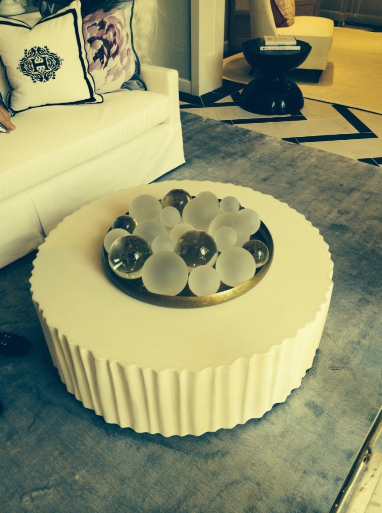
Orbs! Be sure to pile some on in your favorite urn or bowl.
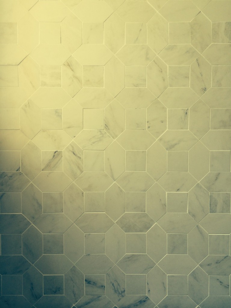
A beautiful tile arrangement.
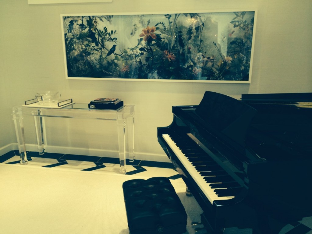
I especially loved this artwork from a Canadian artist Michael recently discovered. Its a little bit fantasy, a little bit Tinkerbell. Like it.
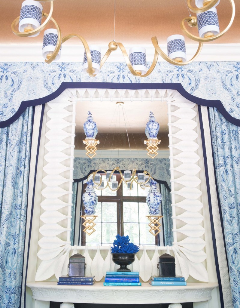
Moving on to Timothy Corrigan’s space, decked out head to toe in his new fabric line. I could of died. I recently pulled this sample in the “sunset” color way and its beachy, gorgeous and fun in orange, pink and coral tones.
I’m constantly keeping my eyes peeled for wall brackets, they provide fun drama to any space, and these were especially sweet. I wonder how he got them to stick?
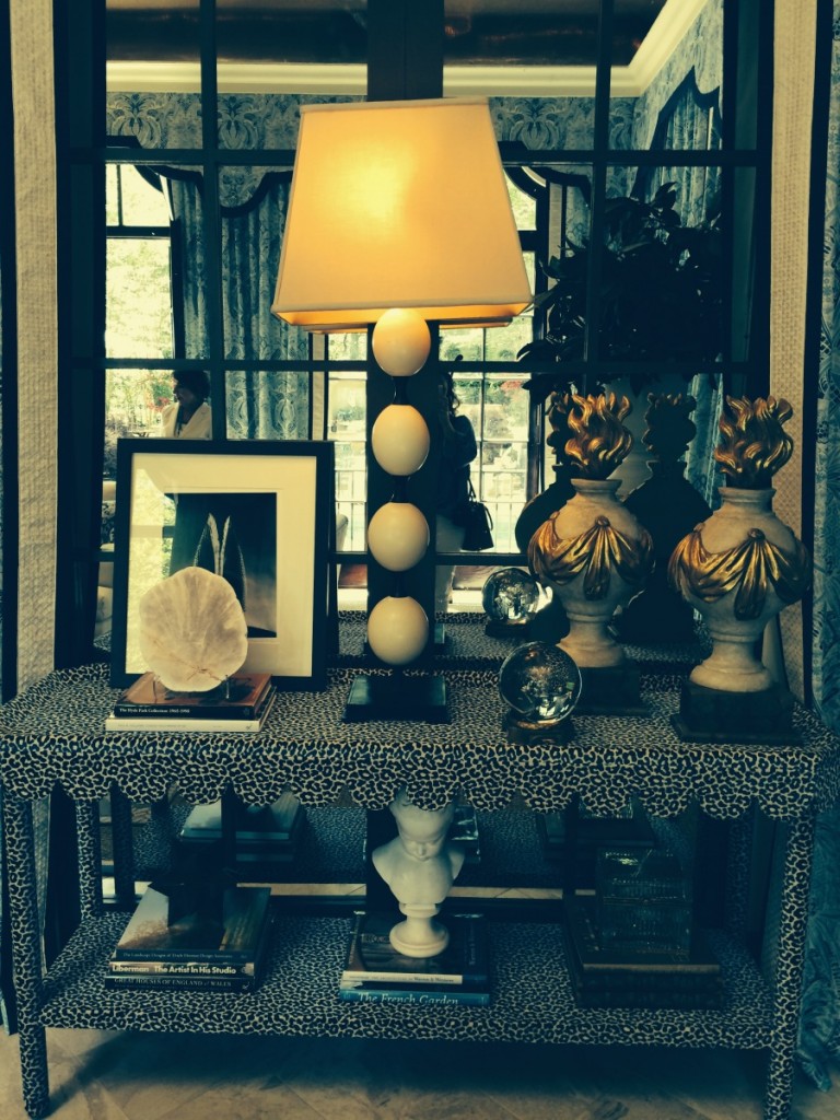
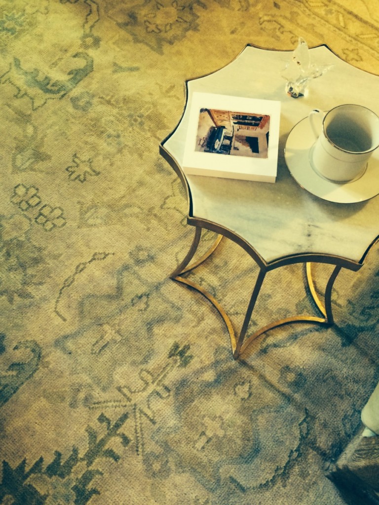
A gorgeous vignette, showing Timothy’s eye for styling. The scalloped tables covered in his fabric as well. So luxurious.
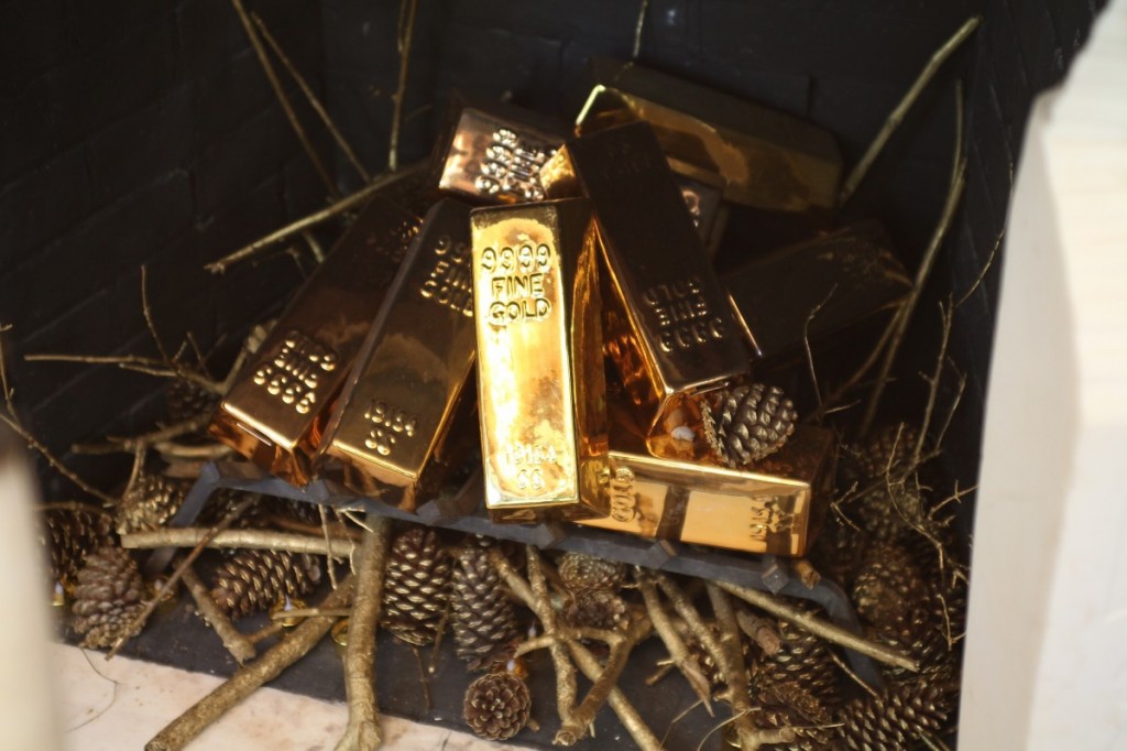
Over the years of touring show houses, I get a big kick out of what designers put inside fireplaces to style them. Gotta love the gold bars.
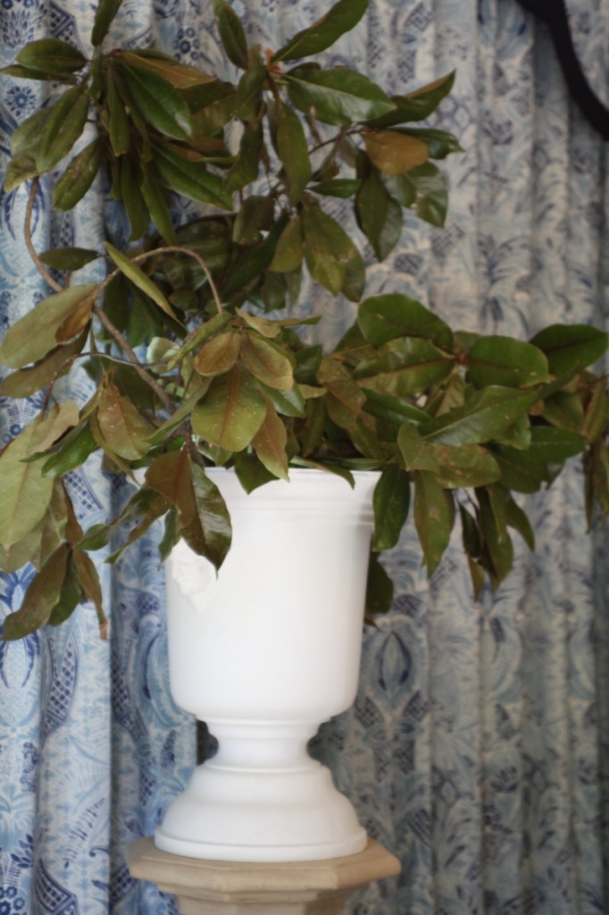
Elaborate urns on pedestals stuffed with magnolia branches, which is a look I’d like to do more of. Need to find me some good clippers.
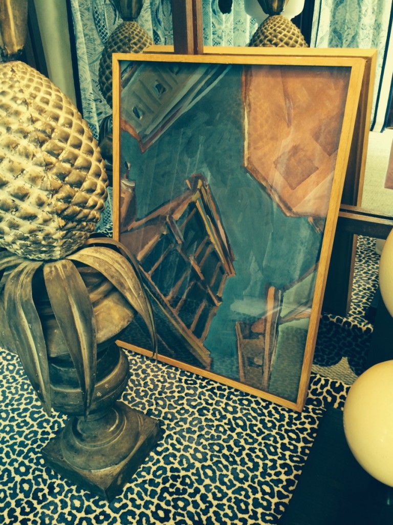
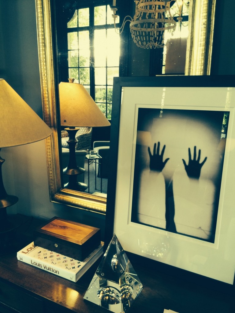
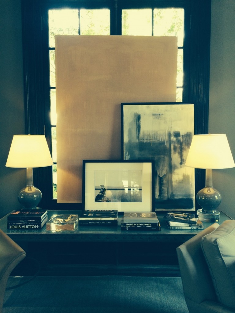
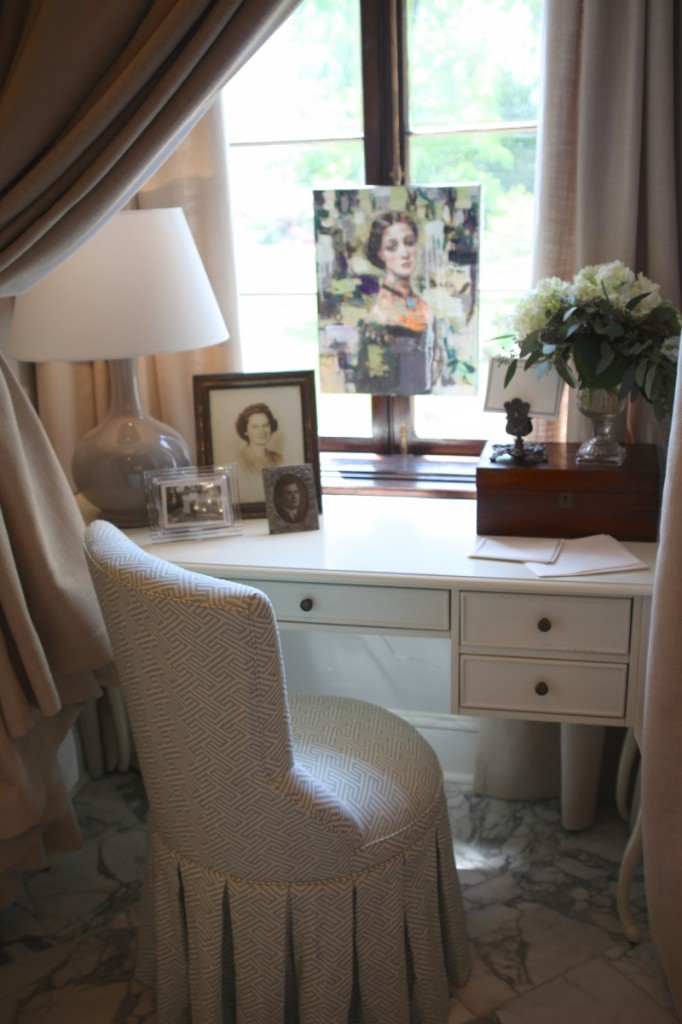
Sucker for art! I saw a lot of art propped up and layered over others and mirrors. Keep this in mind when styling your home. One less hole in the wall and that makes husbands happy.
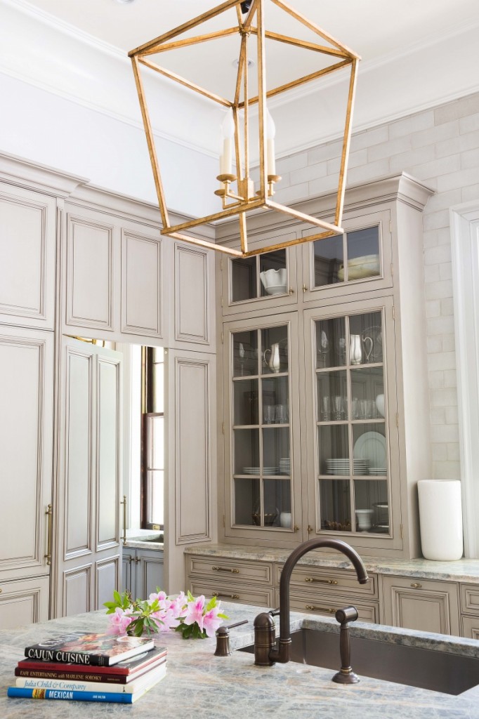
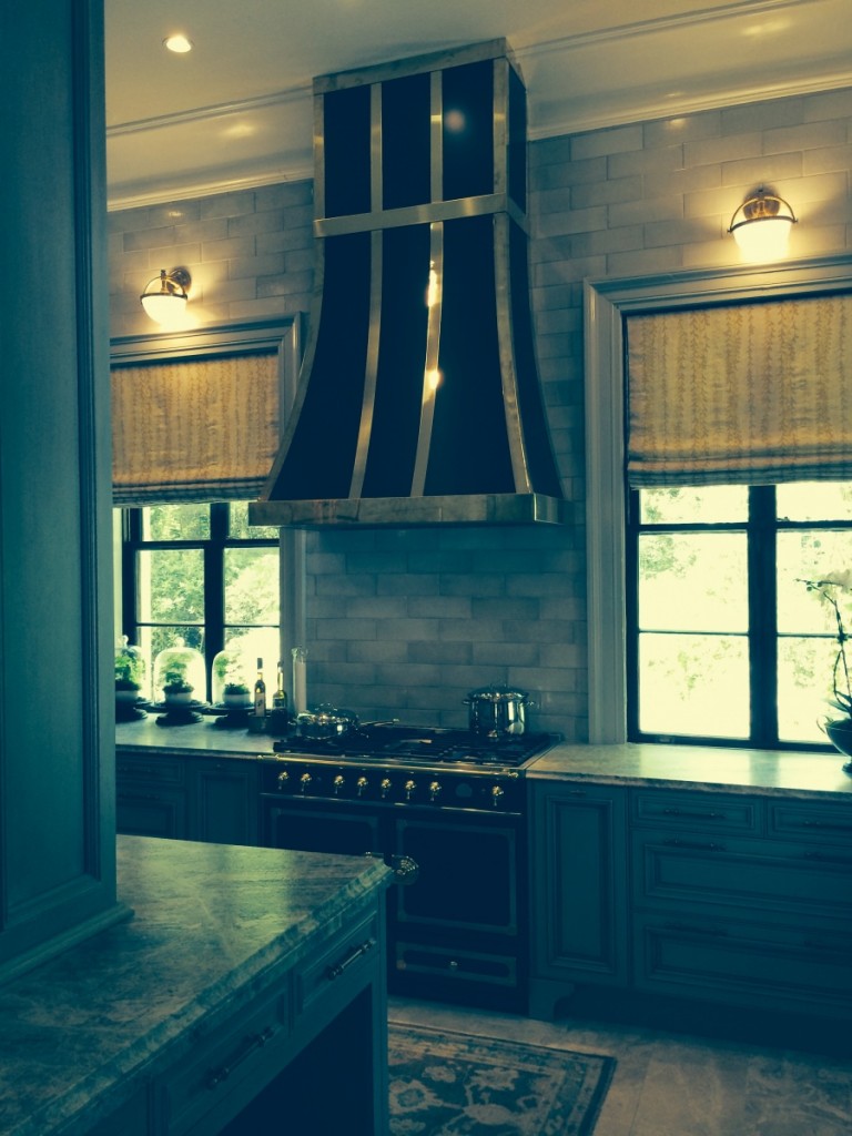
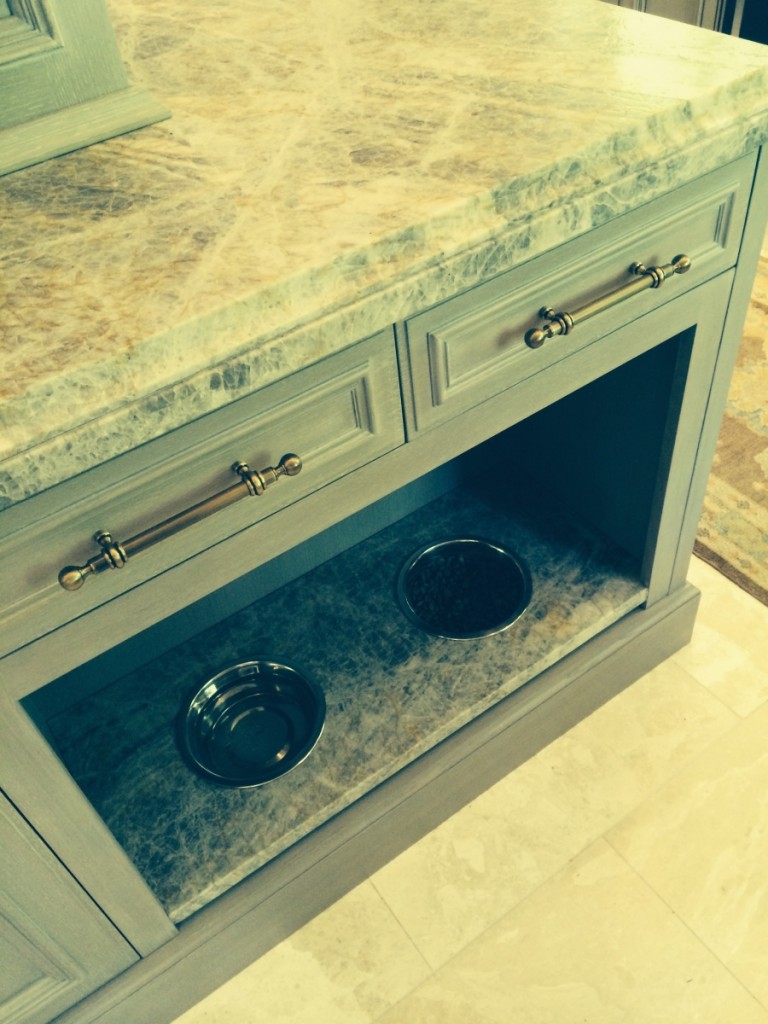
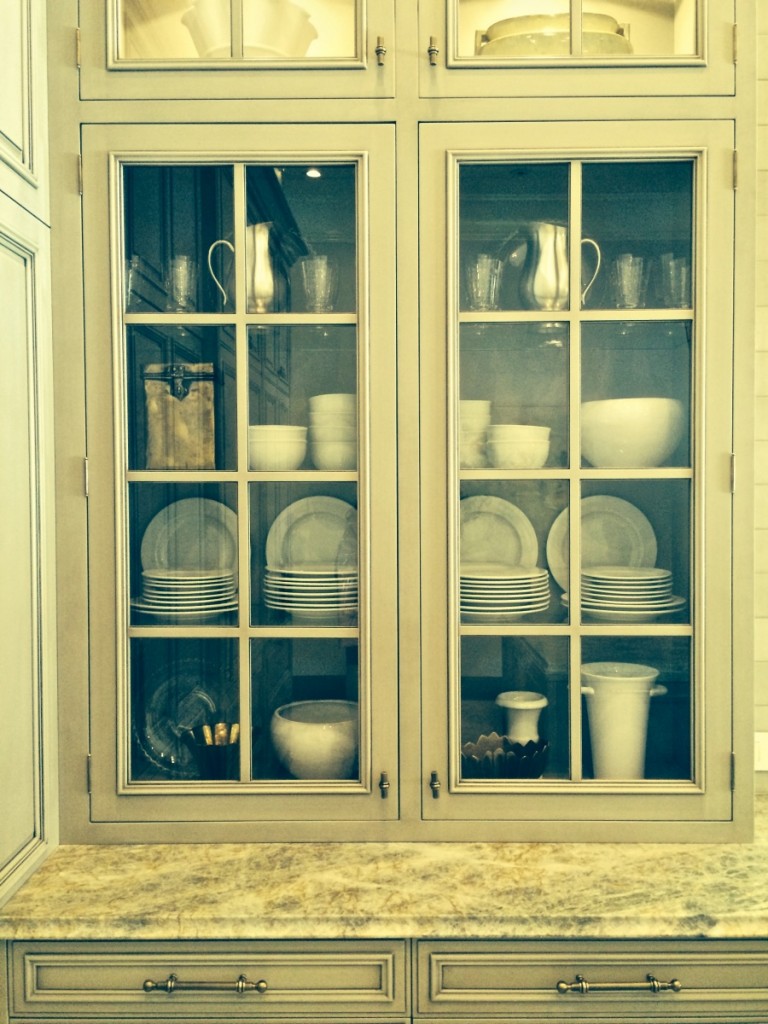
Moving into the kitchen, the perfect shade of greige on the cabinets, tile backsplash all the way to the top…
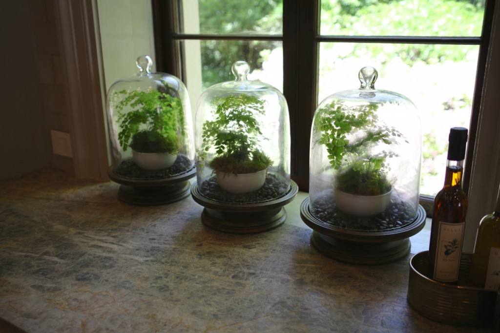
Notice the finish on the quartz counters…its a leather finish?! That’s a new one for me…always a student. Also love the styling of the terrarium trio.
The sconces over the windows, a personal favorite!
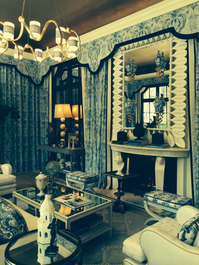
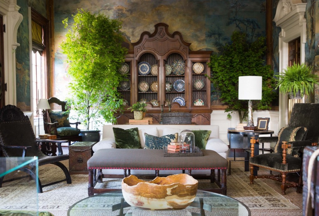
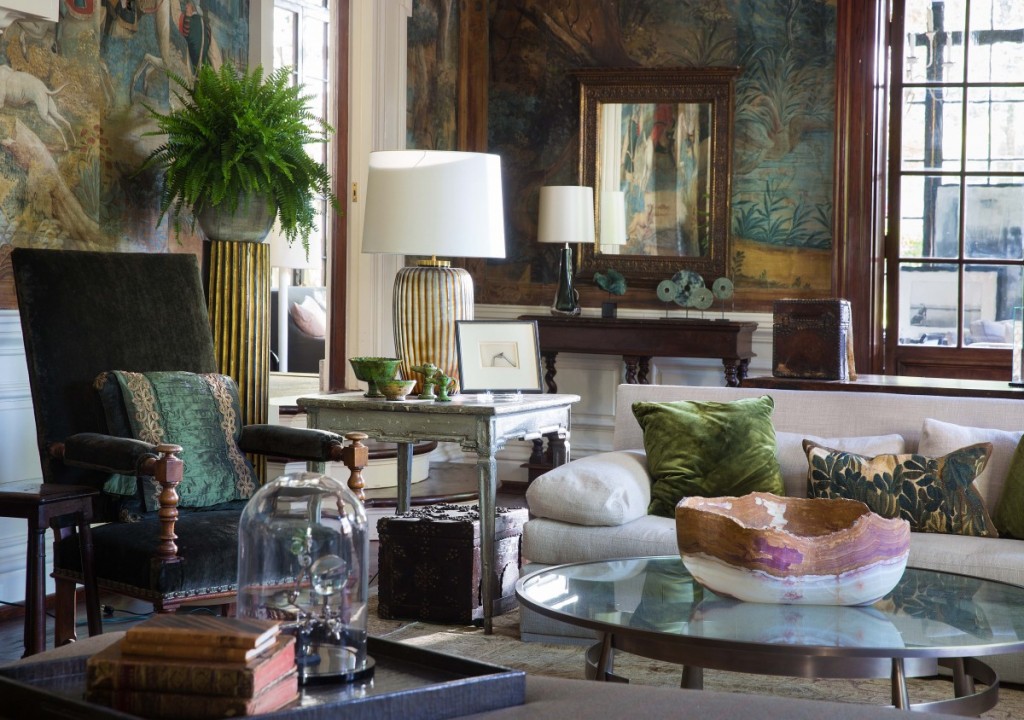
This next space, the Grand Salon, designed by Barbara Westbrook, BLEW ME AWAY with its hand painted linen wall coverings, original to the home! R u kidding me?
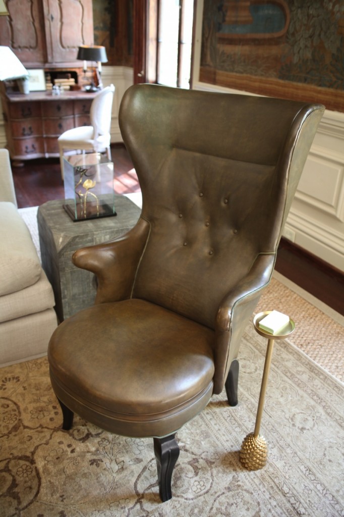
I love the rich emerald tones she pulled from the walls. Below a new take on a traditional wing back chair and how sweet is the side table, standing by for your favorite cocktail.
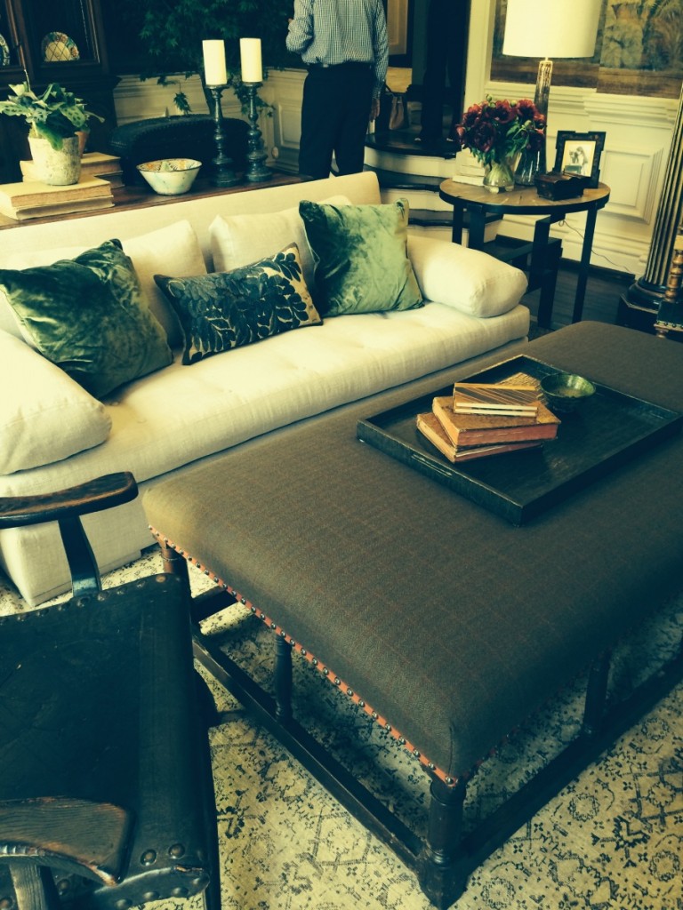
I could have spent a lot of time in this space, it was just so amazing to me. Taking note of the nail and trim on the ottoman here. Its the little details, the little layers, that make designing so much fun.
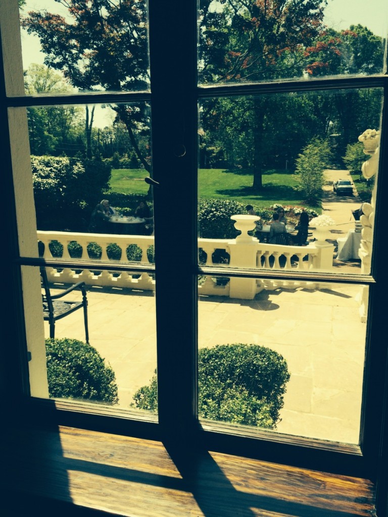
A beautiful lunch on a beautiful day was provided on the front lawn…
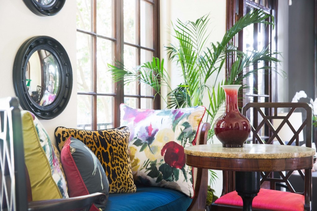
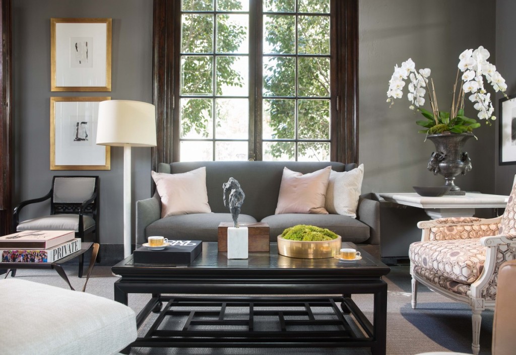
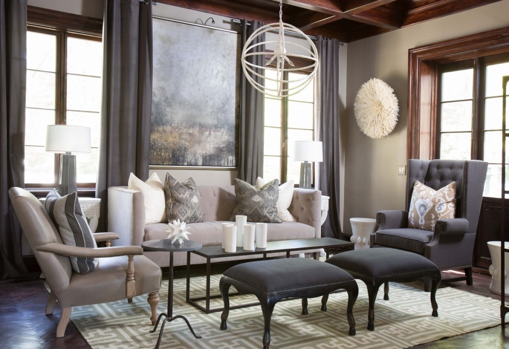
Directly off the Grand Salon, was Robert Brown’s Solarium space in grays, pinks with perfectly-styled vignettes and French Moderne furnishings. Notice how wonderful the wall color looks with the dark wood moldings. I might not have guessed that?
Again more layering of art over mirrors, etc.
Or art over art, whatever your fancy..
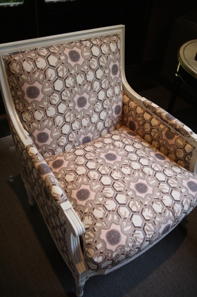
Note to self, pull this fabric memo…it sort of reminds me of sea urchins and may make a great jump off point for a beach house design. I believe its Jim Thompson, with a newly designed show room at ADAC I need to see asap.
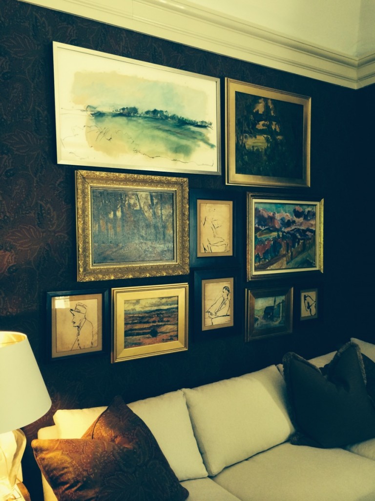
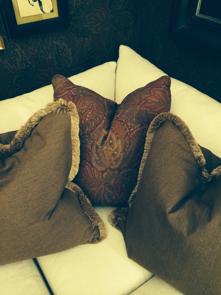
Really digging this salon styled wall in the study designed by Stan Topol and a favorite Brunschwig and Fils fabric on the walls and pillows. You may recall I just had a pillow made in this for my office and have some more coming for the new house.
I miss this good ole fashioned fringe trim. Its such great texture and looks especially cool on the end of round bolster pillows too.
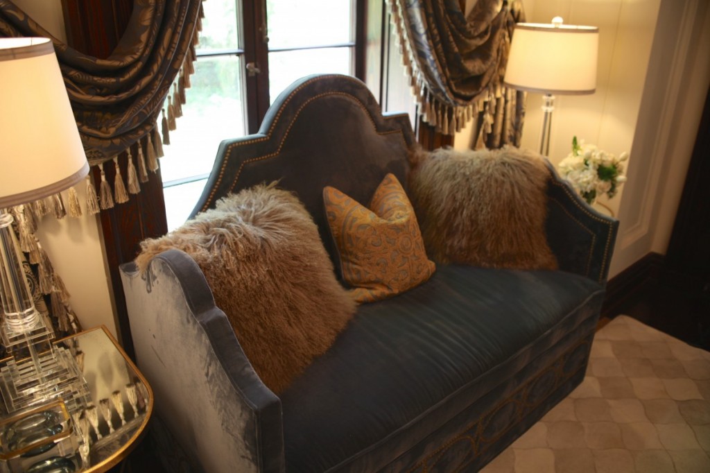
Can I just pick you up, pillows and all, and throw you in the back of my truck? LOVE. And notice the swag of the draperies, extending past the moldings, for more drama. Dig.
Precious
Jimmy Stanton’s spaces ALWAYS look so effortless and CHIC.
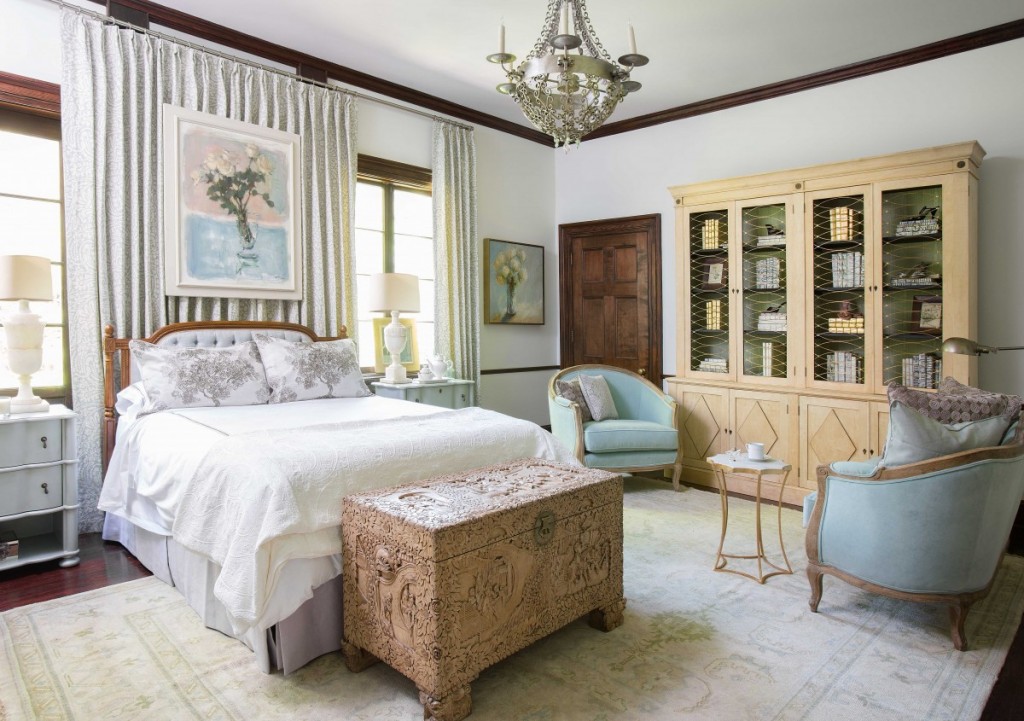
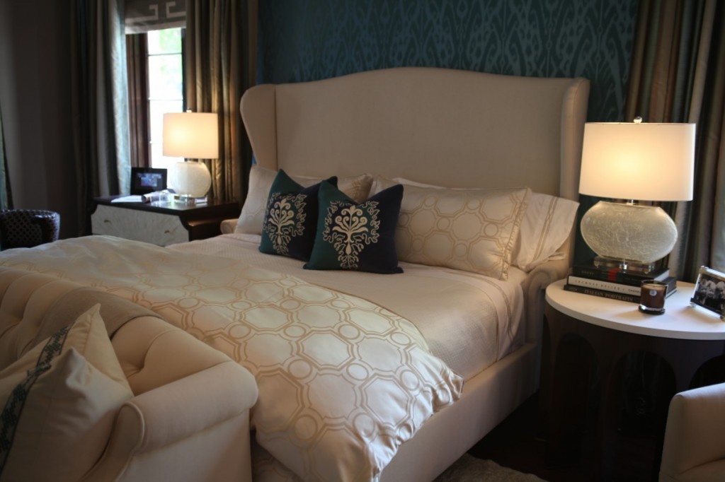
Now that’s a master bed!
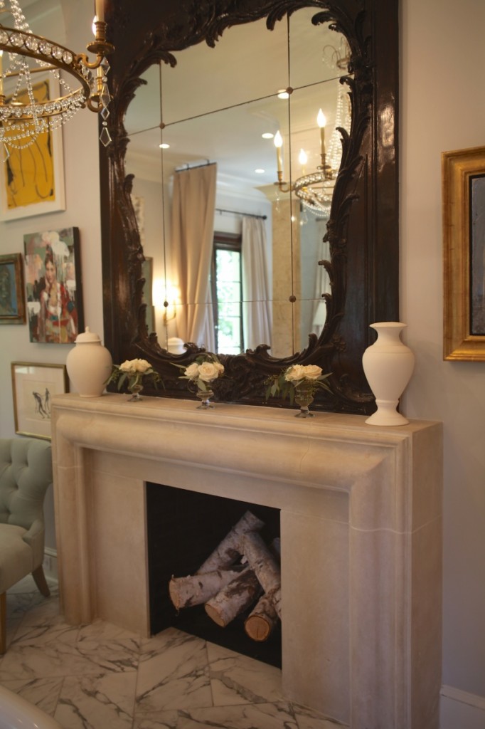
And a master bath!!! I particularly loved the art styled in a mish-mash around the mirror, on both sides. Made a mental note of that as well. 😉
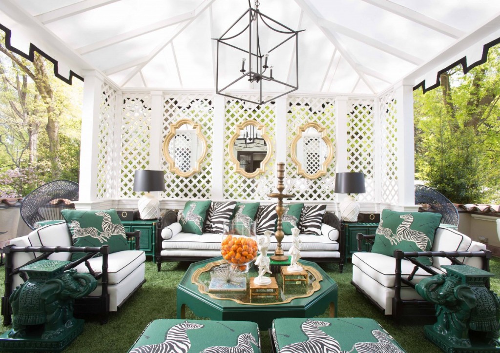
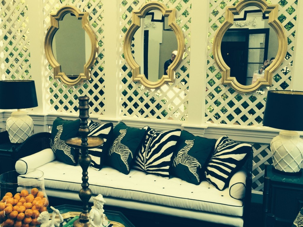
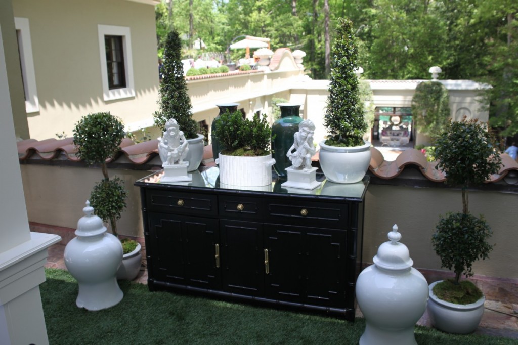
Our friends Lance and David, of Parker Kennedy, did such a phenomenal job with their outdoor space! Throw in the fact that I’m obsessed with black and white and this was an easy vote as one of my favorite spaces.
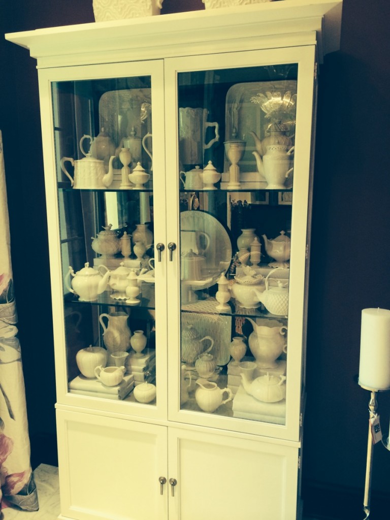
Again, another perfectly styled vignette by Bryan Alan Kirkland Designs. This space was VIBRANT with shades of pink. Really fun! Notice the white wrapped books. Recently Jill and I sprayed an old set of encyclopedia’s gold and will be using them to style some bookshelves with emerald green accents. Hoping that all works out like you picture in your head. 😉
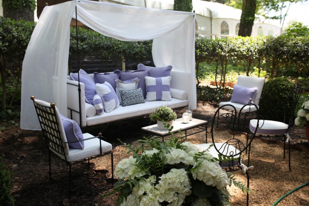
And lastly, our new favorite friends, Lila Pryor Frank and Allyson Kirkpatrick’s solarium garden space in sweet lavender. We had the opportunity to meet these fine ladies at lunch and they are a HOOT. Lee Lee if you are reading, they are from Huntsville and knew your family. Small world. BTW I have totally fallen for this color. I use to hate it. LOL. It’s nice to know we are always changing and evolving right? 😉
I hope you enjoyed the tour! I’m sorry to report that I did not get any good pictures of the Dining Room, by one of my FAVORITE Atlanta Interior Designer’s Melanie Turner. The existing antique murals brought back great memories of my Grandparent’s Funeral Home, hah. I know that sounds crazy, but they too had mural wallpaper on the walls for years (and lived upstairs) and I so wish it was still there. Now I have to look at Mom and Dad’s old prom pictures for a glance. If you do not know Melanie, check out her portfolio HERE. It has rock star written all over it. And she’s fun and sweet to talk to. I would have loved an opportunity to study under her while I was making my way. Heck I still am making my way. Always a student is one of my life’s many mantras. Be a sponge! 😉
Have a GREAT DAY and if you are in the Atlanta area, go be inspired with all this lavish design. This was just the tip of the iceberg. There is so much more! All proceeds benefit the Atlanta Symphony Orchestra, all the info for the show is, HERE. And you can follow along on your favorite social media network with hashtag #ASOShowHouse.
Cheers you all!
Jenny-inspired
xoxo

OH, MY, girlfriend…YOU ARE SO TALKING my language!! This was AWE – SOME!! franki p.s. “orbs” ARE my thing!!!
WOULD IT BE POSSIBLE TO GET THE NAME, MANUFACTURER, COLOR OF THE TILE USED IN THE SHOWCASE KITCHEN? THANKS!
I’m trying desperately to recall who designed this kitchen. I will do some hunting for you!
Could you tell me the color used on the kitchen cabinets, type/color of quartz and color of tile/manufacturer used in the kitchen. It is gorgeous!!
Thank you!
hello, wondering if i may have the color used on the kitchen cabinets. thank you so much.
Sandy Hook Grey by Benjamin Moore xo
Really, is the color Sandy Hook Grey by BM. It really looks nothing like the color of the kitchen. The kitchen is a soft greige and Sandy Hook is so dark. I am trying to decide on a color for my kitchen with the goal of having my kitchen look like this picture.